
Brand
Summary
This is part of the Inclusive Design group course project where we design solutions for problems that affect their day-to-day lives for marginalized or underrepresented user groups.
Responsibilities
Facilitated Co-design sessions with participants for user research and designed high fidelity mockups to test them with users.
Duration
Aug 2019 - Dec 2019
This project has been featured in UX collective design titled, Rethinking reachability in the era of big screens
Inclusive Design
According to Microsoft, Inclusive Design is a methodology, born out of digital environments, that enables and draws on the full range of human diversity. Most importantly, this means including and learning from people with a range of perspectives.
We screened 12 potential participants and selected 6 participants based on their digital literacy and competency with using any voice assistant. We had equal representation of gender and their proficiency to speak in English. The only shortcoming of this demographic is that all our participants were students between the age group 23 to 35.
We screened 12 potential participants and selected 6 participants based on their digital literacy and competency with using any voice assistant. We had equal representation of gender and their proficiency to speak in English. The only shortcoming of this demographic is that all our participants were students between the age group 23 to 35.
We screened 12 potential participants and selected 6 participants based on their digital literacy and competency with using any voice assistant. We had equal representation of gender and their proficiency to speak in English. The only shortcoming of this demographic is that all our participants were students between the age group 23 to 35.
ABOUT THE PROJECT
Reach is a product concept that emerged as a part of the Inclusive Design course work under the guidance of Prof Hernisa Kacorri. The problem statement is to select an under-represented group of users who have been largely neglected as a user group in any product scope, then interview them to understand their pain point to identify the pain points of their day to day lives. Based on the problem statement, the participants and the designers have to engage in a co-design session to brainstorm various ideas and see how it fits in their lives.
We screened 12 potential participants and selected 6 participants based on their digital literacy and competency with using any voice assistant. We had equal representation of gender and their proficiency to speak in English. The only shortcoming of this demographic is that all our participants were students between the age group 23 to 35.
We screened 12 potential participants and selected 6 participants based on their digital literacy and competency with using any voice assistant. We had equal representation of gender and their proficiency to speak in English. The only shortcoming of this demographic is that all our participants were students between the age group 23 to 35.
We screened 12 potential participants and selected 6 participants based on their digital literacy and competency with using any voice assistant. We had equal representation of gender and their proficiency to speak in English. The only shortcoming of this demographic is that all our participants were students between the age group 23 to 35.
TEAM AND PROCESS
Team
I was a part of a group of three amazing designers and researchers for this project. I was responsible for crafting low and high fidelity designs and to test it with the users. I also equally contributed to the study design and protocols, including interview questionnaires, co-design session narrative, and driving the brainstorming sessions during the co-design session.
We screened 12 potential participants and selected 6 participants based on their digital literacy and competency with using any voice assistant. We had equal representation of gender and their proficiency to speak in English. The only shortcoming of this demographic is that all our participants were students between the age group 23 to 35.
We screened 12 potential participants and selected 6 participants based on their digital literacy and competency with using any voice assistant. We had equal representation of gender and their proficiency to speak in English. The only shortcoming of this demographic is that all our participants were students between the age group 23 to 35.
We screened 12 potential participants and selected 6 participants based on their digital literacy and competency with using any voice assistant. We had equal representation of gender and their proficiency to speak in English. The only shortcoming of this demographic is that all our participants were students between the age group 23 to 35.
Design philosophy
My advisor, Dr. Gregg Vanderheiden was amongst the advocates of Universal Design in 1997 who contributed to the principles of Universal Design. We used these principles as a north star for Reach.
INCLUSIVE DESIGN PRINCIPLES
Equitable use
The design does not disadvantage or stigmatize any group of users.
Flexibility in Use
The design accommodates a wide range of individual preferences and abilities.
Size and Space for Approach & Use
Appropriate size and space is provided for approach, reach, manipulation, and use, regardless of the user's body size, posture, or mobility.
Tolerance for Error
The design minimizes hazards and the adverse consequences of accidental or unintended actions.
Low Physical Effort
The design can be used efficiently and comfortably and with a minimum of fatigue.
Simple, Intuitive Use
Use of the design is easy to understand, regardless of the user's experience, knowledge, language skills, or current concentration level.
Perceptible Information
The design communicates necessary information effectively to the user, regardless of ambient conditions or the user's sensory abilities.
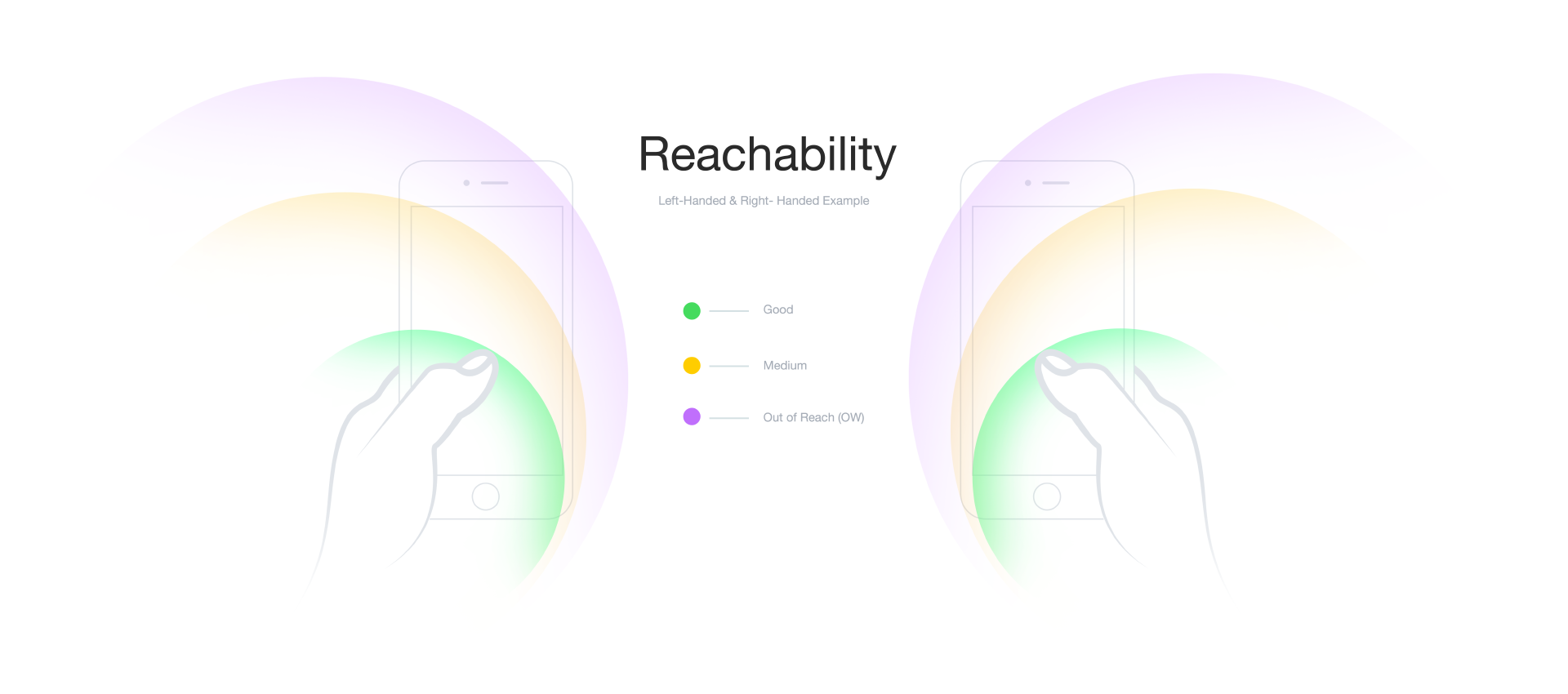
TARGET AUDIENCE
Initially, our target audience or under-represented user group were people who consider themselves as sinistral, a.k.a left-handedness. Soon after the user interviews, to understand their digital experience, we stumbled upon an underlying problem that affects people with both dexterities. Larger screens. After a discussion with our professor and the participants, we re-evaluated our target audience to people with relatively smaller hands.
We screened 12 potential participants and selected 6 participants based on their digital literacy and competency with using any voice assistant. We had equal representation of gender and their proficiency to speak in English. The only shortcoming of this demographic is that all our participants were students between the age group 23 to 35.
We screened 12 potential participants and selected 6 participants based on their digital literacy and competency with using any voice assistant. We had equal representation of gender and their proficiency to speak in English. The only shortcoming of this demographic is that all our participants were students between the age group 23 to 35.
We screened 12 potential participants and selected 6 participants based on their digital literacy and competency with using any voice assistant. We had equal representation of gender and their proficiency to speak in English. The only shortcoming of this demographic is that all our participants were students between the age group 23 to 35.
Methodology
Our core methodology involved bringing in the user to design solutions for them. This helps us to be in the user's shoes as we explore various solutions that will impact their lives in a positive tone. This helps us understand the various edge cases they anticipate during the design phase. These edge cases often are derived from past lived experiences or word of mouth successful ideas within their community.
We screened 12 potential participants and selected 6 participants based on their digital literacy and competency with using any voice assistant. We had equal representation of gender and their proficiency to speak in English. The only shortcoming of this demographic is that all our participants were students between the age group 23 to 35.
We screened 12 potential participants and selected 6 participants based on their digital literacy and competency with using any voice assistant. We had equal representation of gender and their proficiency to speak in English. The only shortcoming of this demographic is that all our participants were students between the age group 23 to 35.
We screened 12 potential participants and selected 6 participants based on their digital literacy and competency with using any voice assistant. We had equal representation of gender and their proficiency to speak in English. The only shortcoming of this demographic is that all our participants were students between the age group 23 to 35.
User interviews
User Interviews are followed by brainstorming sessions with the user to identify a problem statement. Identifying a problem statement with the participant will provide additional involvement from the participant as they express the problem they intend to pursue. This generates numerous back and forth iterative ideas that suit their daily lives.
Participatory Co-design sessions
What better way is representing the voice of the user when you have the user to speak for themselves? Bringing in participants to design solutions to their problem statement fosters healthy discussions around past experiences. This also uncovers some of the insights that were missed during the user interview which could be very important as more context will emerge.
A/b and Usability testing
A/B testing helped us to test various design approaches before finalizing the interface in a wireframe level. Once we have a better idea of how our solutions will shape, usability testing is often a good way to test and weed out flaws, navigational gaps, and cognitive gaps in the solutions.
User Interviews
User interviews gave us a sneak peek of various problems encountered by the user groups. For this project, we interviewed 2 participants who considered themselves as sinistral in nature. User interviews served as a crucial step as it helped us reiterate our target audience from sinistrality to people with smaller hands.
Our user interview focused primarily on the user's digital experiences. The user interview was semi-structured and in-person with plenty of follow up questions to understand the context and situation of lived experiences.
Problem statement
From the interview session, we found out that one of the biggest pain-points in using the smartphone is reachability. Our participant was unable to reach the navigational buttons on the top of the screen where most buttons like search, menu, and settings are placed. Therefore our area of focus is to determine various interactions that can assist the user to interact with the navigational and content that are in the top 25% of the screen real estate.
- What are some of the common problems you face while using everyday objects?
- What are the ways in which you have adapted yourself in a world that has most products designed for right-handed people?
- What digital devices have you used until now? Since how long?
- What are some of the common challenges you have faced while interacting with those digital platforms?
- How do you tackle the issues? Have you been successful so far?
- Are you aware of any feature specifically designed for left-handed users on a smartphone?
- How are your typing patterns on your phone? Do you use both your hands while typing?
- What are some of the common applications you use on a daily basis on your phone?
- Can we see your interaction with these applications?
- Can you walk us through these apps and your daily tasks you want to accomplish in the apps?
Insights
Reachability in terms of content and navigation has been the primary issue for people with smaller hands.
Participants prefer persistent navigation patterns recommended by Apple's Human Interface Guidelines which is being adapted by many app developers even in the android platform.
Most navigation buttons are in the top 25% of the screen.
Our participants are forced to consider purchasing smartphones with smaller form factors as using larger screens is very hard especially when used in a single hand.
Existing accessibility features in android phones are either buried deep in the settings or do not do a good job in helping the participants.
Source - Medium article by Alex Kirhenstein
Brainstorming sessions
Based on the insights we gathered, we started exploring various solutions. Though we let the solutions to derive organically, we also introduced certain ideas to expand the possibilities.
Some of the ideas that came out of the discussion are as follows.
- Voice-based system to interact with individual elements in each application
- Gaze feature to interact with the buttons of the application
- A restructured menu at the bottom navigation bar
- Floating fab button containing all the top navigation menu item
Background research
In the following carousal,
- The tasks performed by the user are listed.
- The various rubrics we used like Average Time-taken, Average user rating, and Average User Emotion.
- The various issues listed or observed by the users are also listed down.
- The dots represent the number of participants with the color indicating if it is successful or not.
There is very little work in the academic literature surrounding the relationship between larger screen size and the size of a human hand.
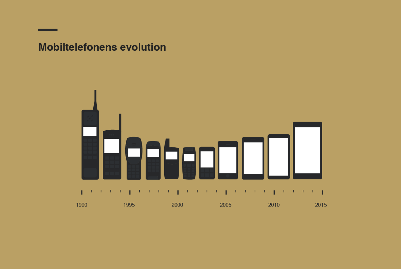
Smartphones, when introduced, had smaller screens which enabled users to interact and navigate with a single hand. As display technologies have been challenged year after year, the bigger screen size has been one of the differentiators to stand apart. Given its benefits, users are forced to adapt to this change and oftentimes, it results in inconvenience. (Count the number of broken iPhone screens). As smartphone displays get bigger, our focus now is to enhance the reachability for smartphone users, especially individuals who have relatively small hands. The main goal is to provide the best user experience without making any additional movements for users that make them feel uncomfortable.
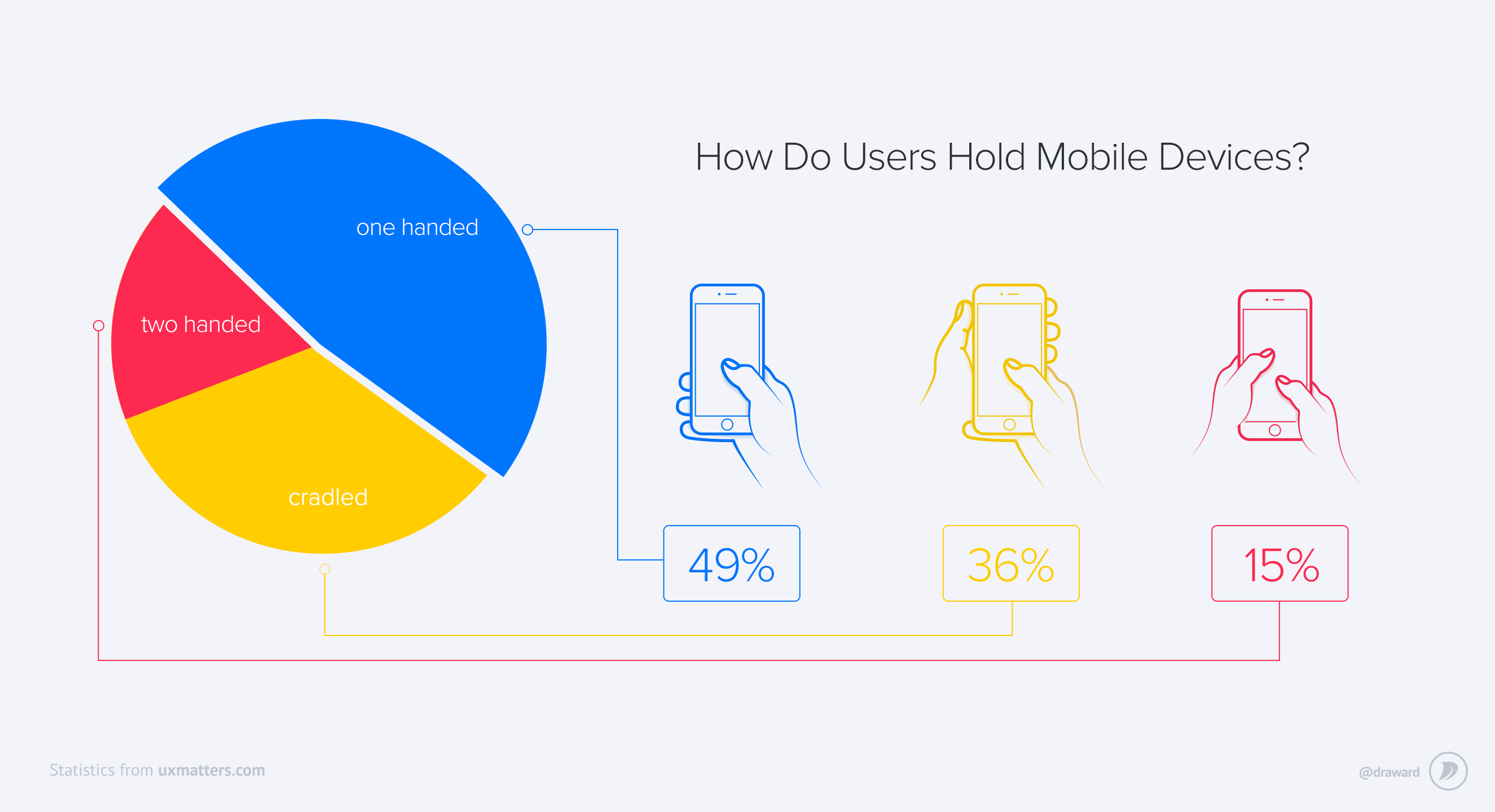
An article in UX matters visualizes the distribution of people's dexterity when using a smartphone. Almost 50% of the users interact with their phones with a single hand. another 36% of the users, use their smartphones with a single hand while holding it with the other hand. Only 15% of them use both their hands. This provides an interesting insight into how users handle their phones.
Reachability is not supported on iPhone X pic.twitter.com/vvclAXMr2J
— Guilherme Rambo (@_inside) September 13, 2017
Sadly, major smartphone manufactures are forced to hide or de-prioritize these accessibility features to push the boundaries of the screen to body ratio. As Apple introduced the gesture control, they dropped the reachability feature since the physical button was removed. Samsung's One UI shrinks the entire screen to let the users interact with the top 25% of the screen. This again is not the best way to deal with this problem since shrinking the screen means shrinking the size of the buttons or any call to actions.
Apple’s iPhone Human Interface Guidelines recommends a minimum target size of 44 pixels wide 44 pixels tall. Microsoft’s Windows Phone UI Design and Interaction Guide suggests a touch target size of 34px with a minimum touch target size of 26px. Nokia’s developer guidelines suggest that the target size should be no smaller than 1cm x 1cm square or 28 x 28 pixels.
PARTICIPATORY CO-DESIGN SESSION
Our co-design session was in person and lasted approximately an hour.
To spur discussion and design iteration with the participant during a co-design session we used some materials for storyboarding and included drawing supplies and storyboard templates that guide the participant without being prescriptive. We also included additional collections of icons, images, and symbols for each app which would make it easier for the participant to build our paper prototypes. This also allowed us quick mobility in terms of the various components in the prototype and to enable us to incorporate our participant’s design suggestions during the co-design session.
We screened 12 potential participants and selected 6 participants based on their digital literacy and competency with using any voice assistant. We had equal representation of gender and their proficiency to speak in English. The only shortcoming of this demographic is that all our participants were students between the age group 23 to 35.
We screened 12 potential participants and selected 6 participants based on their digital literacy and competency with using any voice assistant. We had equal representation of gender and their proficiency to speak in English. The only shortcoming of this demographic is that all our participants were students between the age group 23 to 35.
We screened 12 potential participants and selected 6 participants based on their digital literacy and competency with using any voice assistant. We had equal representation of gender and their proficiency to speak in English. The only shortcoming of this demographic is that all our participants were students between the age group 23 to 35.
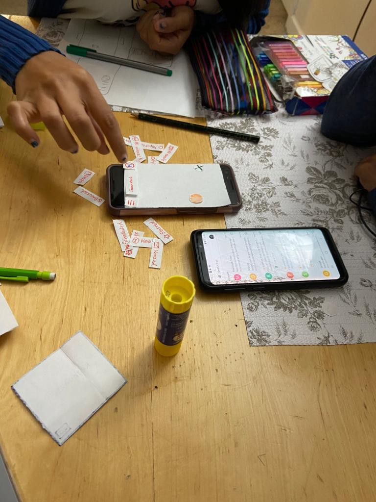
To add more value to the co-design session, we defined three key tasks that were derived from the participant's interview notes. The participants were informed that in the end, they will complete the tasks with their smartphone using the ideas we generate and brainstorm that solves the issue of reachability.
TASK LIST
The three tasks to keep in mind while exploring various ideas we brainstormed were derived based on the interview insights.
- TASK #1 Use WhatsApp to search for the participant’s father’s name
- TASK #2 Navigate to the draft in Gmail
- TASK #3 Search for “Inclusive Design” in Google Chrome web browser
Participant feedback
After exploring the various ideas mentioned before, the participant felt that a floating action button would be worth testing. The participant ruled out other options with the following rationale.
Option #1 - Gaze feature to interact with the buttons of the application
“ I don’t understand the concept of gaze to interact with my phone. I don’t think we have technology that is accurate enough to implement it. That will be inconvenient and I am not used to it."
Option #2 - Voice-based system to interact with individual elements in each application
“I don’t really find the voice feature useful! Especially when I want to use it in a crowded or work environment. I wouldn’t use this for social media apps. I can use this to listen to the emails or messages when I am unable to interact with the phone”
Option #3 - A restructured menu at the bottom navigation bar
"Although this is a great idea, I don't want the app layout to change for me. I would prefer something that is flexible and non-intrusive."
OPTION 4 - REACH (a floating action button)
An OS-wide accessibility feature that will restructure navigational menu items or call to action buttons in the top 25% of the screen and bring them to your fingertips in a floating action button.
We screened 12 potential participants and selected 6 participants based on their digital literacy and competency with using any voice assistant. We had equal representation of gender and their proficiency to speak in English. The only shortcoming of this demographic is that all our participants were students between the age group 23 to 35.
We screened 12 potential participants and selected 6 participants based on their digital literacy and competency with using any voice assistant. We had equal representation of gender and their proficiency to speak in English. The only shortcoming of this demographic is that all our participants were students between the age group 23 to 35.
We screened 12 potential participants and selected 6 participants based on their digital literacy and competency with using any voice assistant. We had equal representation of gender and their proficiency to speak in English. The only shortcoming of this demographic is that all our participants were students between the age group 23 to 35.
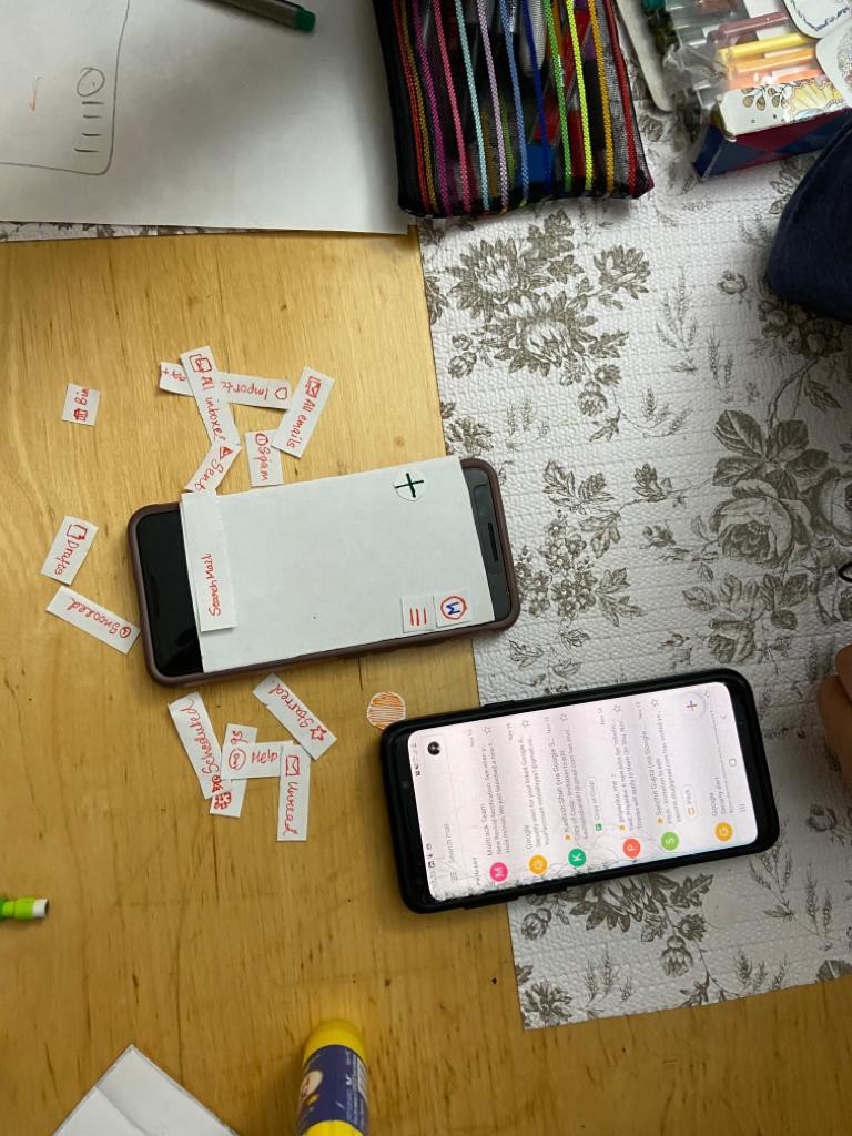
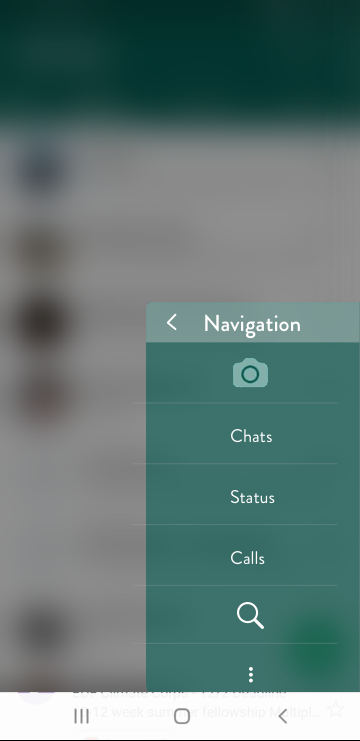
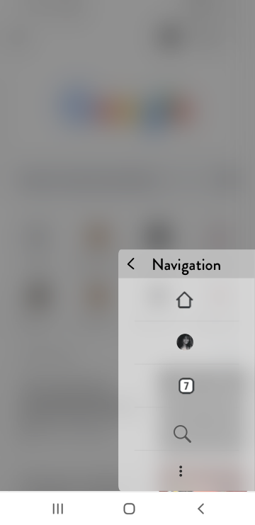
RESTRUCTURING WHATSAPP NAVIGATION
The majority of android applications have most of their menu navigation on the top and WhatsApp is no different. This is because unlike Apple's design language, Material design or google's standard does not enforce or suggest a persistent navigation pattern.
Currently, WhatsApp has 6 navigational menus on top. This is quite difficult to operate with a single hand, especially with a larger phone.
We screened 12 potential participants and selected 6 participants based on their digital literacy and competency with using any voice assistant. We had equal representation of gender and their proficiency to speak in English. The only shortcoming of this demographic is that all our participants were students between the age group 23 to 35.
We screened 12 potential participants and selected 6 participants based on their digital literacy and competency with using any voice assistant. We had equal representation of gender and their proficiency to speak in English. The only shortcoming of this demographic is that all our participants were students between the age group 23 to 35.
We screened 12 potential participants and selected 6 participants based on their digital literacy and competency with using any voice assistant. We had equal representation of gender and their proficiency to speak in English. The only shortcoming of this demographic is that all our participants were students between the age group 23 to 35.
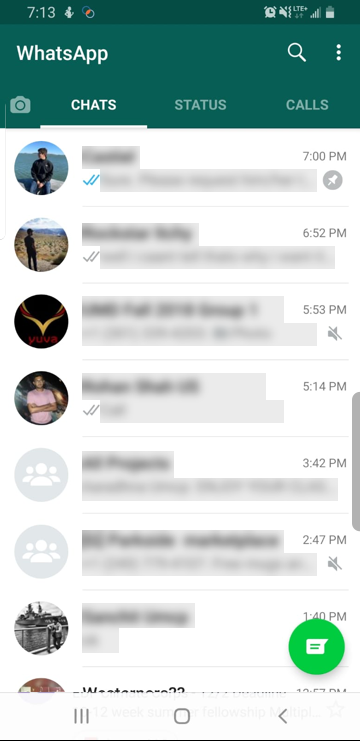
The Stories, Chat, Status, Calls, Search and the menu button are all fixed in the top 25% of the screen which makes it less likely to be reached with ease.
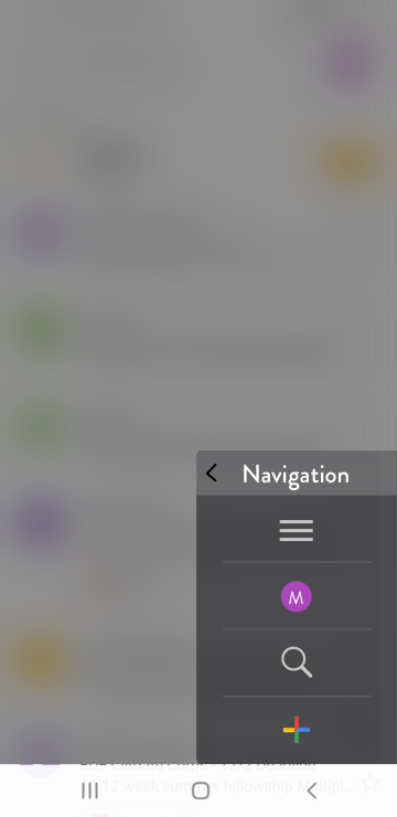
The translucent floating action button is stationed right where the thumb easily covers the screen.
Once the floating action button is pressed, a pop-up modal screen appears and the contents are blurred out. This is done so that the users are not confused with two action buttons to do the same task.
In the modal screen, all the navigational buttons are accessible easily, with just one touch.
RESTRUCTURING CHROME BROWSER NAVIGATION
Similar to WhatsApp, the Chrome web browser has all the navigational menu buttons on the top menu bar of the application.
We screened 12 potential participants and selected 6 participants based on their digital literacy and competency with using any voice assistant. We had equal representation of gender and their proficiency to speak in English. The only shortcoming of this demographic is that all our participants were students between the age group 23 to 35.
We screened 12 potential participants and selected 6 participants based on their digital literacy and competency with using any voice assistant. We had equal representation of gender and their proficiency to speak in English. The only shortcoming of this demographic is that all our participants were students between the age group 23 to 35.
We screened 12 potential participants and selected 6 participants based on their digital literacy and competency with using any voice assistant. We had equal representation of gender and their proficiency to speak in English. The only shortcoming of this demographic is that all our participants were students between the age group 23 to 35.
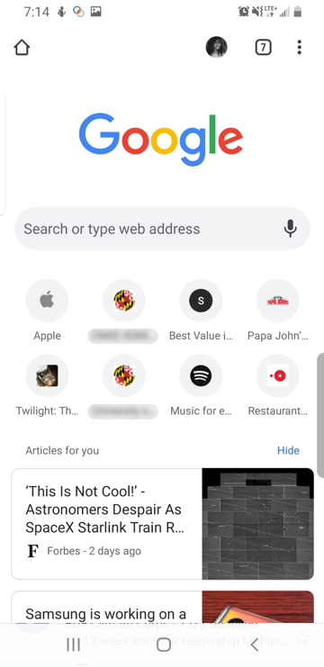
The Homepage, User account page, various active tabs, and the more button are not easily reachable if a user uses a single hand to operate.
The floating action button was designed with the user who suggested that they need the button on a specific area of the screen. But, it can be moved from one side of the screen to the other but within the reach of the thumb. If not, the reachability of that button becomes a problem.
While designing the interface, we realized that sometimes, the more button leads to more complicated interfaces - Like a modal screen by itself. Such scenarios forced us to draw a distinction on to what level our design idea can be scalable. We also discussed with the user for how the interface can fall back if it encounters complex interactions.
In this example, the user account button will open a new screen when selected. A perfect example of complex interactions is Gmail, which is discussed below.
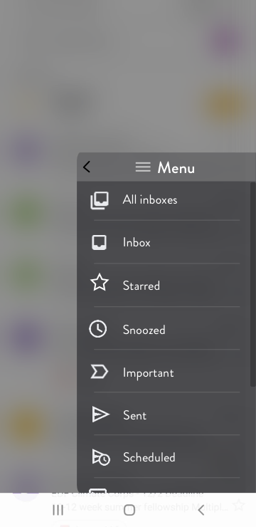
RESTRUCTURING GMAIL NAVIGATION
Gmail is an interesting use case because it has many levels of interaction. The hamburger menu opens up with a lot of options that may still not be reachable.
We screened 12 potential participants and selected 6 participants based on their digital literacy and competency with using any voice assistant. We had equal representation of gender and their proficiency to speak in English. The only shortcoming of this demographic is that all our participants were students between the age group 23 to 35.
We screened 12 potential participants and selected 6 participants based on their digital literacy and competency with using any voice assistant. We had equal representation of gender and their proficiency to speak in English. The only shortcoming of this demographic is that all our participants were students between the age group 23 to 35.
We screened 12 potential participants and selected 6 participants based on their digital literacy and competency with using any voice assistant. We had equal representation of gender and their proficiency to speak in English. The only shortcoming of this demographic is that all our participants were students between the age group 23 to 35.
The hamburger button opens up a menu that has roughly about 15 options like Inbox, Sent, Draft, Scheduled, span and so on and so forth. Some of these options are placed on the upper left corner of the screen which is the most inaccessible area.
The complex interaction of the hamburger menu forced us to rethink how to scale up the design and define breakdowns and fallbacks since the solution is OS-wide and not application-specific.
When the hamburger button is clicked, the ReachIt modal screen expands to accommodate the contents of the hamburger menu.
The user can go back to the previous menu items by clicking on the back button.
USABILITY TESTING
After designing the high fidelity mockups, we used Invision to prototype and test our application. Our participants loved this application and wished it could be used on their phones. In the end, they were happy to see their ideas valued and were enthusiastic about the project.
Play around with our invision prototype.
Incase, the prototype is glitchy, click here to redirect to the prototype.
We screened 12 potential participants and selected 6 participants based on their digital literacy and competency with using any voice assistant. We had equal representation of gender and their proficiency to speak in English. The only shortcoming of this demographic is that all our participants were students between the age group 23 to 35.
We screened 12 potential participants and selected 6 participants based on their digital literacy and competency with using any voice assistant. We had equal representation of gender and their proficiency to speak in English. The only shortcoming of this demographic is that all our participants were students between the age group 23 to 35.
We screened 12 potential participants and selected 6 participants based on their digital literacy and competency with using any voice assistant. We had equal representation of gender and their proficiency to speak in English. The only shortcoming of this demographic is that all our participants were students between the age group 23 to 35.
When we tested this outside of our participants, we received some constructive feedback.
- Our design could affect the participants who have color blindness or less vision since the floating button is small. One solution could be to make a big floating button with higher contrast, but that may affect the overall aesthetics of the app.
- Since the floating button is different than the menu it may take some time for the users to get adapted.
IMPACT
As more and more smartphones are having a high body to screen ratio, our solution could be a wonderful accessibility feature that can benefit everyone. This could be potentially used for tablets (like the iPad), as it is inherently hard to use it with one hand. Our solution follows the rule- solve for one; expand to many.
We screened 12 potential participants and selected 6 participants based on their digital literacy and competency with using any voice assistant. We had equal representation of gender and their proficiency to speak in English. The only shortcoming of this demographic is that all our participants were students between the age group 23 to 35.
We screened 12 potential participants and selected 6 participants based on their digital literacy and competency with using any voice assistant. We had equal representation of gender and their proficiency to speak in English. The only shortcoming of this demographic is that all our participants were students between the age group 23 to 35.
We screened 12 potential participants and selected 6 participants based on their digital literacy and competency with using any voice assistant. We had equal representation of gender and their proficiency to speak in English. The only shortcoming of this demographic is that all our participants were students between the age group 23 to 35.
LIMITATIONS AND TAKEAWAYS
The biggest limitation of this project is the solutions were tailored to only a select few participants who may or may not represent the larger target audience. The tasks were built around what the users most likely use in their daily lives. More work and research should be done to understand various interaction patterns in other apps and how our solution will fail to operate.
The biggest takeaway is how to conduct a successful co-design session. I am currently applying this co-design session for my externship at Stardog union which has generated a lot of ideas and design approaches since it is an exploratory project.
Do you think I can thrive in your complex problem space? Let's talk!
Apart from work, I am fiddling around with Google Assistant actions to create a Bot that helps me be more productive. Ask me about that when we talk.
Email: hello@aravindjr.com
LinkedIn: Aravind Jembu Rajkumar
© Aravind 2021
Designer | Researcher | Product?