
ENTERPRISE DATA SERVICE (EDS)
Enterprise Data Service is an internal branch which is like the central system for all the data that is being collected by PayPal. This includes every transaction made by customers and merchants, customer support, Media relations, revenue, profit, etc. EDS provides the stats to all stakeholders and all-hands meetings about the performance of the company. To summarize, Data is Oil, and EDS is the oil refinery for PayPal.
We screened 12 potential participants and selected 6 participants based on their digital literacy and competency with using any voice assistant. We had equal representation of gender and their proficiency to speak in English. The only shortcoming of this demographic is that all our participants were students between the age group 23 to 35.
We screened 12 potential participants and selected 6 participants based on their digital literacy and competency with using any voice assistant. We had equal representation of gender and their proficiency to speak in English. The only shortcoming of this demographic is that all our participants were students between the age group 23 to 35.
We screened 12 potential participants and selected 6 participants based on their digital literacy and competency with using any voice assistant. We had equal representation of gender and their proficiency to speak in English. The only shortcoming of this demographic is that all our participants were students between the age group 23 to 35.
ABOUT THE PROJECT
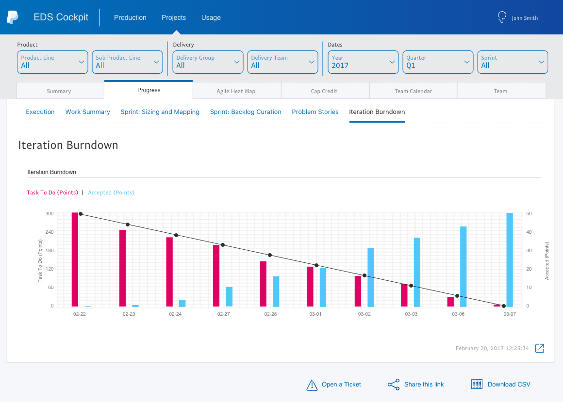
I was the only designer based in Chennai for EDS. I loosely worked with another designer from San Jose. My task during my tenure at PayPal was to create mobile versions of Data Operations Intelligence and Media Intelligence that would supplement the desktop applications. These two applications were the main applications that would help stakeholders make informed decisions.
We screened 12 potential participants and selected 6 participants based on their digital literacy and competency with using any voice assistant. We had equal representation of gender and their proficiency to speak in English. The only shortcoming of this demographic is that all our participants were students between the age group 23 to 35.
We screened 12 potential participants and selected 6 participants based on their digital literacy and competency with using any voice assistant. We had equal representation of gender and their proficiency to speak in English. The only shortcoming of this demographic is that all our participants were students between the age group 23 to 35.
We screened 12 potential participants and selected 6 participants based on their digital literacy and competency with using any voice assistant. We had equal representation of gender and their proficiency to speak in English. The only shortcoming of this demographic is that all our participants were students between the age group 23 to 35.
OTHER ENGAGEMENTS
I worked on A/B testing a chatbot which was scrapped due to low usage. I also designed data-intensive dashboards like Bazil Sales Ops, Daily KPIs for C level stakeholders and sometimes, designed posters for internal events and festivals.
We screened 12 potential participants and selected 6 participants based on their digital literacy and competency with using any voice assistant. We had equal representation of gender and their proficiency to speak in English. The only shortcoming of this demographic is that all our participants were students between the age group 23 to 35.
We screened 12 potential participants and selected 6 participants based on their digital literacy and competency with using any voice assistant. We had equal representation of gender and their proficiency to speak in English. The only shortcoming of this demographic is that all our participants were students between the age group 23 to 35.
We screened 12 potential participants and selected 6 participants based on their digital literacy and competency with using any voice assistant. We had equal representation of gender and their proficiency to speak in English. The only shortcoming of this demographic is that all our participants were students between the age group 23 to 35.
TEAM AND PROCESS
Team
I was an individual contributor but collaborated with cross-functional teams, Product owners, developers and sometimes high-level stakeholders to get the designs right and implemented.
We screened 12 potential participants and selected 6 participants based on their digital literacy and competency with using any voice assistant. We had equal representation of gender and their proficiency to speak in English. The only shortcoming of this demographic is that all our participants were students between the age group 23 to 35.
We screened 12 potential participants and selected 6 participants based on their digital literacy and competency with using any voice assistant. We had equal representation of gender and their proficiency to speak in English. The only shortcoming of this demographic is that all our participants were students between the age group 23 to 35.
We screened 12 potential participants and selected 6 participants based on their digital literacy and competency with using any voice assistant. We had equal representation of gender and their proficiency to speak in English. The only shortcoming of this demographic is that all our participants were students between the age group 23 to 35.
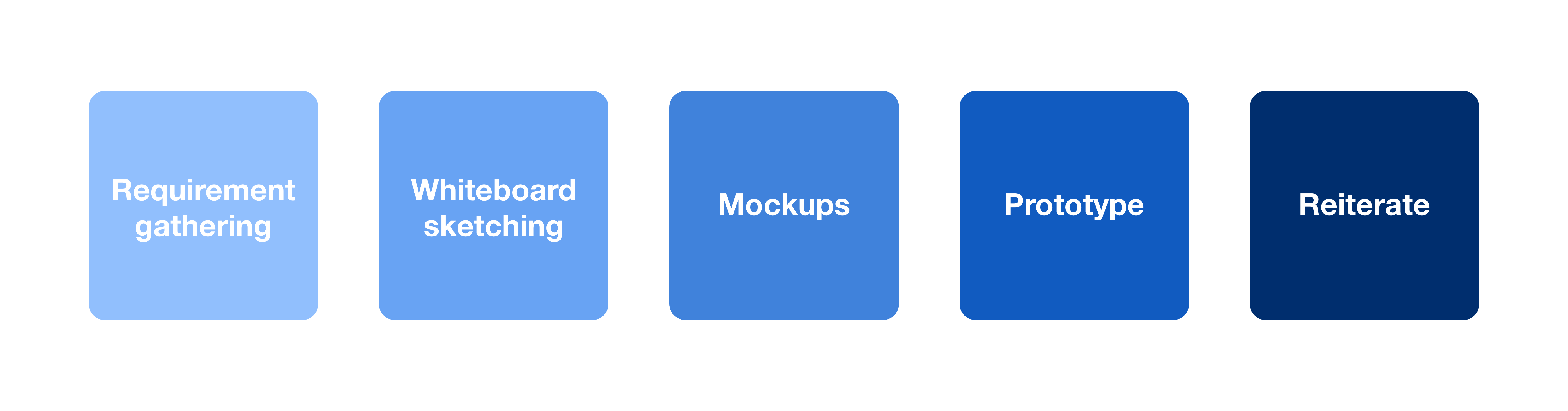
Process
On a very high level, the design process at EDS consists of 5 steps. It is a very fluid process depending on the project and the requirements. For these projects, I skipped a few steps, but it gets the work done and the target audience were happy; a win-win situation.
TARGET AUDIENCE
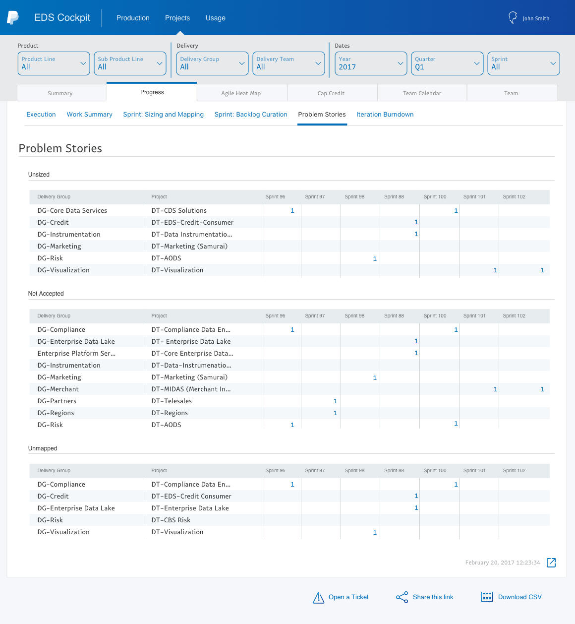
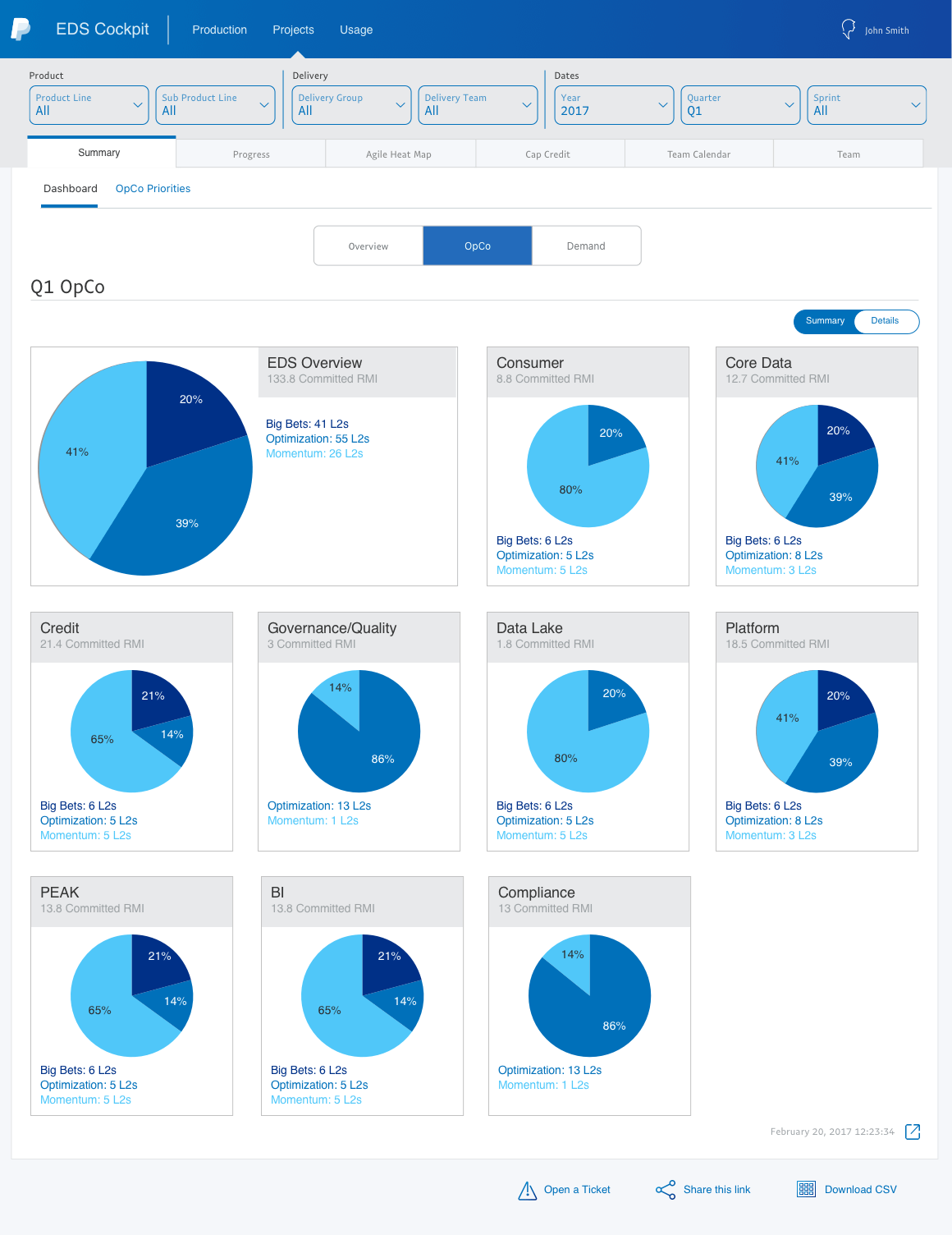
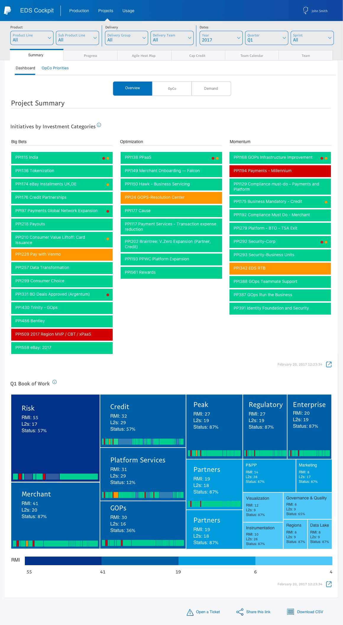
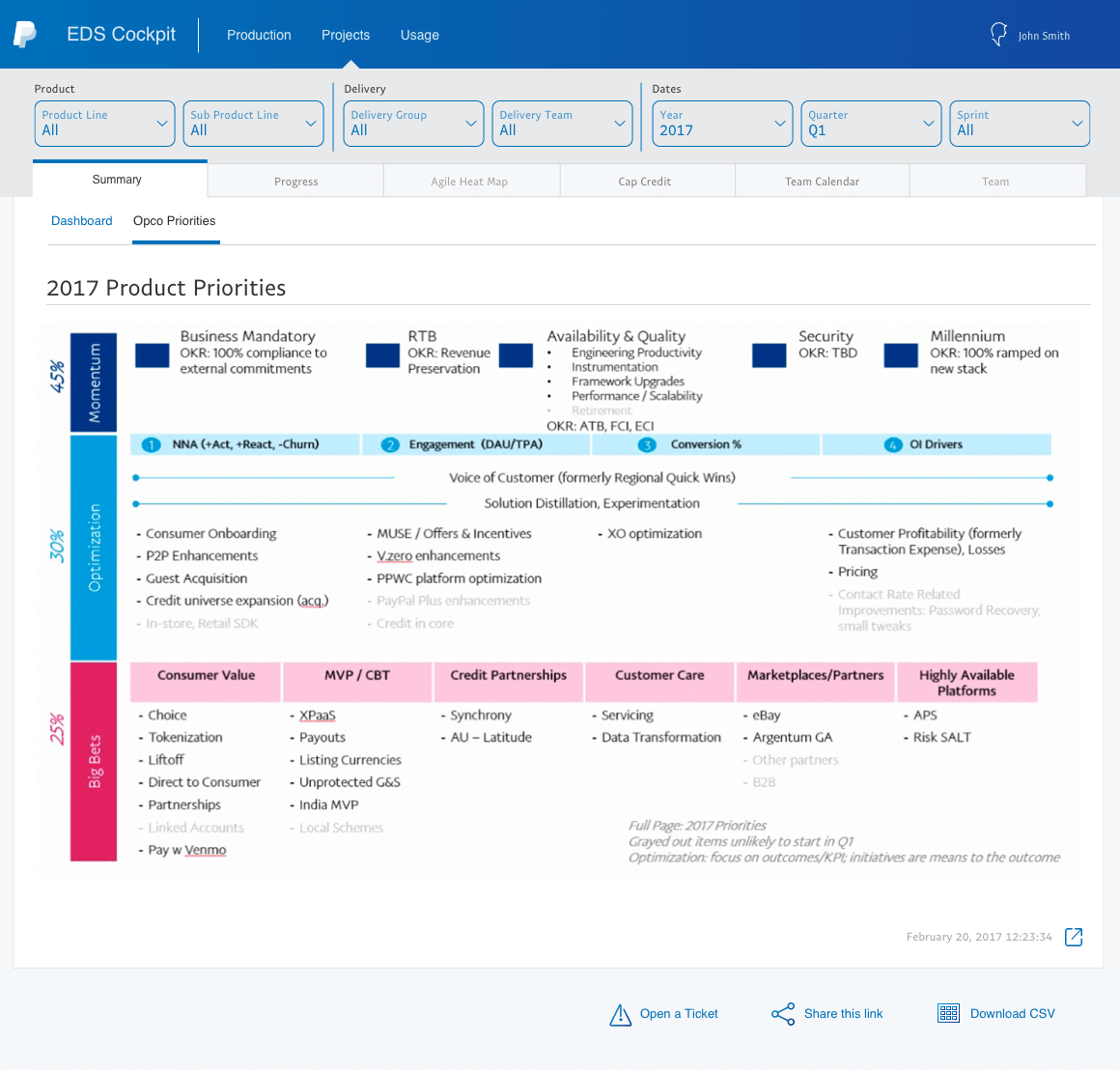
Even though it was an internal tool, PayPal’s data visualization team was very vital internally since it was very important for the team to visualize the business metrics to see the overall health of the company and performance. The user groups are quite diverse. Everyone in the Delivery Groups within EDS will have access to Data Operations Intelligence and Media Intelligence which is available from the PayPal App Store. This includes everyone from the CTO to every data analyst across the EDS.
We screened 12 potential participants and selected 6 participants based on their digital literacy and competency with using any voice assistant. We had equal representation of gender and their proficiency to speak in English. The only shortcoming of this demographic is that all our participants were students between the age group 23 to 35.
We screened 12 potential participants and selected 6 participants based on their digital literacy and competency with using any voice assistant. We had equal representation of gender and their proficiency to speak in English. The only shortcoming of this demographic is that all our participants were students between the age group 23 to 35.
We screened 12 potential participants and selected 6 participants based on their digital literacy and competency with using any voice assistant. We had equal representation of gender and their proficiency to speak in English. The only shortcoming of this demographic is that all our participants were students between the age group 23 to 35.
CHALLENGES
Most of the tools at EDS are often visualizations and data-centric dashboards. It was natural to have information-heavy dashboards since the team works around crunching the numbers to call the right decision at the right time. During fall 2017, the executives of PayPal rolled out a new vision for 2020. There was a lot of organizational and structural changes which restricts and provides access to the data the groups previously had.
We screened 12 potential participants and selected 6 participants based on their digital literacy and competency with using any voice assistant. We had equal representation of gender and their proficiency to speak in English. The only shortcoming of this demographic is that all our participants were students between the age group 23 to 35.
We screened 12 potential participants and selected 6 participants based on their digital literacy and competency with using any voice assistant. We had equal representation of gender and their proficiency to speak in English. The only shortcoming of this demographic is that all our participants were students between the age group 23 to 35.
We screened 12 potential participants and selected 6 participants based on their digital literacy and competency with using any voice assistant. We had equal representation of gender and their proficiency to speak in English. The only shortcoming of this demographic is that all our participants were students between the age group 23 to 35.
Naturally, this made it pretty hard to understand the needs of the user since the new vision for 2020 was not fully understood. On top of the mobile interfaces were not scoped for future product releases.
We screened 12 potential participants and selected 6 participants based on their digital literacy and competency with using any voice assistant. We had equal representation of gender and their proficiency to speak in English. The only shortcoming of this demographic is that all our participants were students between the age group 23 to 35.
We screened 12 potential participants and selected 6 participants based on their digital literacy and competency with using any voice assistant. We had equal representation of gender and their proficiency to speak in English. The only shortcoming of this demographic is that all our participants were students between the age group 23 to 35.
We screened 12 potential participants and selected 6 participants based on their digital literacy and competency with using any voice assistant. We had equal representation of gender and their proficiency to speak in English. The only shortcoming of this demographic is that all our participants were students between the age group 23 to 35.
Smoke before the fire 🔥
- Since mobile interfaces were not scoped before, the previous designers did not consider a mobile-first approach. I was tasked with designing mobile interfaces from scratch. One of the biggest problems faced was redesigning some visualization and interactions for mobile interfaces.
- It was also highly iterative as requirements were not crystallized. I had to work on a lot of assumptions and design tweaks happen back and forth within the same design sprint.
- Some of the applications I designed did not follow the color palette which was set by PayPal's branding.
USER RESEARCH
In the following carousal,
- The tasks performed by the user are listed.
- The various rubrics we used like Average Time-taken, Average user rating, and Average User Emotion.
- The various issues listed or observed by the users are also listed down.
- The dots represent the number of participants with the color indicating if it is successful or not.
Until now, EDS provides data for various teams using the same applications. There were some confidential, but not restrictive data which could be visible to different teams. As a part of the vision 2020, the power of autonomy and collaboration would be granted to every group. Therefore, understanding the data flow, data access and organizational flow across the groups was vital to design seamless and secure applications.
Redesigning visualizations for mobile interfaces is not shrinking the visualizations to fit the mobile real estate. In my opinion, it doesn’t provide functional experience. The whole idea to provide data on the go is lost. I asked a lot of "how may I" questions to come up with a lot of visualizations using convergence and divergence methods and A/B tested them to validate them right away.
User interviews
User interviews were not part of the process, but I incorporated some degree of user interviews while speaking with various product owners, product groups and stakeholders to understand the data needs, data dependency on how they perceive the visualization.
Show and tell
Show and tell is an unconventional way of to understand how users perceive a visualization. This was a very important step because most of the visualizations in the desktop application can not be reused for mobile responsiveness.

From the above images, it is very evident that resizing these visualizations don't provide a good user experience at all. Resizing to fit the mobile real estate often leads to horizontal and vertical scrolling. The whole idea to provide data on the go is lost. This is where the show and tell approach helped me. I was intrigued by what level of data granularity is too much. In fact, I used to show and tell approach every time I encountered a complex viz so that I can represent the visualization into simple and easily understandable visualization.
I faced 3 major roadblocks when it comes to redesigning mobile interfaces for these complex data-centric visualization heavy dashboards.
Often show and tell approach and A/B testing of various data visualizations helped me to get my validations and understandings.
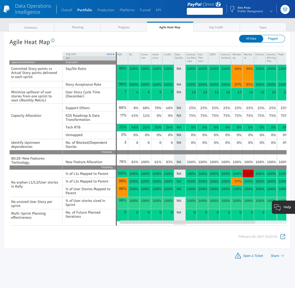
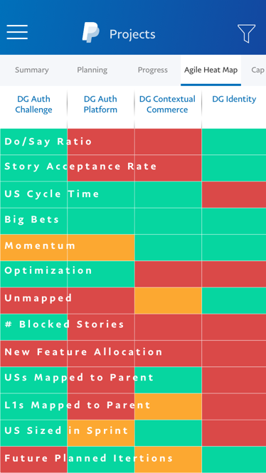
ROADBLOCK #1 - HEATMAPS ARE A PAIN TO DESIGN
Accommodating heatmaps in a mobile real estate was very challenging. Heatmaps are usually loaded with information. It can be cognitively taxing because there are too many colors and numbers trying to convey the same information in multiple ways.
We screened 12 potential participants and selected 6 participants based on their digital literacy and competency with using any voice assistant. We had equal representation of gender and their proficiency to speak in English. The only shortcoming of this demographic is that all our participants were students between the age group 23 to 35.
We screened 12 potential participants and selected 6 participants based on their digital literacy and competency with using any voice assistant. We had equal representation of gender and their proficiency to speak in English. The only shortcoming of this demographic is that all our participants were students between the age group 23 to 35.
We screened 12 potential participants and selected 6 participants based on their digital literacy and competency with using any voice assistant. We had equal representation of gender and their proficiency to speak in English. The only shortcoming of this demographic is that all our participants were students between the age group 23 to 35.
How can we simplify heatmaps?
- Which information matters?
- Do users need everything on the mobile interface?
- How do users perceive this data?
- How does color-coding help the users?
Research findings suggest...
- Almost all my users knew the definitions of the KPIs by heart.
- They rarely use many functionalities like the Org Unit goals on the website.
- My manager only looks at the metrics of her Delivery teams. Her manager only looks at the metrics of Delivery groups.
- If a metric is in Green, they usually don’t worry about them. So yeah color codes make their life simple.
Based on the feedback from the project managers, I came up with a solution after multiple iterations, consulting with the dev team on the feasibility of the solutions.
I removed the definitions from the mobile interface but recommended to keep the same in the web application because a new user would find it very helpful.
The metrics names lie as a fixed non-clickable overlay on top of the color-coded blocks. The Delivery groups are scrollable, but the metric names would be anchored to the left.
I decided to remove the numbers and retain the color-coded blocks as numbers seem to be redundant in trying to convey the information.
ROADBLOCK #2 - REPRESENTING THE DATA WITHOUT BREAKING THE MENTAL MODEL OF THE USER
"Familiarity bread contempt" is not something which is true for data-centric dashboards. Breaking the mental model of how users perceive the data is something that I wanted to avoid.
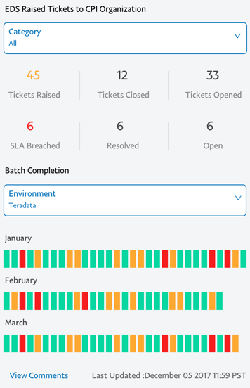
Even changing the layout of the visualization threw the users out of their element. Therefore, understanding the context, granularity, and aesthetics of visualization was primal. For example, desktop visualization of Batch Completion provided a holistic view of the various environments month by month.
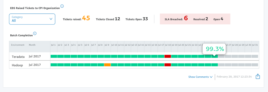
How can we simplify this?
Although a very good visualization that serves the purpose, this viz is not mobile-friendly. To simplify this, I proposed the following questions
- What value does the user get from looking at this visualization?
- What level of detail is needed in the first interaction?
- How can a similar visualization be designed for mobile?
Mobile-first visualization
Although a very good visualization that serves the purpose, this viz is not mobile-friendly. To simplify this, I proposed the following questions
- I had to ensure the visualization should be kept as similar as possible to the web interface.
- Using color codes play a vital design element that communicates exactly what the user wants to see.
- This on-demand data visualization shows the high-level information first which reduces cognitive load.
ROADBLOCK #3 - BREAKING THE MENTAL MODEL
This was inevitable given the real estate and the complex visualizations. In order to help the user transition effortlessly to newer visualizations, it was prudent to understand what do the users take away from the existing visualizations. Most users are used to perceiving visualization in a certain way. Any change will make the users think and as a designer, you should not let your user think. (There’s a book titled “Don’t make me think by Steve Krug). But when it comes between the user’s mental model and easy understanding of data, I had to take the side of an easy understanding of data. I had to break the mental model. This is where the show and tell approach came handy. It turned out that different users in different organizational hierarchy inferred data with varying granularity. For example, the Delivery group leader would be interested to see only if there are potential under usage of the system across all the Delivery groups. But, the team leader would be interested to see all the status of the source and target systems to further optimize the load of the systems.
We screened 12 potential participants and selected 6 participants based on their digital literacy and competency with using any voice assistant. We had equal representation of gender and their proficiency to speak in English. The only shortcoming of this demographic is that all our participants were students between the age group 23 to 35.
We screened 12 potential participants and selected 6 participants based on their digital literacy and competency with using any voice assistant. We had equal representation of gender and their proficiency to speak in English. The only shortcoming of this demographic is that all our participants were students between the age group 23 to 35.
We screened 12 potential participants and selected 6 participants based on their digital literacy and competency with using any voice assistant. We had equal representation of gender and their proficiency to speak in English. The only shortcoming of this demographic is that all our participants were students between the age group 23 to 35.
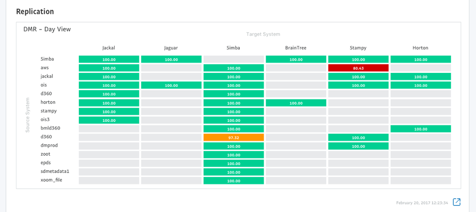
In this screen, a few things are visually wrong.
- Bad visual representation of data
- Redundant data is displayed.
How to simplify this?
A redesigned visualization should help users easily find what they want and show more information on demand. Prioritizing the real estate. in hand, a redesigned visualization should convey the same story, but more perceivable and shows the most important data first. Here, the numbers do not matter for a Delivery Group leader since he is interested to only see the health of the source systems
Redesigned visualization
- The text on the various database tab is color-coded to convey the information even before they visit the tab.
- The values of the mappings (Source to target system) acts as secondary information. The health of the source system was the most important information the user wanted to see. Therefore, I removed the names of the target systems, instead designed a birds-eye view of the health of the source system.
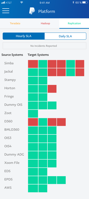
Since there are sensitive metrics involved, I have renamed them in the mockups and all the values are arbitrary.
TAKEAWAYS
I would say working at PayPal has been an amazing experience for me. It was the most influential and challenging project so far.
- I learned to grow professionally keeping tabs on different projects simultaneously.
- It taught me how to walk through my designs to different audiences - Stakeholders, designers, developers.
- Push deliverables on time. So that I don’t starve the dev team without user stories.
- Agile methodology in UX design.
- Visual design is a game-changer, especially in data visualization.
These are the major challenges I faced while designing visualizations. Last semester, I took Data Visualization as a part of my course work and I feel that there is a lot of room for improvement.
Do you think I can thrive in your complex problem space? Let's talk!
Apart from work, I am fiddling around with Google Assistant actions to create a Bot that helps me be more productive. Ask me about that when we talk.
Email: hello@aravindjr.com
LinkedIn: Aravind Jembu Rajkumar
© Aravind 2021
Designer | Researcher | Product?