Client
Maryland’s Destination Marketing Organization.
Summary
This project was in collaboration with Harford County's Tourism division. The focus of this collaboration was to identify possible avenues for user engagement and recommendations to revamp the Visit Harford county website.
Responsibilities
UX Researcher
Study Design, Recruitment, Data Collection and Analysis
Duration
Sep 2018 - Dec 2018
VISIT HARFORD
Visit Harford is a part of Maryland's Destination Marketing Organization. Harford County has seen increasing year-over-year growth in tourism sales and revenue through brick and motor tourism commerce. However, analytics show that the user engagement of their digital platform has not contributed much to their tourism economy. Mr. Gregory Pizzuto, Executive Director, Visit Harford was excited to collaborate with us to understand more about its current audience and increase user engagement of Visit Harford.
This is a group project for my Advanced Usability Testing Course work. I was part of a 3 member team and we wanted to evaluate a system that is very subjective and unexplored.
This is a group project for my Advanced Usability Testing Course work. I was part of a 3 member team and we wanted to evaluate a system that is very subjective and unexplored.
This is a group project for my Advanced Usability Testing Course work. I was part of a 3 member team and we wanted to evaluate a system that is very subjective and unexplored.
TEAM
I worked along with 3 other UX researchers who were involved in contextual inquiry, recruitment and screening participants and data analysis.
The Problem statement for our semester-long project is to evaluate a design system that is being used widely on a day-to-day basis. The rubrics to evaluate the system are Consistency, efficiency and End-user satisfaction.
The Problem statement for our semester-long project is to evaluate a design system that is being used widely on a day-to-day basis. The rubrics to evaluate the system are Consistency, efficiency and End-user satisfaction.
The Problem statement for our semester-long project is to evaluate a design system that is being used widely on a day-to-day basis. The rubrics to evaluate the system are Consistency, efficiency and End-user satisfaction.
KICK-OFF MEETING
Mr. Gregory Pizzuto and his team met with my team in the first week of October to discuss their needs and their understanding of the problem. The key concern raised by them were,
- Negligible traffic on their Web platform.
- Convert Business visitors to vacation tourists.
- Harford County is primarily seen as a tourist spot by the visitors who are 35 and above.
- To cater to all age groups.
- Involving local businesses to boost tourism and attractions.
The goal of the study is to critique the usability of Google's Voice Assistant - The Google Assistant, which is widely available in over a billion smartphone devices. We realized that each user's need and expectation of the assistant differ, hence we concentrated on end-user satisfaction.
The goal of the study is to critique the usability of Google's Voice Assistant - The Google Assistant, which is widely available in over a billion smartphone devices. We realized that each user's need and expectation of the assistant differ, hence we concentrated on end-user satisfaction.
The goal of the study is to critique the usability of Google's Voice Assistant - The Google Assistant, which is widely available in over a billion smartphone devices. We realized that each user's need and expectation of the assistant differ, hence we concentrated on end-user satisfaction.
BACKGROUND RESEARCH
We started off by analyzing the ‘Visit Harford County’ website, the iOS and Android mobile application. We also looked up other counties and state tourism websites like Prince George County and Visit Maryland to understand what is being offered. The following insights came out of the analysis:
- All the websites have a clean and intuitive user interface
- The websites are consistent and navigable which makes it easy for the users.
- They have social media integration through Instagram, Facebook, Flickr, Twitter, and Youtube
- PG County’s website dedicates a blog to the tourists which adds a personal touch to users’ experience.
- The websites are promoted through popular travel sites like TripAdvisor.
RESEARCH QUESTIONS
Based on our kick-off meeting, client needs, we came up with 2 main research questions.
- How do people plan their vacation?
- What do they expect out of their vacation?
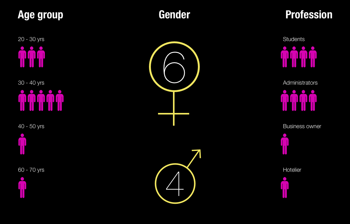
We screened 12 potential participants and selected 6 participants based on their digital literacy and competency with using any voice assistant. We had equal representation of gender and their proficiency to speak in English. The only shortcoming of this demographic is that all our participants were students between the age group 23 to 35.
We screened 12 potential participants and selected 6 participants based on their digital literacy and competency with using any voice assistant. We had equal representation of gender and their proficiency to speak in English. The only shortcoming of this demographic is that all our participants were students between the age group 23 to 35.
We screened 12 potential participants and selected 6 participants based on their digital literacy and competency with using any voice assistant. We had equal representation of gender and their proficiency to speak in English. The only shortcoming of this demographic is that all our participants were students between the age group 23 to 35.
Contextual Inquiry - Interview focus
The interview though was not a traditional master-slave type, but more like a free-flowing conversation. The team tried to structure the flow of the conversation using the following focus:
- Understanding how the users plan the trip
- Their seasonal and accommodation preferences
- Users' intention of using the website
- Understanding what information the user is looking for
- The features of the website users interact with in the website
- The steps users take while navigating through the website
- What other resources/apps/websites they use along with the county’s website to inform their trip planning decisions
- Users’ initial experience with the website.
After each interview, the team converged to make sense of the interview notes. We fleshed out the macro elements like behavior patterns, planning methods, preferred platforms to plan and the microelements like their tone when talking about specific experiences to understand the emotion, who takes up the lead to plan and intricate details.
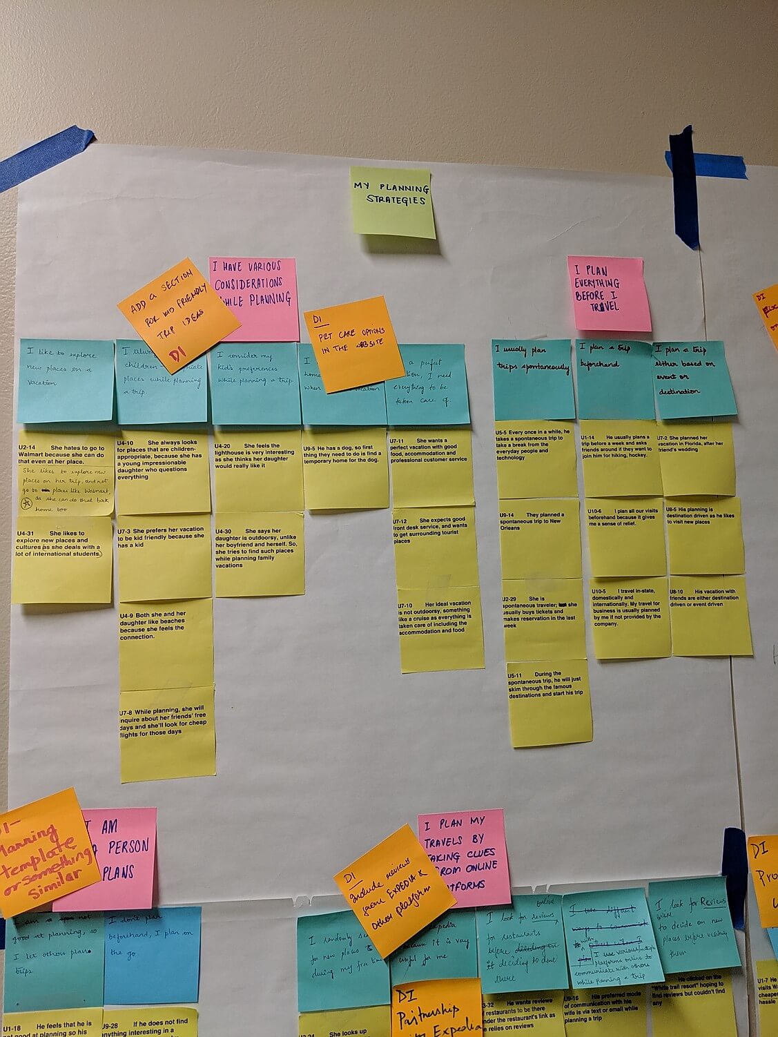
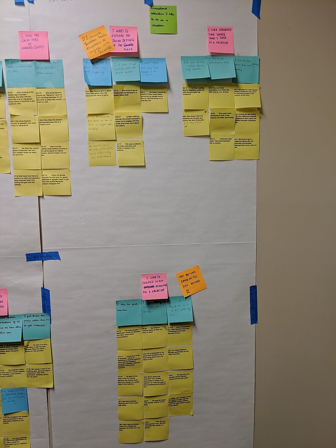
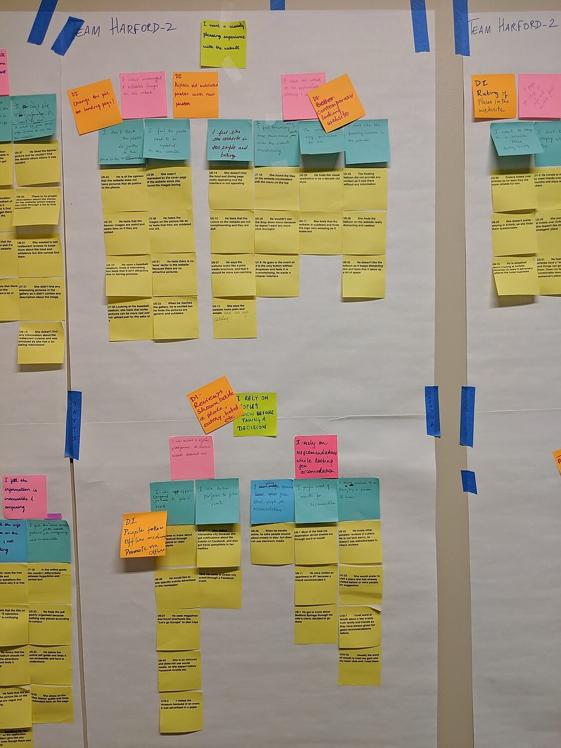
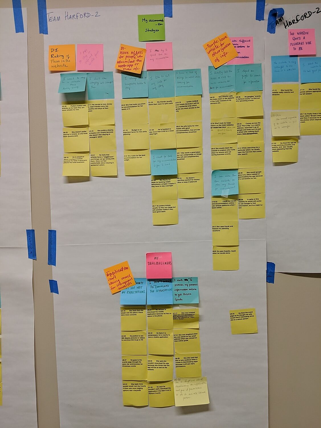
Affinity map
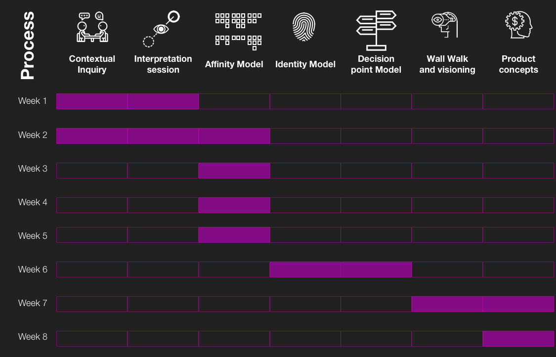
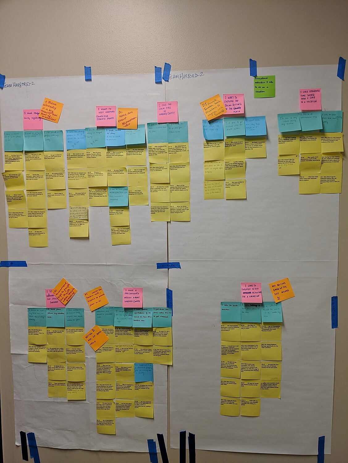
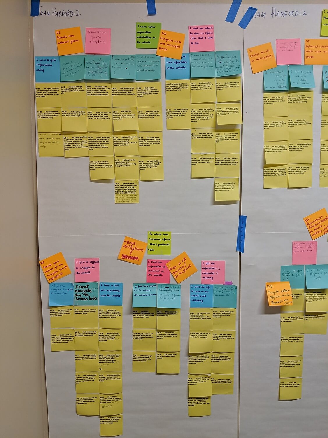
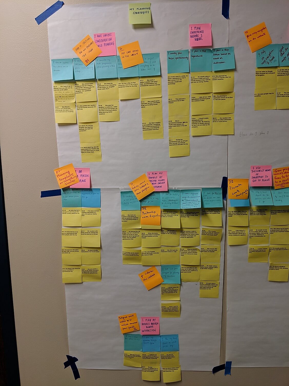
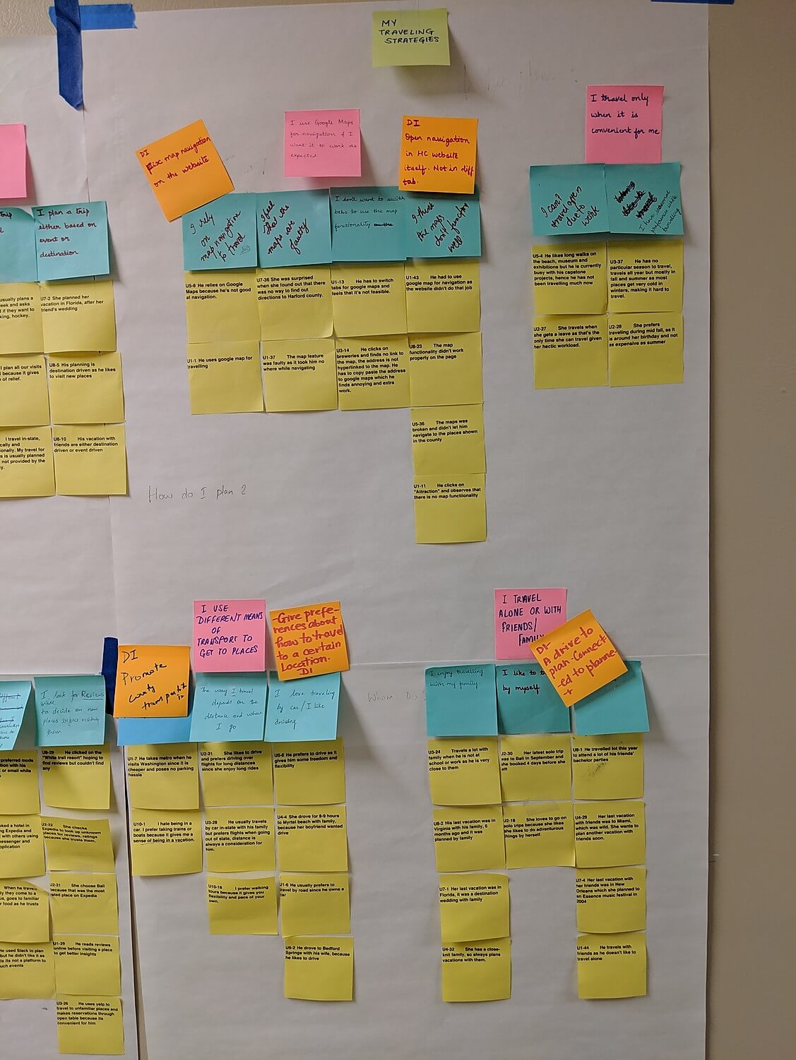
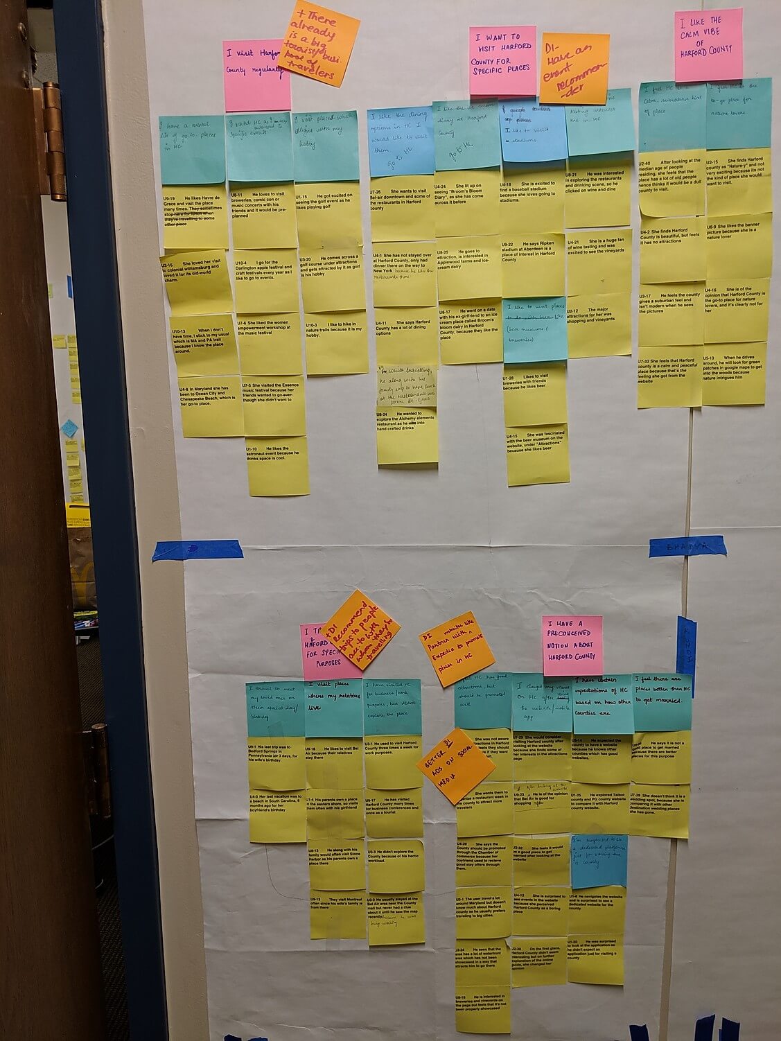
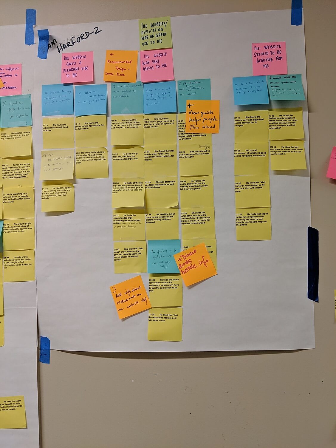
The Affinity Diagram is a simple method to organize large amounts of field data and organize them into groups or themes based on their relationships. The affinity process is great for grouping data gathered during research or ideas generated during brainstorms. It was the most intense 3 weeks of the project.
This model needs multiple iterations because the model should make sense of both top-down and bottom-up approaches. As you build and iterate this model, a lot of themes will emerge.
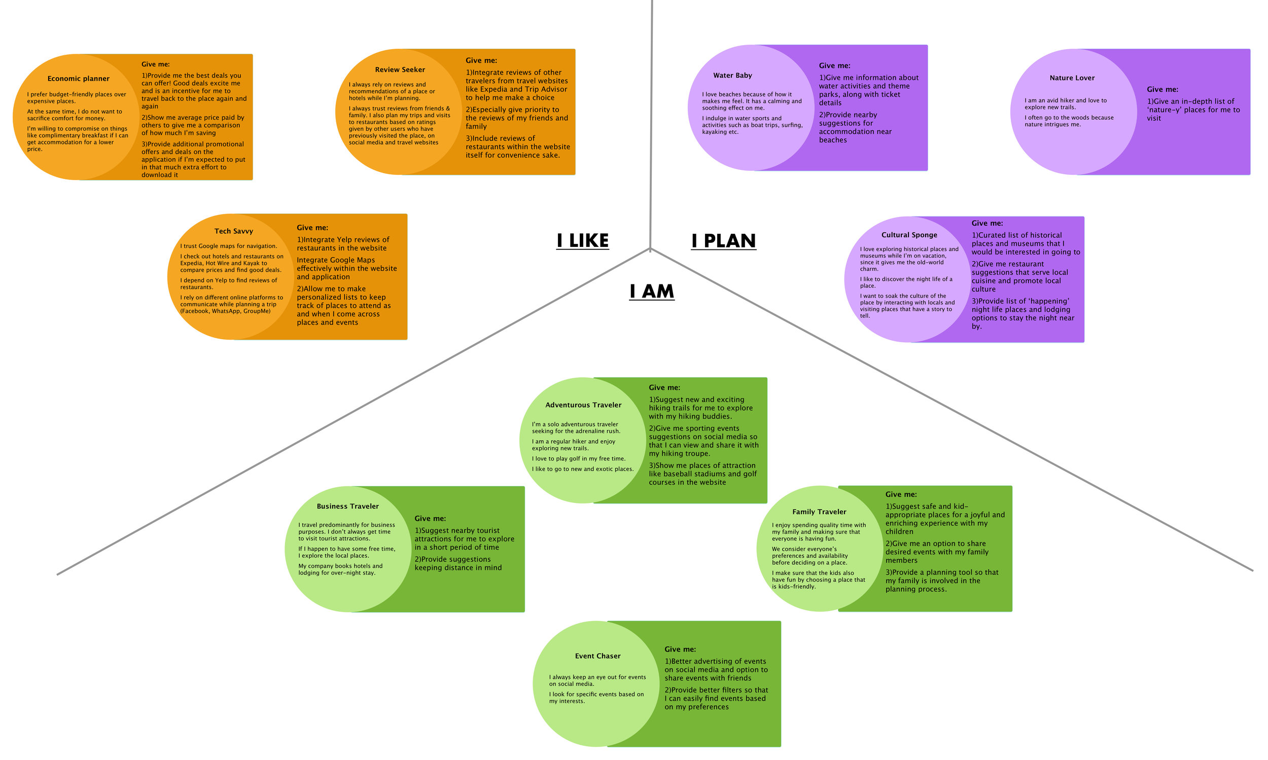
Identity Models
The Identity model helped to understand how the users view themselves, who they were and how they planned their vacation
The Identity model helped focus on collecting data that uncovers the sources of pride, self-expression, and core values. This model reflects data relevant to one’s Identity. It reveals the key identity elements in the target population that a product might touch. We used this model to understand the view of the users’ world. Identity model helped us in the later stage during product concepts since we designed the solution based on the user’s identity because a user will use the product with which he/she relates him/herself.
To get a better picture of how our users performed, I visualized the quantitative data using Tableau - a data visualization software. Below are the visualizations to help better understand the data we collected.
To get a better picture of how our users performed, I visualized the quantitative data using Tableau - a data visualization software. Below are the visualizations to help better understand the data we collected.
To get a better picture of how our users performed, I visualized the quantitative data using Tableau - a data visualization software. Below are the visualizations to help better understand the data we collected.
The above visualization is an animated bar chart relating the time taken to complete the task vs the tasks. The user's time taken for that task are stacked on top of each other. It can be clearly seen that in most instances, beginners and intermediate users spent more time to perform the task.
Some of the power user spent more time in certain task because their expectation was different from the assistant's response. So they tried framing the questions with different keywords.
Decision Point Model
We investigated the various issues our participant reported and found a reoccuring pattern both within the task and across tasks. The above chart shows the Frequency of issues (y-axis) and the tasks (x-axis).
We investigated the various issues our participant reported and found a reoccuring pattern both within the task and across tasks. The above chart shows the Frequency of issues (y-axis) and the tasks (x-axis).
We investigated the various issues our participant reported and found a reoccuring pattern both within the task and across tasks. The above chart shows the Frequency of issues (y-axis) and the tasks (x-axis).
The decision point model helps designers to understand what influences the user to rely on a service or a product. Designers can leverage these mental models to design intuitive and user-friendly products.
We went ahead with Decision point model because we were interested in knowing what influences the behavior of our user. Decision Point model brings exactly that out clearly. These served as a checkpoint during the conceptualization process.
- Train the assistant on languages so that it can recognize the user’s pronunciation and colloquial language more accurately.
- Enhance the ability for continued conversation by incorporating more trigger words for a follow up response. (Like yes, no, stop).
- Understand the context and react to the user’s request in a smart and informed way.
- Give the user freedom to choose just voice interaction or visual interaction.
- Add a function that automatically provides some choices of what it thinks the user is trying to convey and let the user pick from those options, if the users fails to ask the question more than 2-3 times.
- Clear distinction between “Events” and “Reminders”.
- Improve the food ordering mechanism.
Wall Walks
“The Wall Walk is managed like a visit to an art museum—each person experiences the data silently, having their own experience with it, and writing up design ideas as they go.”
— Karen Holtzblatt in Contextual Design
Wall walks gives the team a chance to review and think about what this story means for the product we hope to design. It’s the team’s first chance to see the whole scope of data together and consider how to respond with a coherent design solution.
As we went around our affinity maps, we came up with a Design Ideas (DI). Once we collated our Design Ideas, we took a vote on these ideas. We call them the Hot Ideas. These will be used in our visioning process.
1.Privacy and security concerns - “I don’t want Google to read my messages”
2.Language support - “It doesn’t always get what I am saying”
3.Discovery and retention - “I didn’t know that this feature exists. Its cool ”
1.Privacy and security concerns - “I don’t want Google to read my messages”
2.Language support - “It doesn’t always get what I am saying”
3.Discovery and retention - “I didn’t know that this feature exists. Its cool ”
1.Privacy and security concerns - “I don’t want Google to read my messages”
2.Language support - “It doesn’t always get what I am saying"
3.Discovery and retention - “I didn’t know that this feature exists. Its cool ”
Visioning
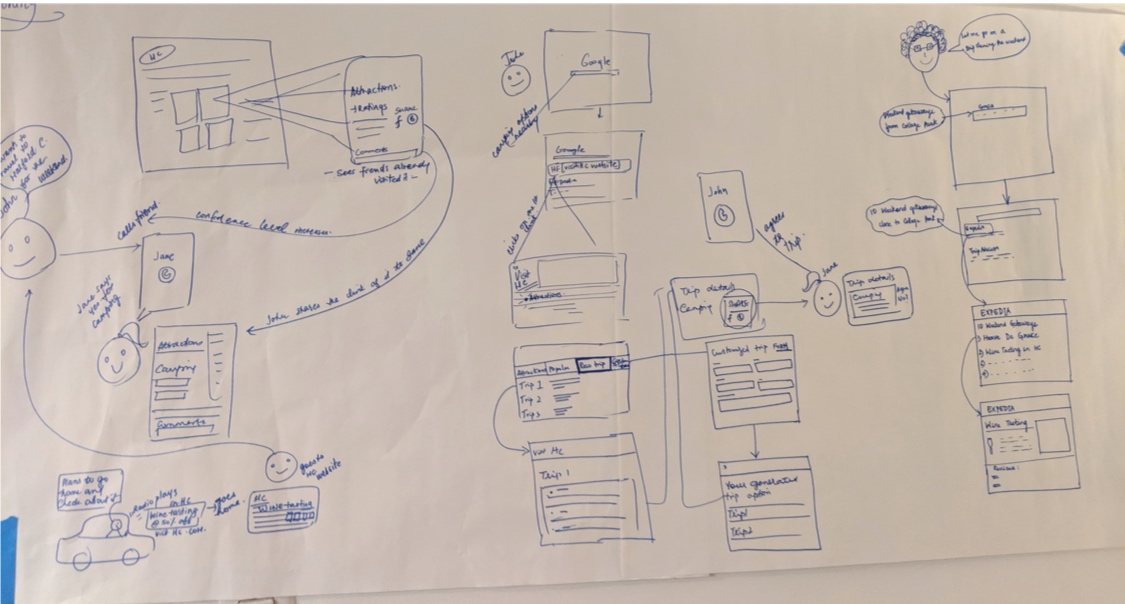
Keeping in mind all the Hot Ideas we came up with during the wall walk, we collectively went through the various scenarios that a user could encounter. We storyboarded various scenarios to see if our products will serve our users.
- The test was conducted on a small set of users.
- Google Assistant faced trouble to recognise voice profiles for different people, and tailor the responses accordingly as they were not using their own device for the study
- The users were biased while rating each task based on the feature they discovered
Our Findings and Insights
These findings were based on our interviews and models. We also came up with design recommendations and suggestions for our client. These are part of the slides we presented during the final presentation.
Use the arrow keys to go through the findings in the carousel.
For widespread implementation of VUI, machines should enhance the user experience by
- Comprehending context
- Understanding the user’s tone, attitude, and intention
- Personalize the user experience based on historical data and the observation of previous patterns of behaviour
For widespread implementation of VUI, machines should enhance the user experience by
- Comprehending context
- Understanding the user’s tone, attitude, and intention
- Personalize the user experience based on historical data and the observation of previous patterns of behaviour
For widespread implementation of VUI, machines should enhance the user experience by
- Comprehending context
- Understanding the user’s tone, attitude, and intention
- Personalize the user experience based on historical data and the observation of previous patterns of behaviour
Product Concepts
After we did multiple iterations of visioning, we were all ready for product conceptualization. This is the part we were all excited about. Based on the hot ideas, my team and I came up with low-fidelity wireframes.

A CHATBOT
The existing website was very much cluttered, visual and information-wise. People come to the website to find specific information. Digging through a lot to find relevant information will lead to a high attrition rate and bad user experience.
Hence we thought a chatbot will be a “way in” the website for the users to find what they are looking for.
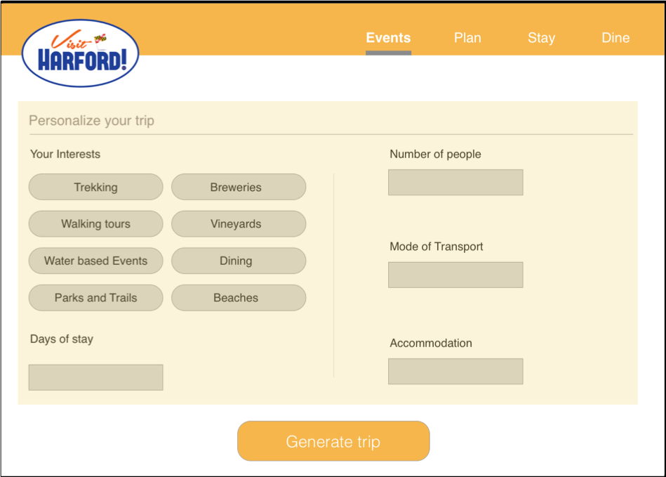
A PERSONALIZED TRIP RECOMMENDER
From our research, we found that people really like the recommended trip.
We went one step ahead and come up with a personalized recommender which suggests attractions and events based on your interest, duration of stay, number of people, mode of transportation, etc.
PEOPLE LOVE REVIEWS
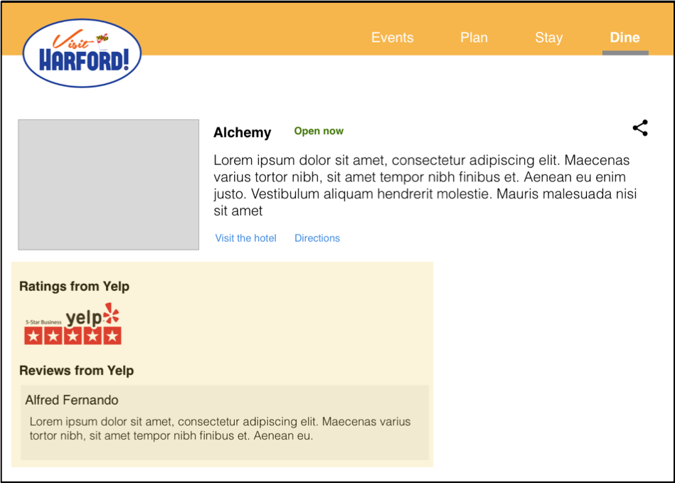
Yes, people love reviews. Most people complained that they can't find reviews that hinders their decision-making abilities.
Integrating Yelp ratings for restaurants will help solve this problem. In fact, a lot of users favored/relied on Yelp.
BETTER PROMOTION OF EVENTS
Using a landing page for informing what’s happening in the county is a great way to engage with the users. Show them what you’ve got.
We also suggested having an active blog for the county to inform the visitors would be a great way to engage with the users.

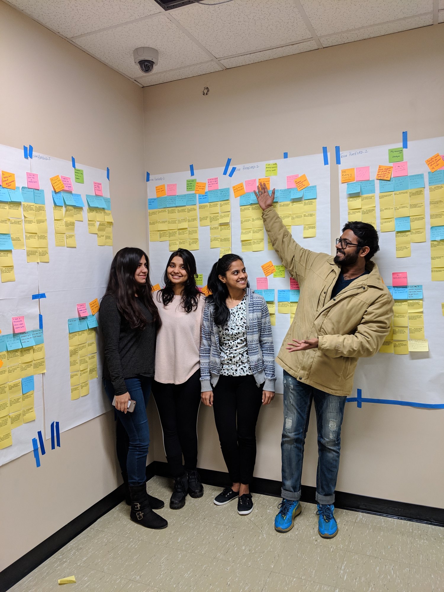
Well, that's the end of the project. The client was very pleased with our findings and product concepts. His team and our team engaged with a 2-hour client presentation where we had a constructive discussion on our findings.
Thank you from me and my amazing team 
Do you think I can thrive in your complex problem space? Let's talk!
Apart from work, I am fiddling around with Google Assistant actions to create a Bot that helps me be more productive. Ask me about that when we talk.
Email: hello@aravindjr.com
LinkedIn: Aravind Jembu Rajkumar
© Aravind 2021
Designer | Researcher | Product?

