
Brand

Summary
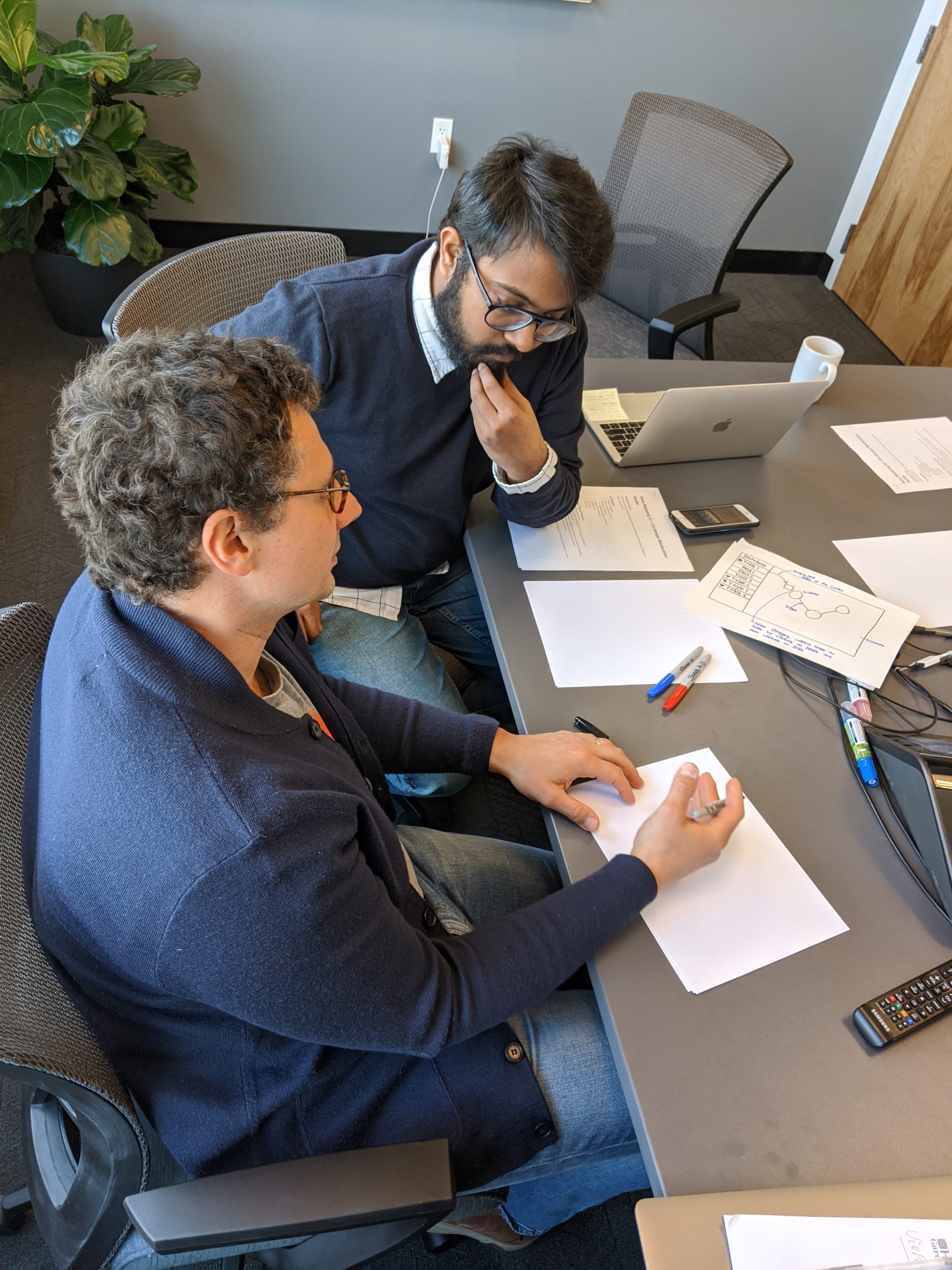
A team of 6 product designers helped Stardog Union, an enterprise data unification SaaS company, to transition from Command Line Interface to GUIs to empower users with limited or no coding background.
I helped identify the needs and validate the research hypothesis. I also contributed to the design specs, product conceptualization, wireframing, and Prototyping.
Responsibilities
Lead UX Researcher and Product Designer
Duration
2019 - 2020
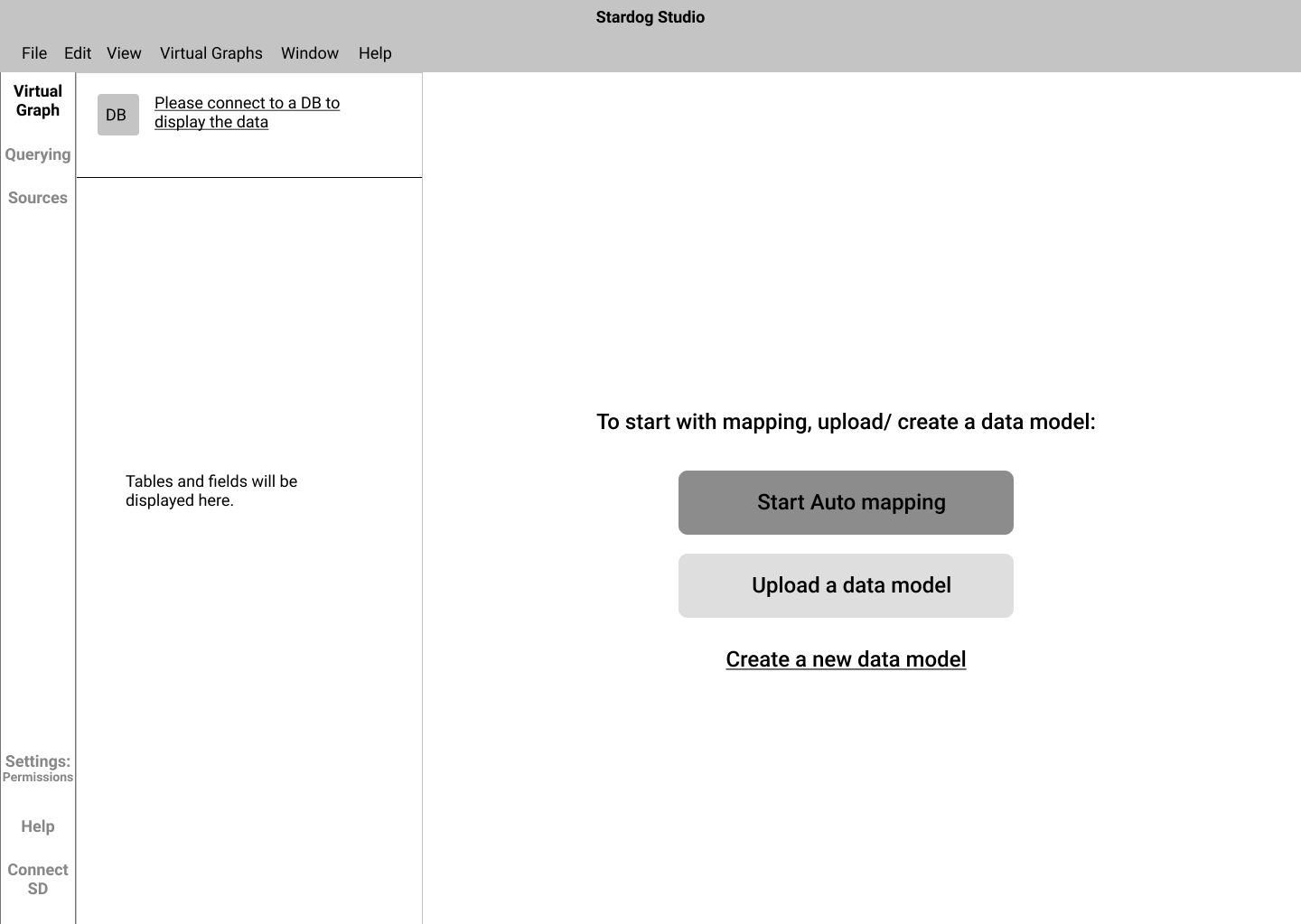
Before
After
Use the slider to see the before and after versions of the product
Mike Grover, co-founder, and SVP of Stardog Union, laid out the vision for his company during the kick-off meeting. He mentioned that Stardog had reached an inflection point where Stardog has established itself as an industry leader in the domain. As good as it sounds, the current product does not capture a segment of the users who will be the future users of Stardog - People with limited coding expertise.
One of the most significant design opportunities in this project was to create a no-code interface that is intuitive and functional for users who play a vital role in shaping the knowledge graph creation process.
So let's get the vocabulary right
Knowledge Graph
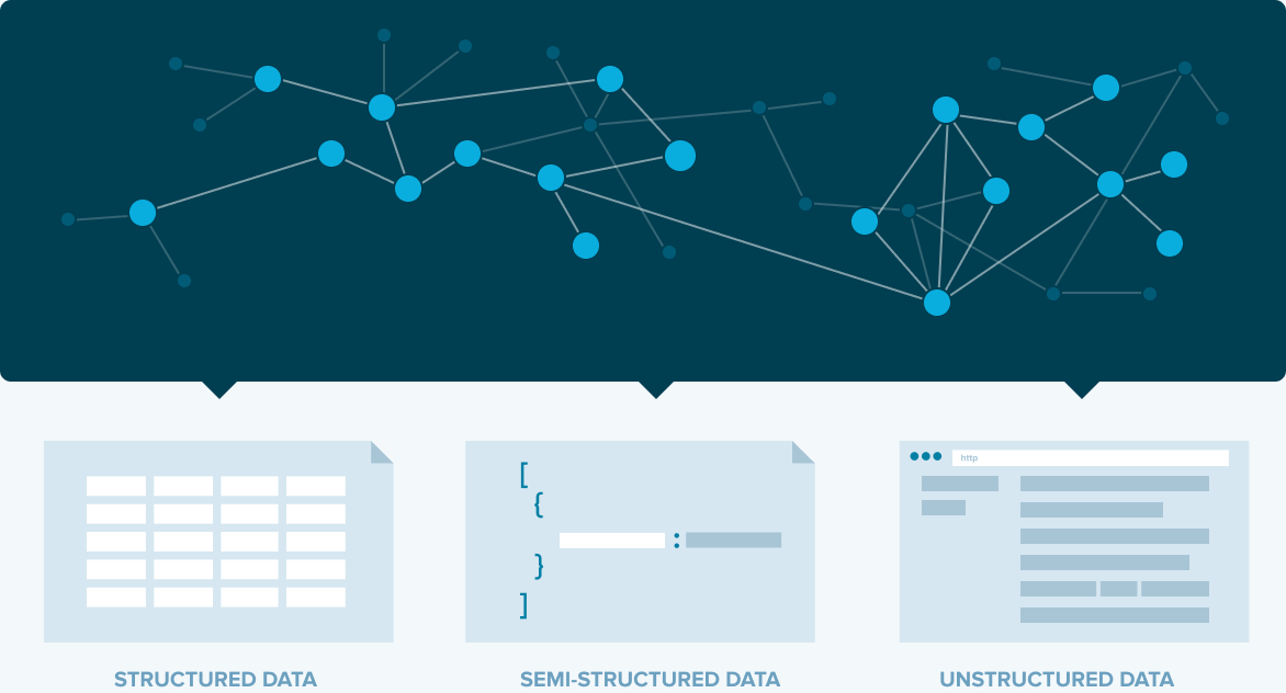
A knowledge graph is a graphical representation of all the databases connected (which is segregated) to transform information into useful knowledge to make an informed decision. Knowledge graph uses machine learning and semantic networks to gather and interlink information from a variety of sources.
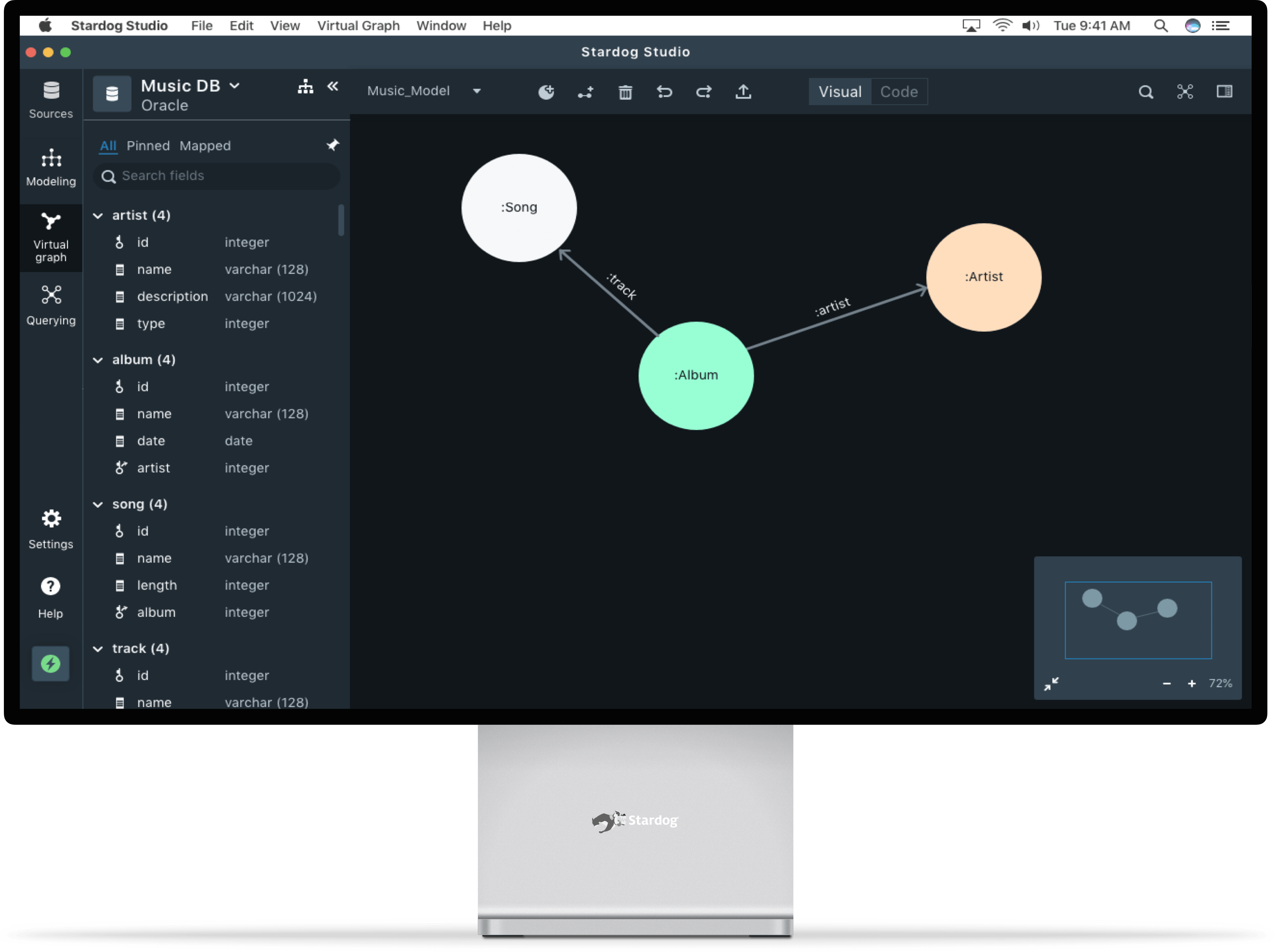
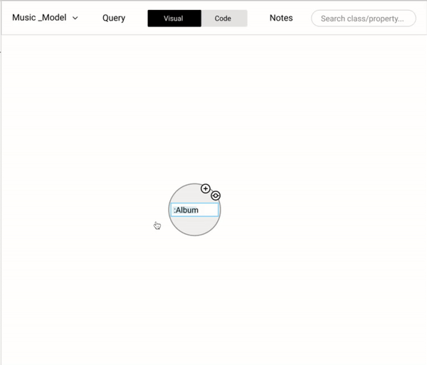
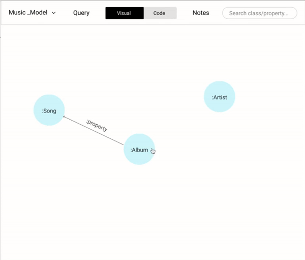
Data modeling
Data modeling simply provides the structure of the Knowledge Graph. A data model consists of three main components.
Nodes - Nodes are the fundamental elements of a Knowlege graph.
Properties - Properties are attributes of a node. They define the characteristics of a node.
Relationships - Nodes are often connected to each other via relationships.
For example, Bones are similar to nodes. Like how bones provide the structure to the body, nodes provide structure to the KGs. Nodes are categorized into different types which are identified by their properties, just like the attributes of a bone. Nodes are connected together by relationships, just like how bones are connected by tissues.
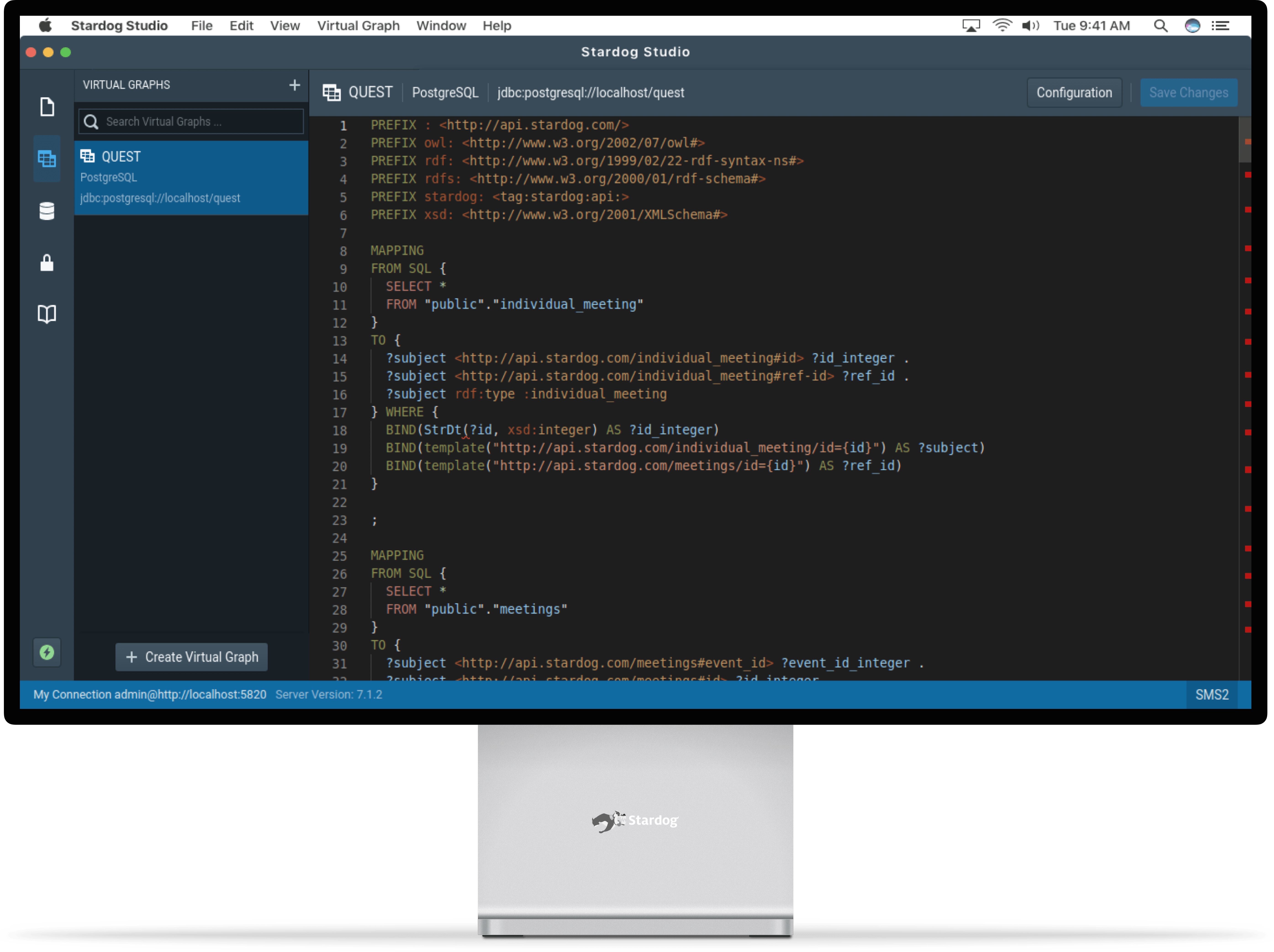
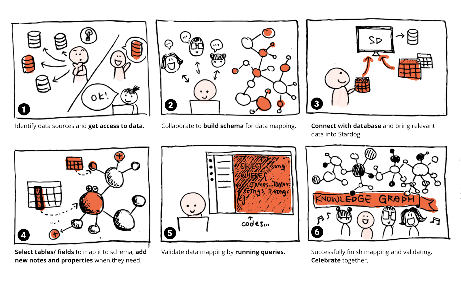
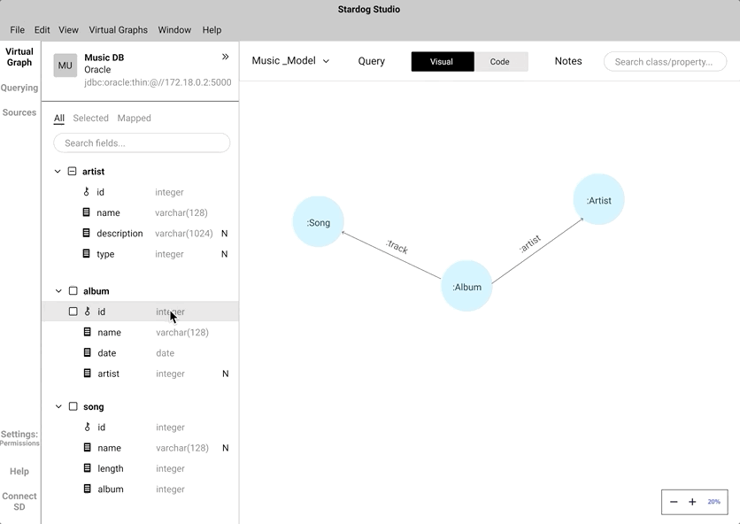
Data mapping
As straightforward as it sounds, mapping the data on the built model is data mapping. This completes and adds value to a knowledge graph. Only after a model is mapped, a KGs is queried to show patterns and answer business questions.
PROBLEM STATEMENT
When we did a quick market and domain analysis, my team came to an understanding that this is a two-point problem.
1. There are a lot of tools in the market that does a great job but only for a part of the KG creation process. Due to this, Ontologists and data analysts use various tools in their workflow. There is no single tool that delivers a great end-to-end KG creation experience.
2. The stakeholders who play a vital part in the KG creation are dependant on ontologists and data analysts due to lack of coding competency.
Ontologists/ analysts often employ different tools in their workflow to build and query KGs. Currently, Stardog’s users work across different platforms, use several coding languages, and collaborate with end-users who describe their needs.
The process of building a KG requires learning a querying language called SPARQL language which prevents low-level techies and business analysts to participate in the process of creating a KG.
- Current tools exclude users with little to less technical knowledge.
- The market is flooded with many tools none of them provide an end-to-end knowledge graph creation process.
TARGET AUDIENCE
Our primary audience is people with limited or no technical skills like Business analysts and Subject Matter Experts (SMEs). Our secondary audience is existing user groups who are well versed with the SPARQL language like Ontologists, Senior developers, and Data scientists.
Primary audience
Low Techies (Junior Data Architects, SMEs and Business Analysts)
Little to no experience in KG domain
Existing audience
High Techies (Ontologies, Data Architects)
5+ years of experience in the KG domain
Approach a.k.a "The Process"
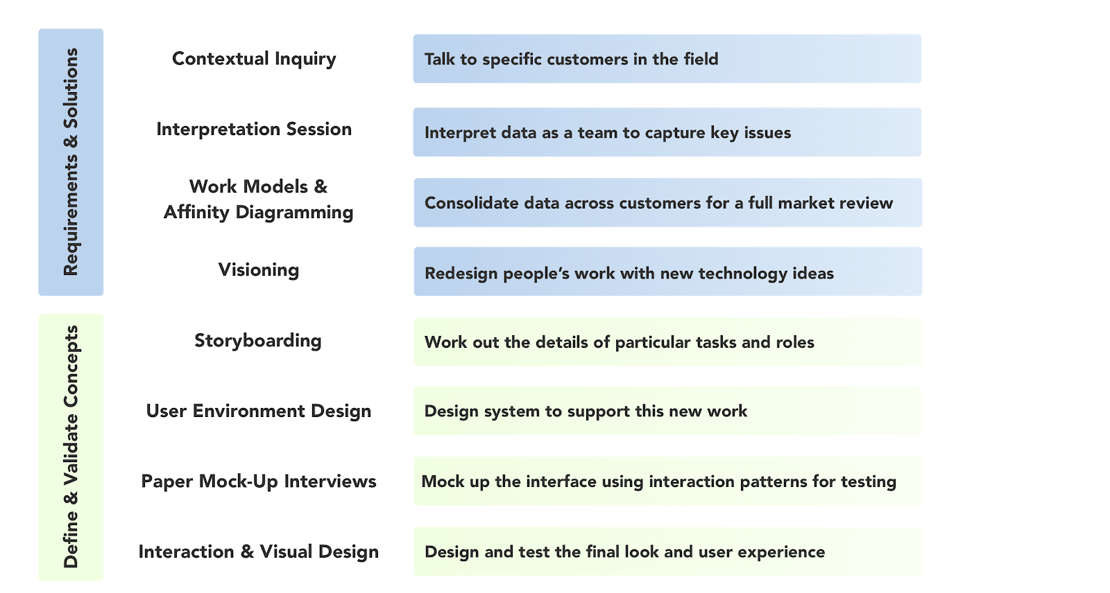
I knew that transitioning from CML to GUI means we need to get our research done first. We divided this project into 2 phases. The research phase that informs and validates our assumptions and the Design phase which relies on the research findings. We followed the Contextual Design Process by Karen Holtzblatt for this engagement.
Contextual Design Process
Are we asking the right questions?
Better questions yield better insights. We decided to do a semi-structured contextual inquiry method since we knew that there was no unique workflow. A common practice in semi-structured interviews is to lead with open-ended questions and then spontaneously devise follow-up questions to draw out more specific evidence about the user's pain points and needs.
Interview guides
We conducted 11 in-person and remote sessions to understand the workflow and mental models. Since this is a new domain, after each interview, we interpreted the conversations and tweak the interview guide. Overall, our interview focus was centered around the following.
- Technical competencies
- Tools used in their workflow
- Relationship between various teams in the company
- Workflow process
- Limitations, pain points while using Stardog studio
- Opportunities for GUI interfaces
- Opportunities for better UX
- Communicating findings to stakeholders
Managing the data points we amassed during these interviews was challenging to keep track of and squeezing the essential information. We used affinity mapping to let more significant themes emerge organically. This helped us see where the problems lie and how to tackle them.
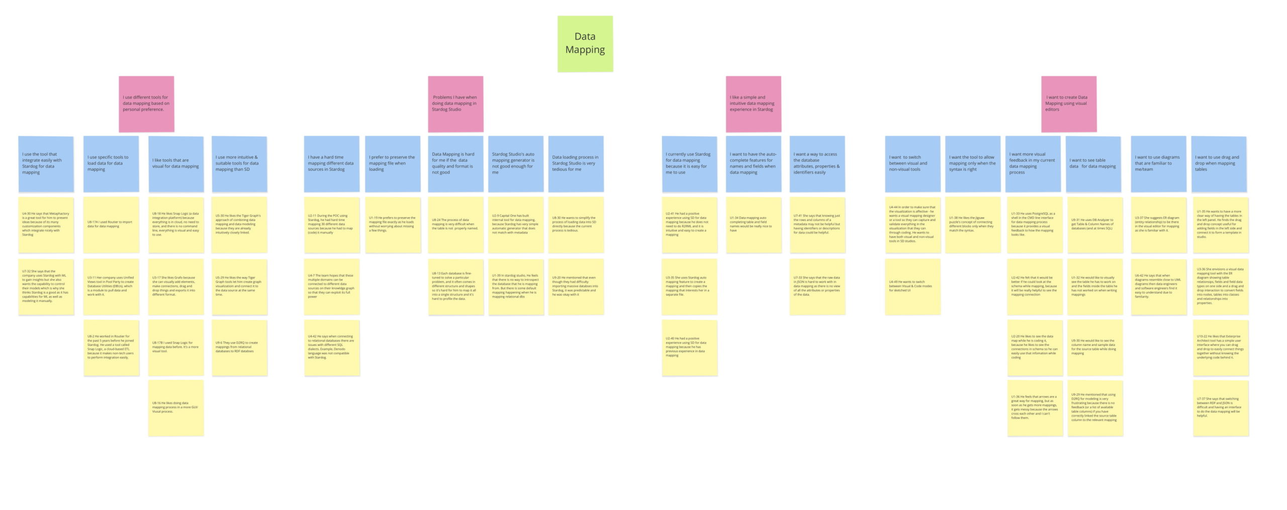
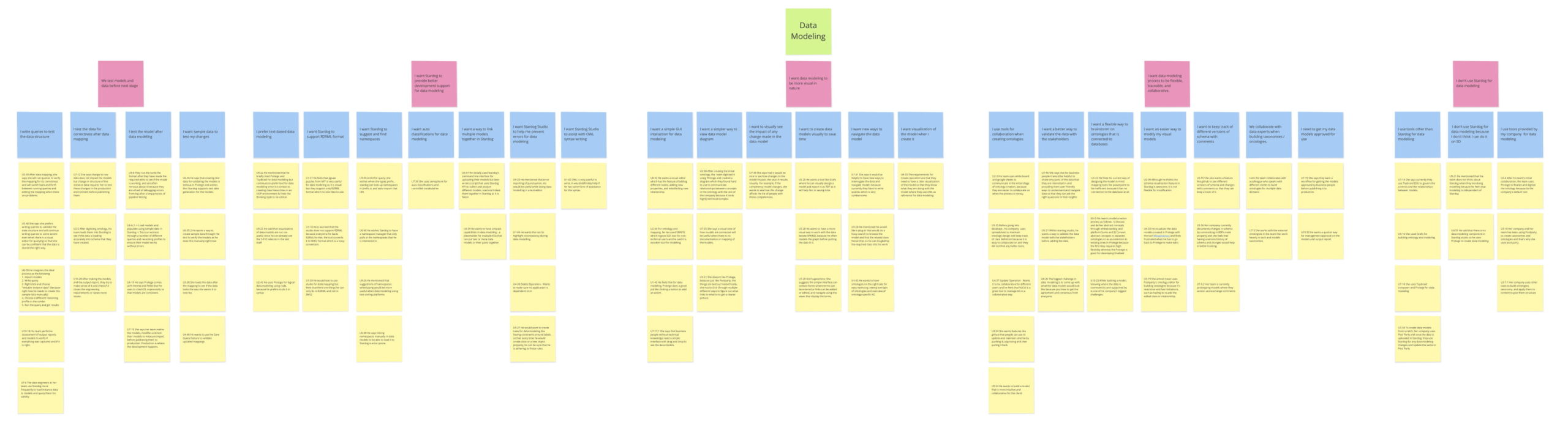
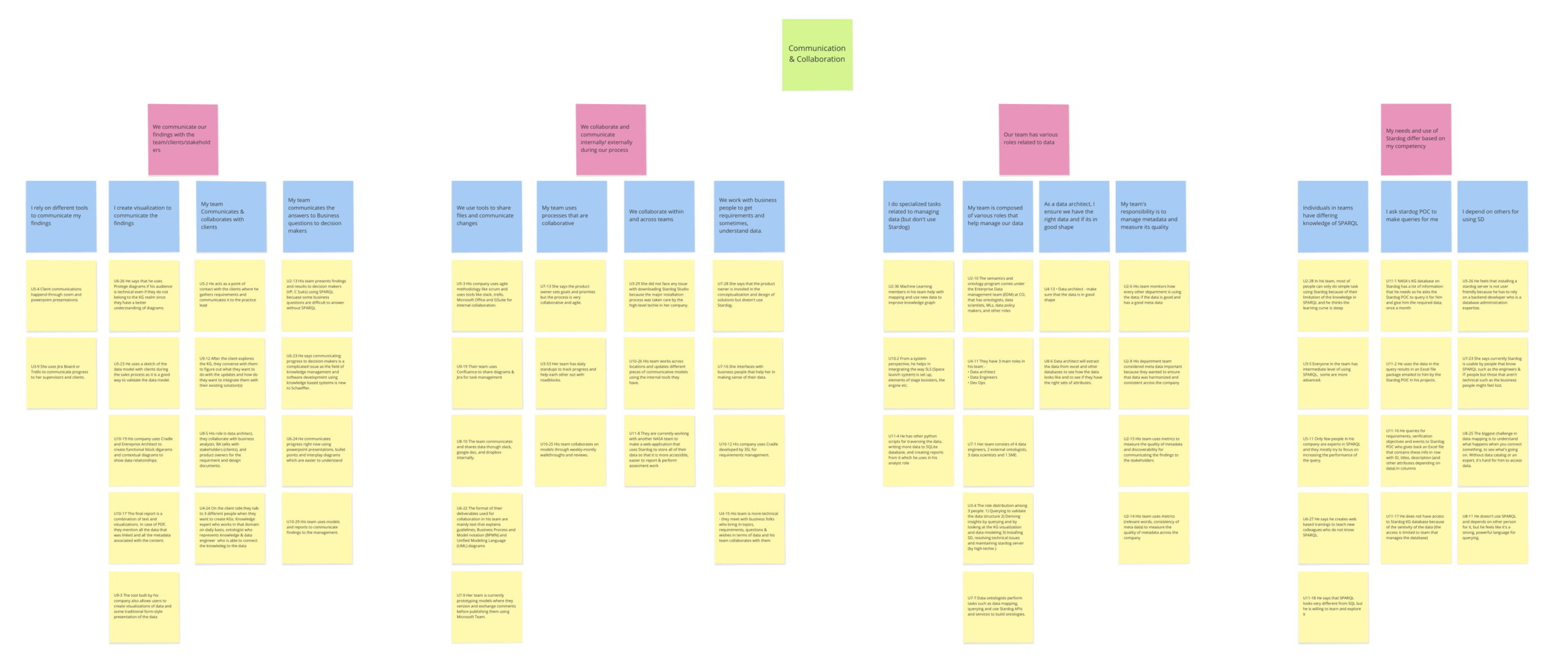
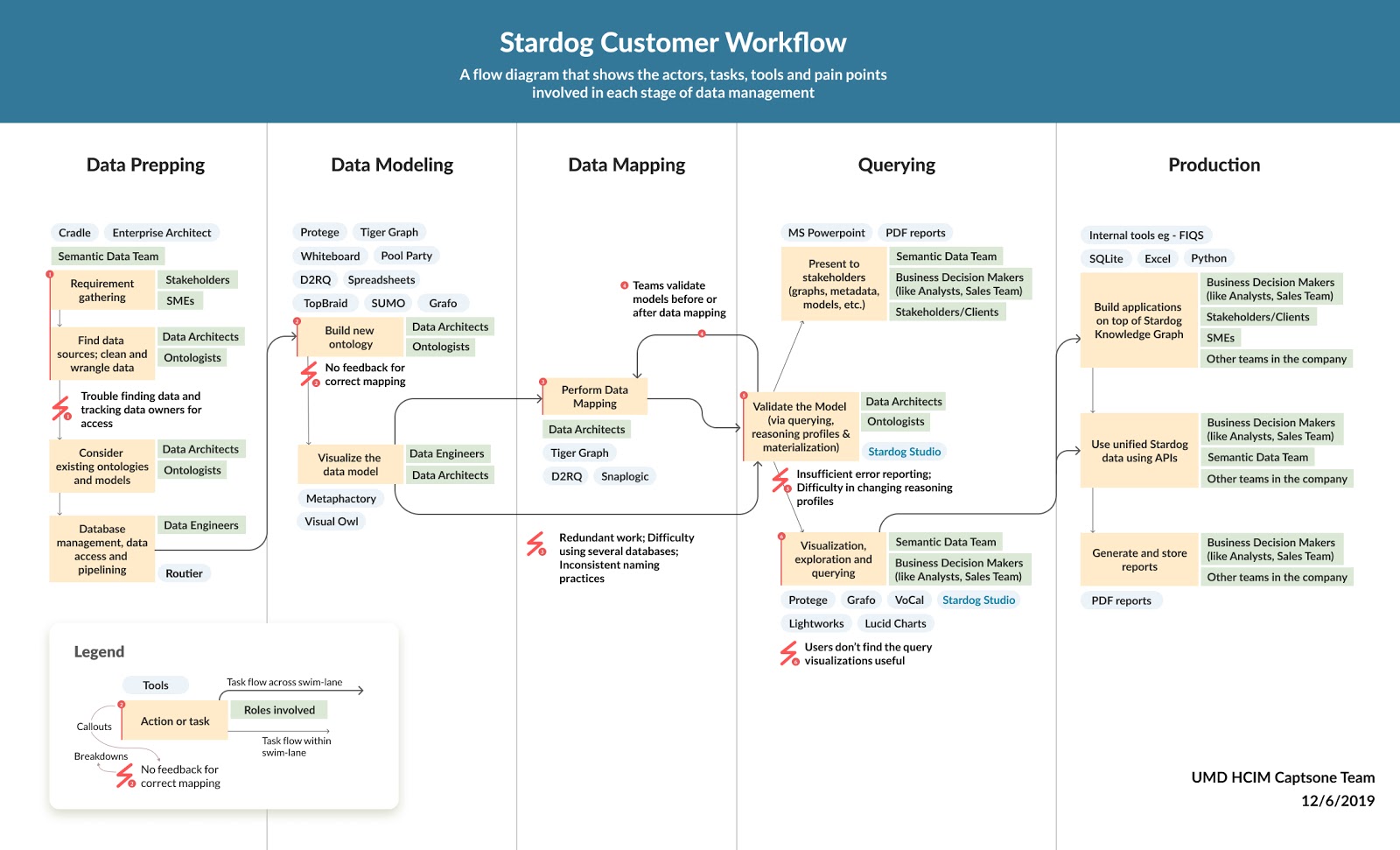
Understanding how Stardog works in tandem with other tools in our user’s workflow was fundamental to know since it gives a good idea of how and where other tools complement Stardog. I designed a workflow model that shows the various stages of the KG creation process, the different tools used in each stage, the tasks performed by multiple actors in each step along with the roadblocks faced.
Key insights influenced our decisions
Modeling is highly collaborative (and requires communication over different platforms), whereas mapping is mostly done by one expert.
Modeling and mapping are a tightly coupled process.
Users start with a smaller set of data to work with before scaling up the mapping process.
Before we get started with low fidelity designs
We believed including our users in the design phase would yield interesting ideas and discussions. We also introduced our thoughts to them organically as our co-design session progressed. We invited 5 participants to be part of our co-design session. As we designed together, it allowed us to cover a lot of edge cases.
We discovered many unique workflows and our user's ideas of an interface that would make their workflow more effective and productive. We captured the unique workflows in a whiteboard to consolidated thems and generalized them using a storyboard.
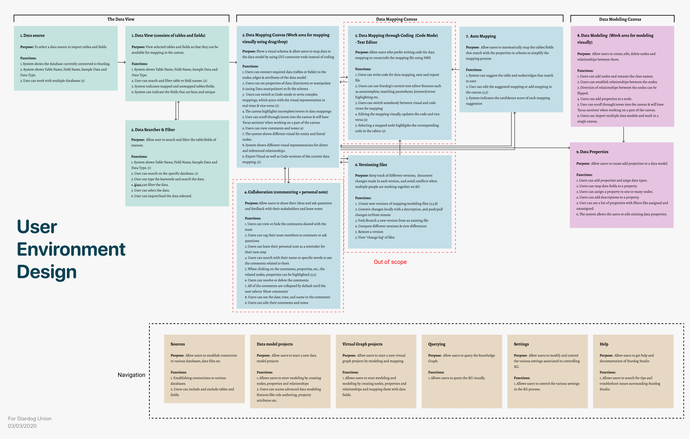
Defining structure before designing
Before starting with the designs, we documented various "Focus Areas," a user can interact with. A focus area has a definite purpose or an objective a user can accomplish by performing a set of functions. UEDs also helped us understand the relationships and dependencies between the various focus areas based on the user's workflows.
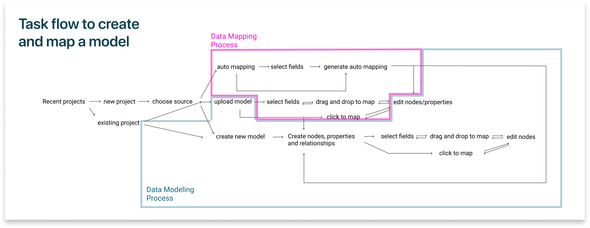
Understanding the process a user performs to complete a task helped us in demarcating our design features. This task flow represents the two important parts of creating a knowledge graph - Modeling and mapping.
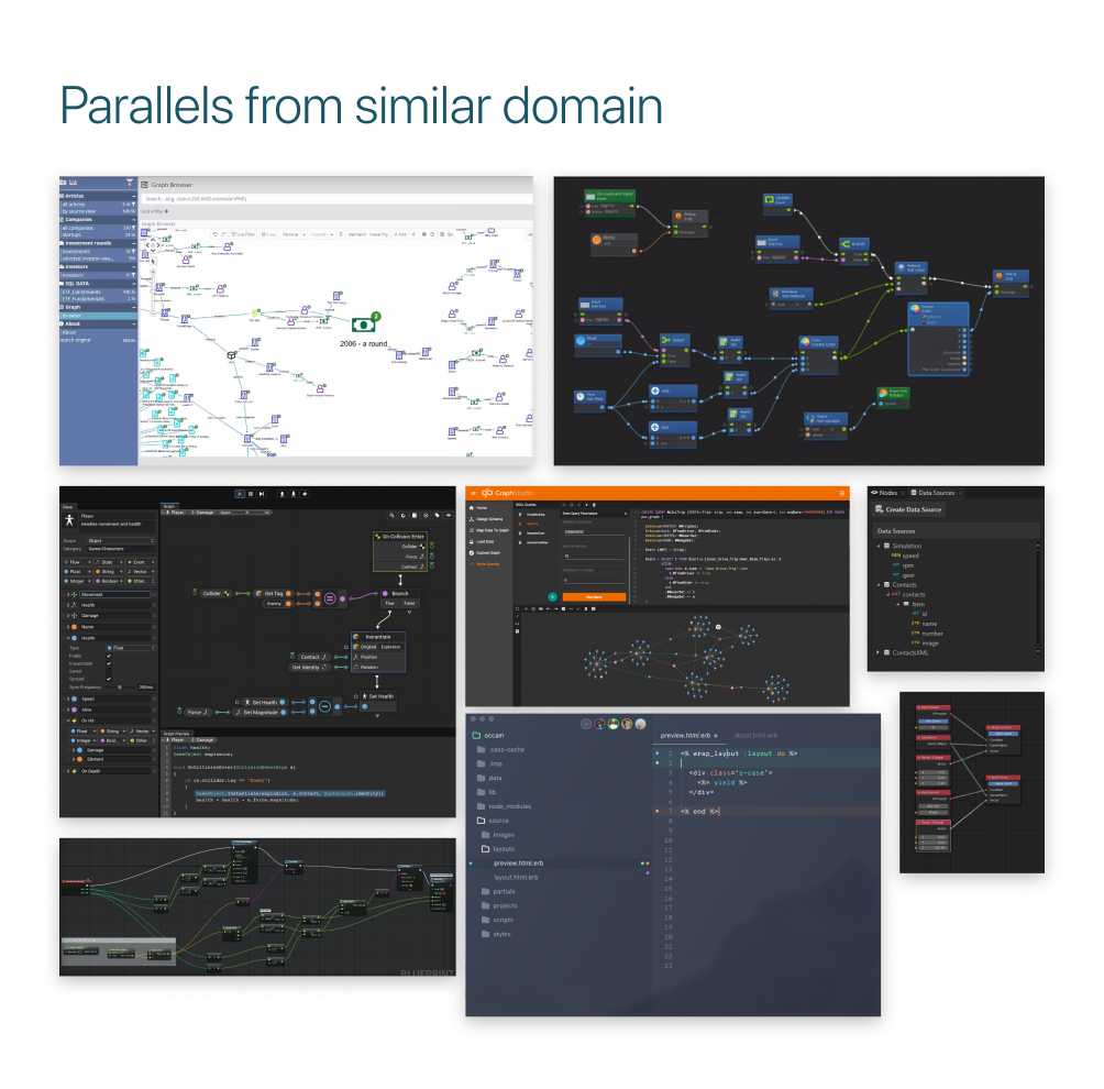
DESIGN INSPIRATIONS
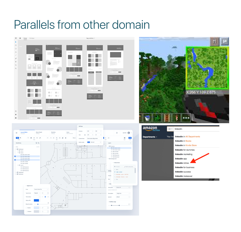
Drawing parallels from tools in similar and dissimilar domains helped us to expand our inspiration for a user friendly, yet functional framework for our tool to be designed.
We drew parallels from various data mapping and modeling tools to understand the market competitors in this domain, and at the same time, we drew parallels from tools from dissimilar domains like 3D modeling tools, image editing tools, and search engines and even video games like Minecraft to include in our interaction pattern.
We screened 12 potential participants and selected 6 participants based on their digital literacy and competency with using any voice assistant. We had equal representation of gender and their proficiency to speak in English. The only shortcoming of this demographic is that all our participants were students between the age group 23 to 35.
We screened 12 potential participants and selected 6 participants based on their digital literacy and competency with using any voice assistant. We had equal representation of gender and their proficiency to speak in English. The only shortcoming of this demographic is that all our participants were students between the age group 23 to 35.
Now let’s get started with designing
Designing and usability testing go hand in hand. Our low-fi designs underwent 4 rounds of usability testings with 11 users. We tested multiple concepts and flows to deliver the best user experience. We rethought how to leverage user’s mental models to design intuitive experience.
We screened 12 potential participants and selected 6 participants based on their digital literacy and competency with using any voice assistant. We had equal representation of gender and their proficiency to speak in English. The only shortcoming of this demographic is that all our participants were students between the age group 23 to 35.
We screened 12 potential participants and selected 6 participants based on their digital literacy and competency with using any voice assistant. We had equal representation of gender and their proficiency to speak in English. The only shortcoming of this demographic is that all our participants were students between the age group 23 to 35.
Iterative low fidelity designs
How can we make it easier for our users to get started with creating a knowledge graph?
We wanted to retain the existing workflow. Since there was a lot of data configuration that has to be set, we felt it was best to replicate the current designs [ Version 1]. When tested, the feedback we got was more control over the configurations and information they see. Hence, we included useful information like database type and last accessed date in the form of a list. [Version 2]
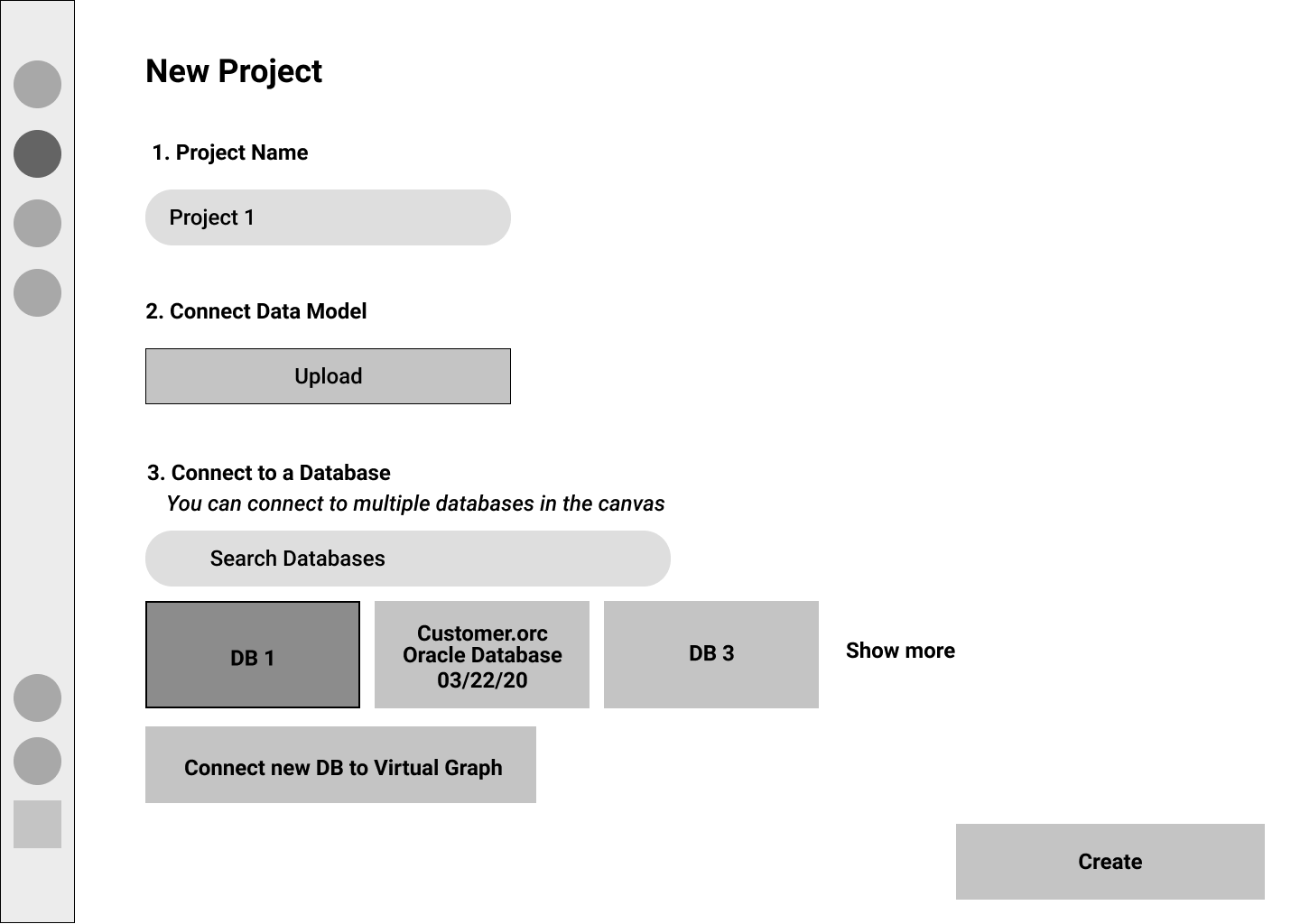
Version 1
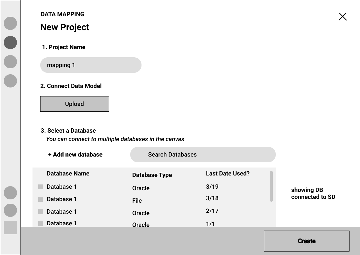
Version 2
When asked our users about their onboarding experience, the average score was 3 on a 5 point Likert scale, despite listening to our user's need. On probing deep into the mental models of the users, we uncovered that, in order to start modeling, the users did not have to connect to any data source. Thus, the process of configuration of data sources was unnecessary.
Version 3 - Final
We entirely skipped the configuration settings dialog box and led the users directly to the canvas to get started with data modeling, thus creating a frictionless experience.
This improved the user’s onboarding experience to 4.6 on a 5 point Likert scale.
Testing the intuitveness
From our research phase, we learned that transitioning from the command-line interface (CLI) to GUI will be smooth only if the interface is intuitive and follows the established interaction patterns. We wanted to provide equitable functionalities as expected in the CLI, like adding new properties, nodes, and relationships while modeling.
We also wanted to leverage the advantages of the WYSIWYG approach over CLI like cut, copy, paste, renaming, and also interactions like dragging and dropping the anchor points of a relationship to different nodes, which saved the users a lot of time.
We consistently recorded a 4+ score on the Likert scale in terms of usefulness and intuitiveness in all our iterations.
A/B testing multiple concepts
Coming to a consensus within the team to decide on a design concept was a difficult thing to achieve, especially if both the designs shared similar pros and cons. We encountered this problem during many instances in our project. One of those instances was between “Click to map” and “Drag and drop” for data mapping.
We wanted to mimic the natural gesture of mapping - Drag and drop. We also considered the implication of drag and drop triggers in a crowded knowledge graph.
An alternate to drag and drop is the click-to-map approach. This will definitely come handy while mapping nodes in a highly-populated knowledge graph.
We A/B tested both approaches for usability and ease of use. All our participant's first touch interaction was to drag and drop. Some of the participants anticipate that this approach could be cumbersome and not scalable. Participants preferred to have both approaches that work in tandem.
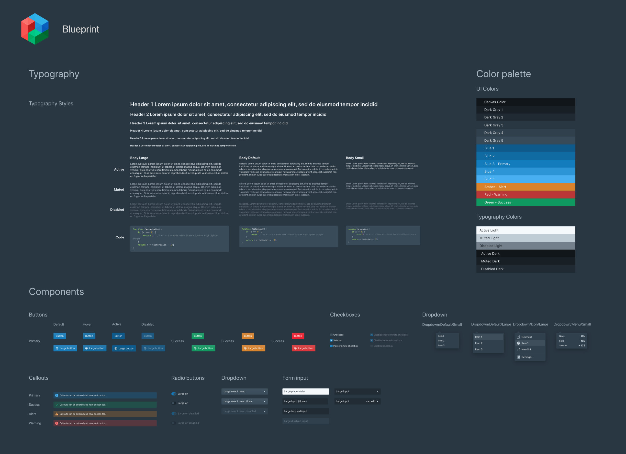
Redefining the design language
Stardog followed Blueprint.js for their design language. We used components from blueprint.js to design our mockups. The stakeholders pointed out some existing design inconsistencies and wanted better recommendations and uniformity. We spent 3 weeks creating various states for the below components. This saved the team a lot of time while designing hi-fi mockups and ensured consistent and pixel-perfect mockups.
We screened 12 potential participants and selected 6 participants based on their digital literacy and competency with using any voice assistant. We had equal representation of gender and their proficiency to speak in English. The only shortcoming of this demographic is that all our participants were students between the age group 23 to 35.
Research-informed designs always ticks
For six months, we gathered a lot of user data, including their behaviors, needs, mental models, workflow, and, most importantly, their feedback. Basing our designs on these research findings helped our product receive a strong usability score.
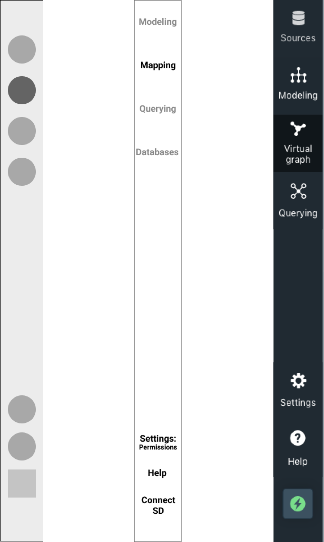
Navigating the KG creation process
Over time, our navigation panel evolved from mimicking the existing design to rethinking how projects live in Stardog Studio. Below is the evolution from low-fi to hi-fidelity design
We wanted the users to switch between various stages in creating a knowledge graph quickly. This way, the flow is in line with the user's mental models.
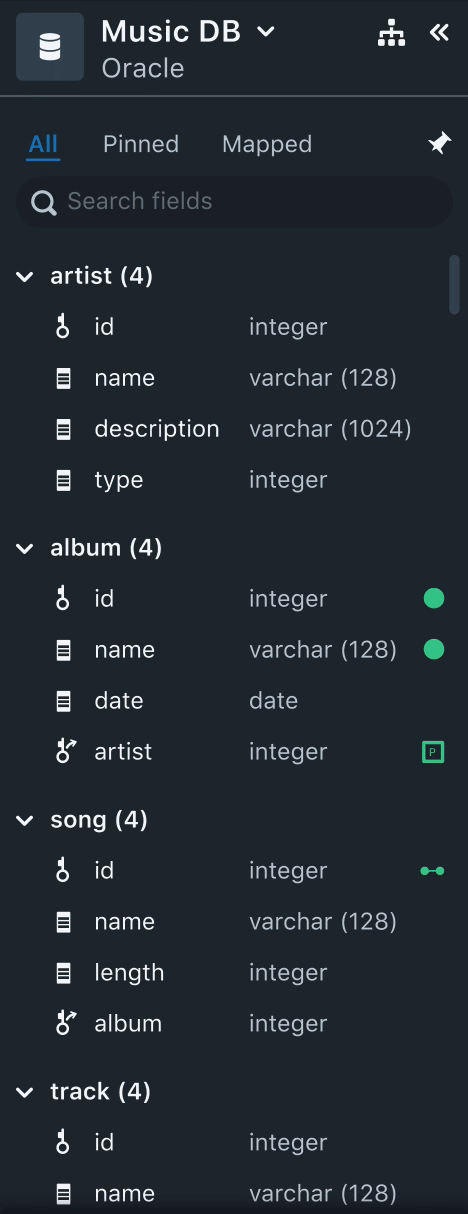
Dealing with data
Throughout our research, our users brought up issues related to data. The two repeated issues were
- Identifying mapped and unmapped data fields were time-consuming.
- Users also pointed out that they spend time filtering through an extensive list of data fields to get get started.
Solutions: Having the “Mapped” section helps users to identify mapped and unmapped data fields. Using icons of nodes, relationships, and properties next to the mapped data fields provide a context of the mapped data field.
Allowing the users to pin select data, in the beginning, helps users to focus on starting with smaller datasets.
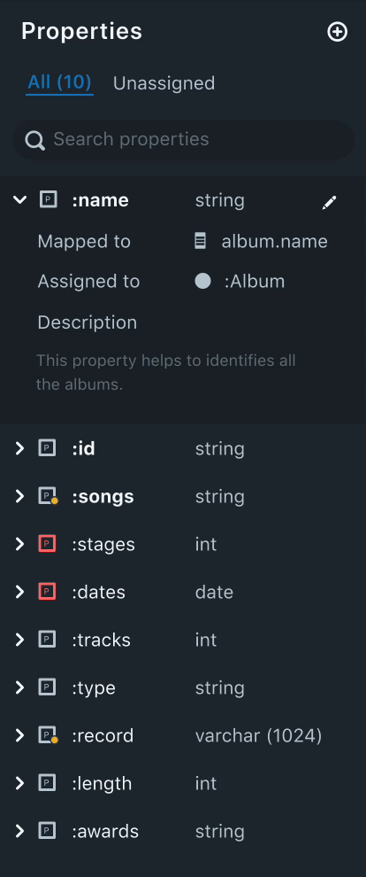
Managing properties
An interesting finding that was uncovered during a co-design session was when the experts were given real data, their first action looking at the data was identifying probable attributes, independent to the nodes. The users also repeated that identifying tagged properties takes a good chunk of time.
Solutions: Similar to the “Mapped” section, we populated all the unassigned properties under the ”Unassigned” section. This dramatically cut the search time and instantly identified unassigned properties.
Leveraging icons and colors to differentiate assigned and unassigned properties was welcomed by all users. I validated my hypothesis of having colored icons during the usability tests.
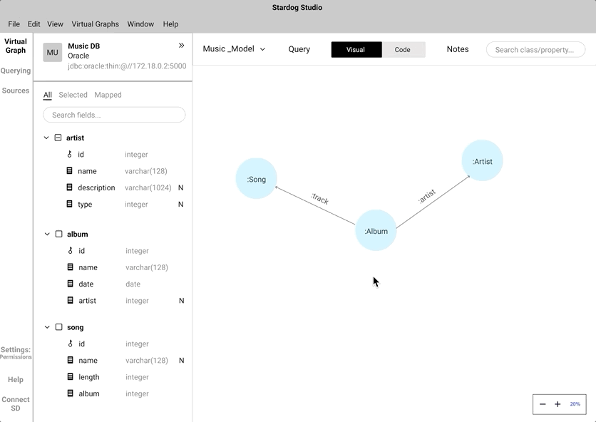
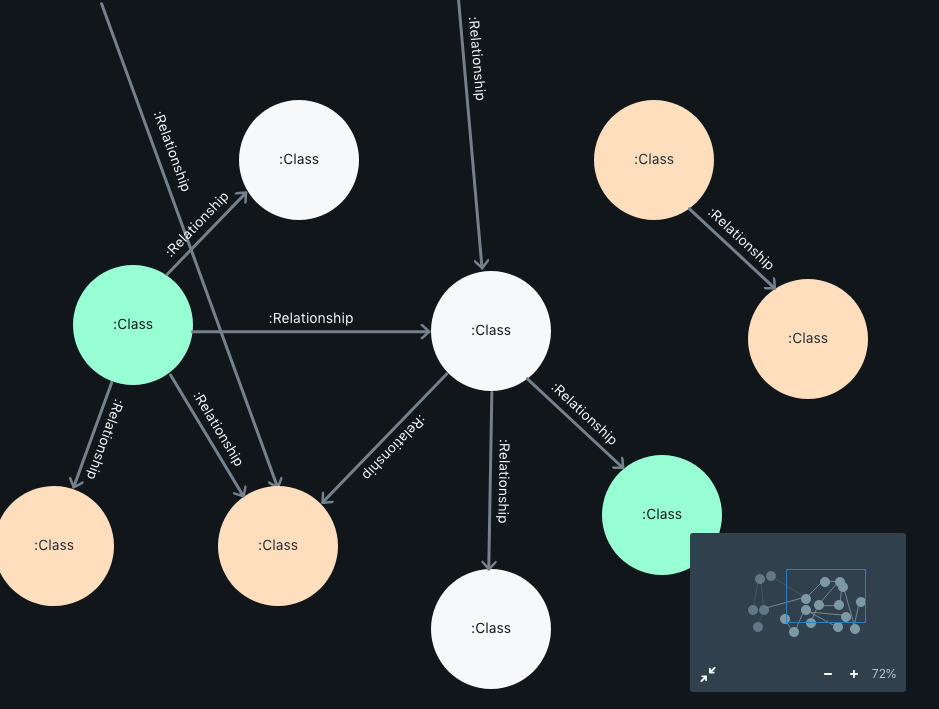
The playground
All the abovementioned elements work in unison with the canvas. This is where a user creates a KG.
We color-coded the nodes depending on a mapping criterion.
Gray, if the nodes are not mapped.
Orange, if partially mapped.
Green, if completely mapped.
Clicking on the node triggers a pop-up box that lets the user manipulate the node, the properties, and the mappings associated with the node.
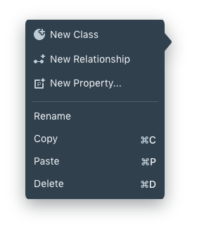
On right-clicking, a context-aware menu opens up that allows users to perform data modeling functions like adding a Class, Relationships, and Properties.
Keyboard shortcuts increase productivity. Some of the keyboard triggers are:
[⌘ + N] -> Add a new Class
[⌘ + R] -> Establish new Relationship
[⌘ + T] -> Add a new Property
Experience and takeaways
Experience and takeaways
Experience and takeaways
Working on this project was a fantastic opportunity to understand how SaaS companies work. At the end of this project, I was very comfortable managing both the researcher and a designer hat. Leading a team of 6 designers had its challenges. It helped me realize that working as a team is a very collaborative process, and there is always a difference of opinion. One way to bridge any disagreements or multiple design directions is to rely on the user's feedback. I helped create a design system using Adobe XD, which was very useful in working with five other product designers.
Do you think I can thrive in your complex problem space? Let's talk!
Apart from work, I am fiddling around with Google Assistant actions to create a Bot that helps me be more productive. Ask me about that when we talk.
Email: hello@aravindjr.com
LinkedIn: Aravind Jembu Rajkumar
© Aravind 2021
Designer | Researcher | Product?