

Before
After
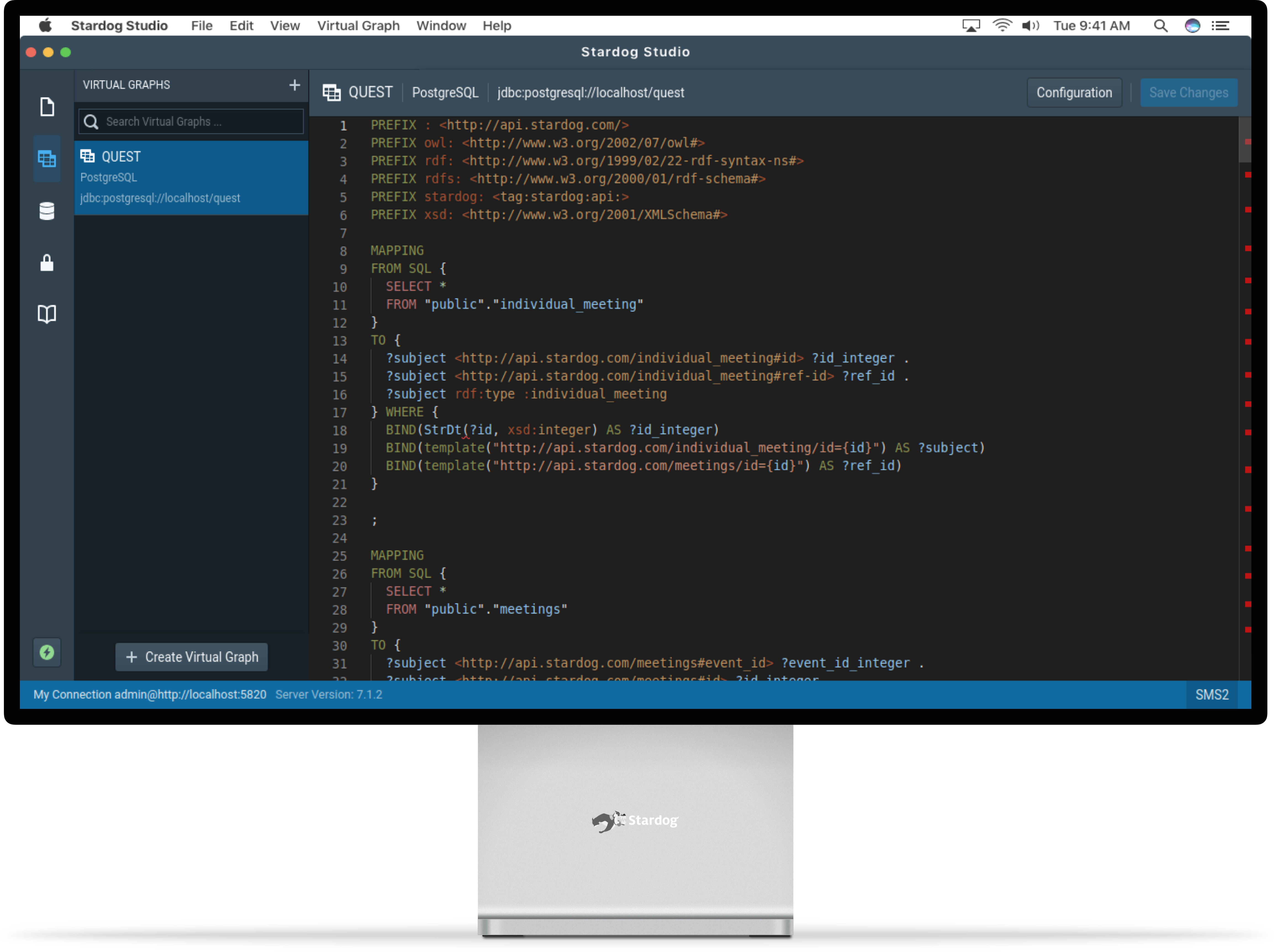
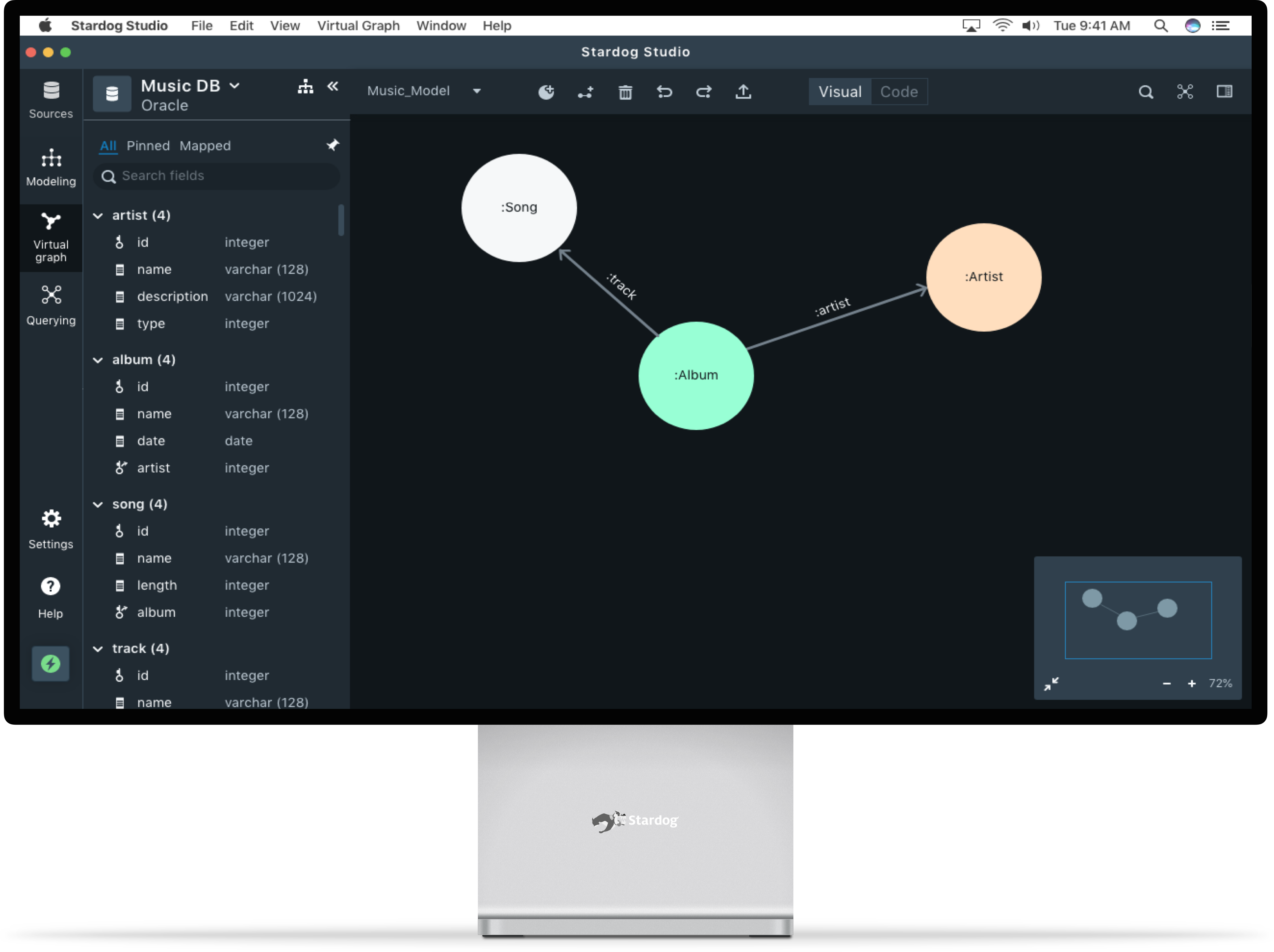
Use the slider to see the before and after versions of the product
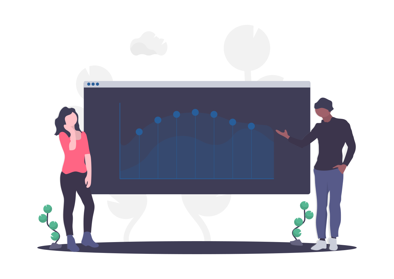
STARDOG UNION
As a part of iConsultancy of the University of Maryland, my team is partnering with Stardog Union, headquartered at Washington D.C to help design their product - Stardog Studio - an enterprise data unification tool which is widely used by large businesses like NASA, Dow Jones, Pfizer, Morgan Staley, CapitalOne, FINRA, etc.
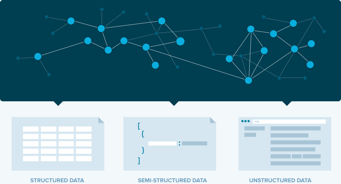
Enterprise data in large companies are stored in silos databases that fail to provide insights that are required to make better business decisions. Data is becoming increasingly complex, but data integration tools haven’t changed. Stardog enables organizations to unify all their data by leveraging ‘Knowledge Graph’ (KG) technology - a graph that uses relevant data across silos to answer business queries of end-users.
ABOUT THE PROJECT
This is an ongoing year long project nearing completion, currenrtly in usability testing phase. Our stakeholders include the founder and CEO, VP of Marketing, Solutions Architect, Product Manger and Senior Software Engineer who have constantly helped us understand the domain and data space. The high-level scope of this porject is to transition from a command line interface to a GUI platform to include non technical users like Data and Business Analysts, and SMEs who depend on Ontologists and software developers who are highly skilled at SPARQL and other querying languages.
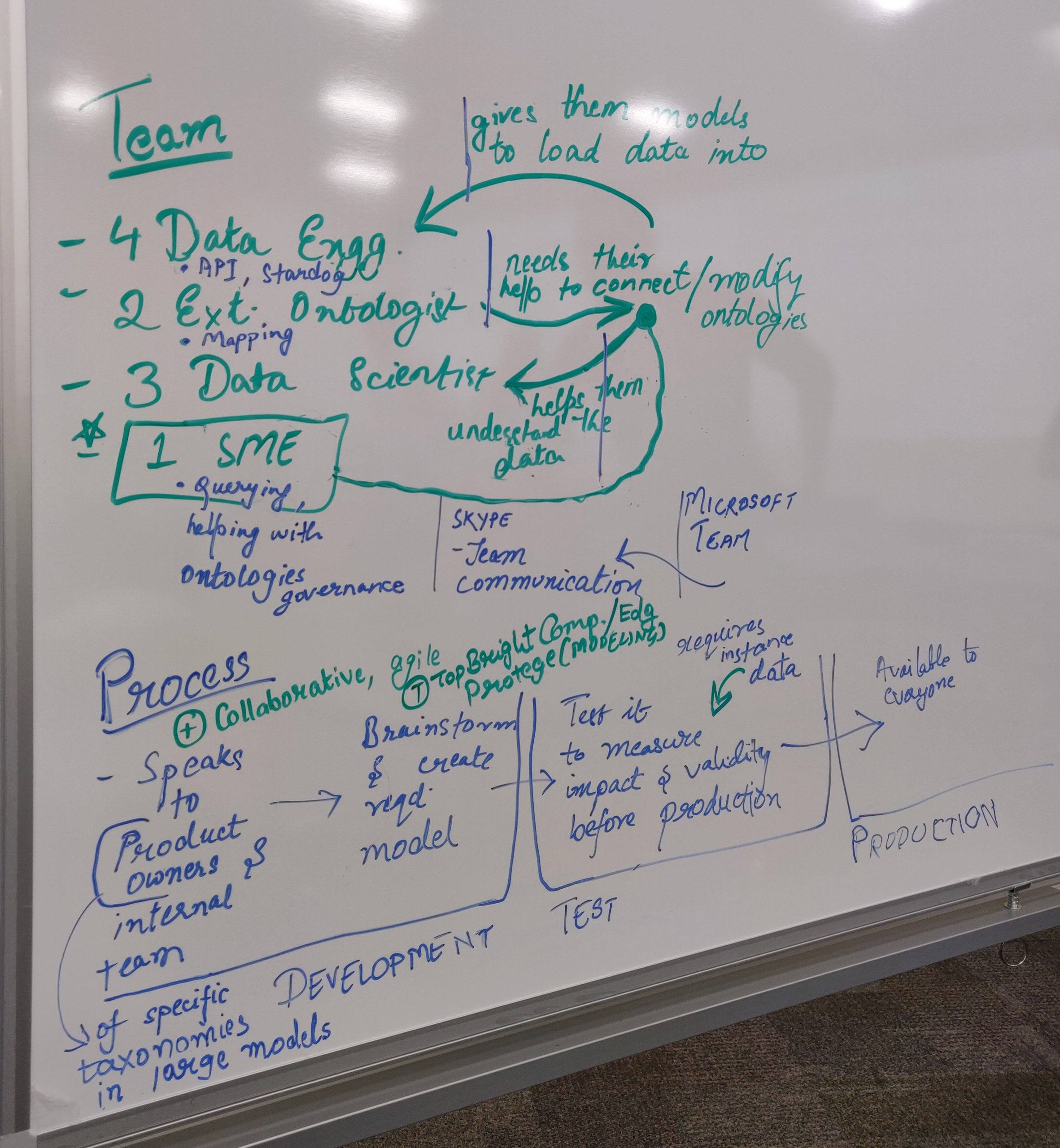
Team
Aravind Jembu Rajkumar
Jashan Gupta
Modassir Iqbal
Monikka Ravichandran
Natalie Tzu-Chia Yeh
Yirang Choe
Knowledge graph simplified
To simply put, a knowledge graph is a graphical representation of all the databases connected together (which was previously segregated) to transform information into useful knowledge to make an informed decision. Knowledge graph uses machine learning and semantic networks to gather and interlink information from a variety of sources.
PROBLEM STATEMENT
Ontologists/ analysts often employ different tools in their workflow to build and query KGs. Currently, Stardog’s users work across different platforms, use several coding languages, and collaborate with end-users who describe their needs.
The process of building a KG requires learning a querying language called SPARQL language which prevents low-level techies and business analysts to participate in the process of creating a KG.
- Current tools exclude users with little to less technical knowledge.
- The market is flooded with many tools none of them provide an end-to-end knowledge graph creation process.
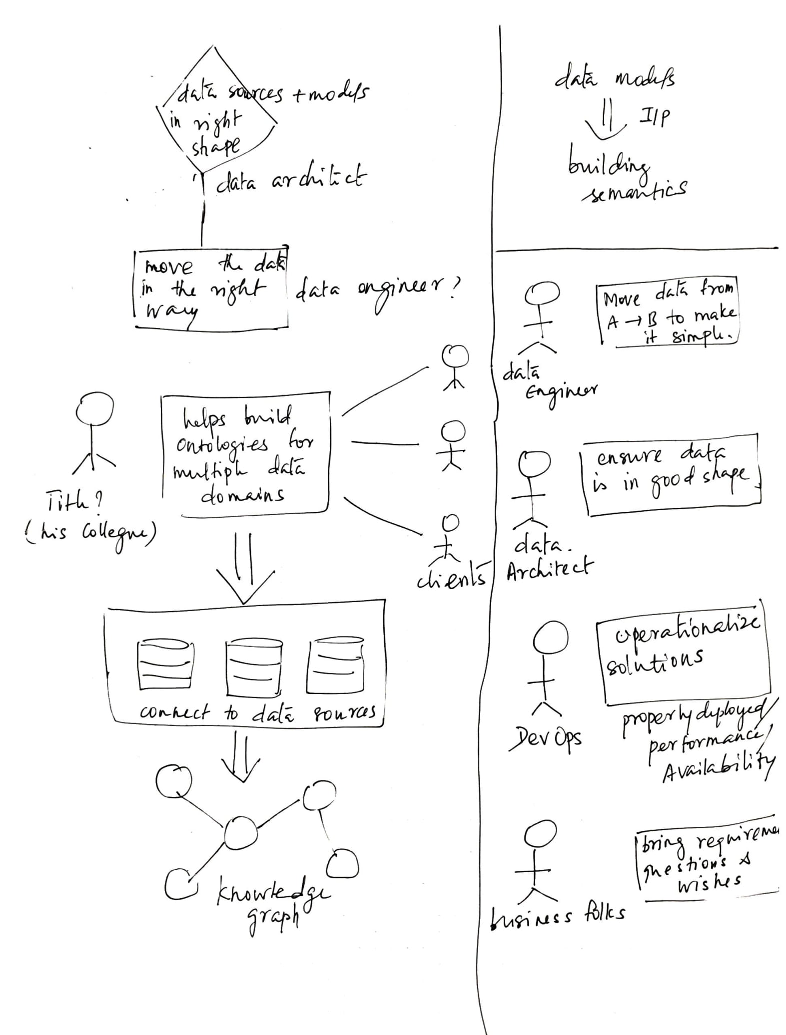
TARGET AUDIENCE
Our primary audience were people with limited or no technical skills like Business analysts and Subject Matter Experts (SMEs). Our secondary audience were exisiting user groups who are well versed with the SPARQL language like Ontologists, Senior developers and Data Scientists.
Primary audience
Low Techies (Junior Data Architects, SMEs and Business Analysts)
Little to no experience in KG domain
Existing audience
High Techies (Ontologies, Data Architects)
5+ years of experience in the KG domain
PROCESS
Designing a tool for a new population requires understanding the market and competitors, their USP and capabilities, and the user's need and mental models. It was imperative to gather all this information before designing. We divided this project into two phases - Research and design phase. We used Contextual Design Process by Karen Holtzblatt.
Contextual Design Process
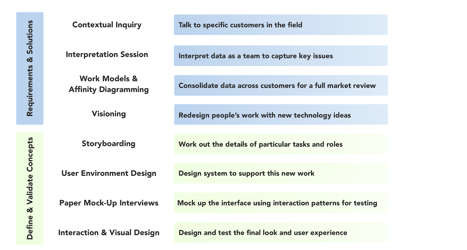
Research Phase - Fall 2019
Contextual Inquiry
Journey Map
Workflow Model
Affinity Map
CONTEXTUAL INQUIRY
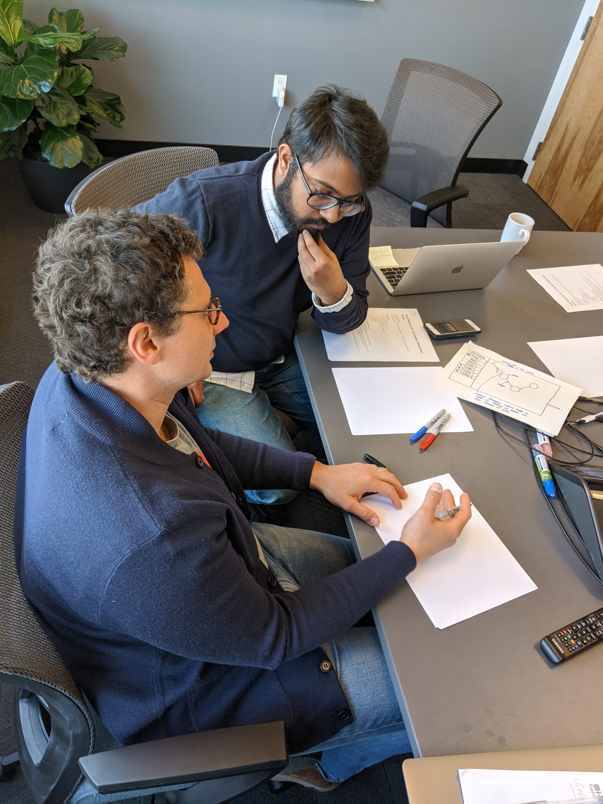
As the lead UX researcher, I realized that better questions yield better insights. It was also important to understand the various user groups we wanted to elicit information from. We decided to go with a semi-structured contextual inquiry method. A common practice in semi-structured interviews is to lead with open-ended questions and then spontaneously devise follow-up questions to draw out more specific evidence about the user's pain points and needs.
Interview guides
We were aware that we cannot have one size fits all interview guide when it comes to interviewing various user groups. Hence we created seperate interview guides. Our interview guide focused on understanding the following
- Technical competencies
- Tools used in their workflow
- Relationship between various teams in the company
- Workflow process
- Limitations, painpoints while using Stardog studio
- Opportunities for GUI interfaces
- Opportunities for better UX
- Communicating findings to stakeholders
Click here to view the interview guides
For SMEs
For Low Techies
For High Techies
Recruitment
We reached out to and screened 15 participants and ended up recruiting 11 participants for this study. Participants were predominantly from North America and Europe. We conducted an in-person interview for people residing within the DMV metro area. For participants across America and Europe, we conducted remote interviews. Stardog was actively involved in the recruitment process. The split-up of user groups is as follows.
- 3 Low techies
- 2 SME
- 6 High techies
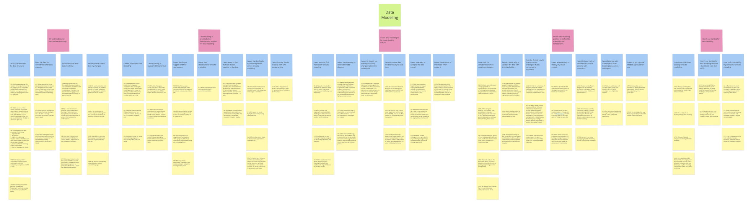
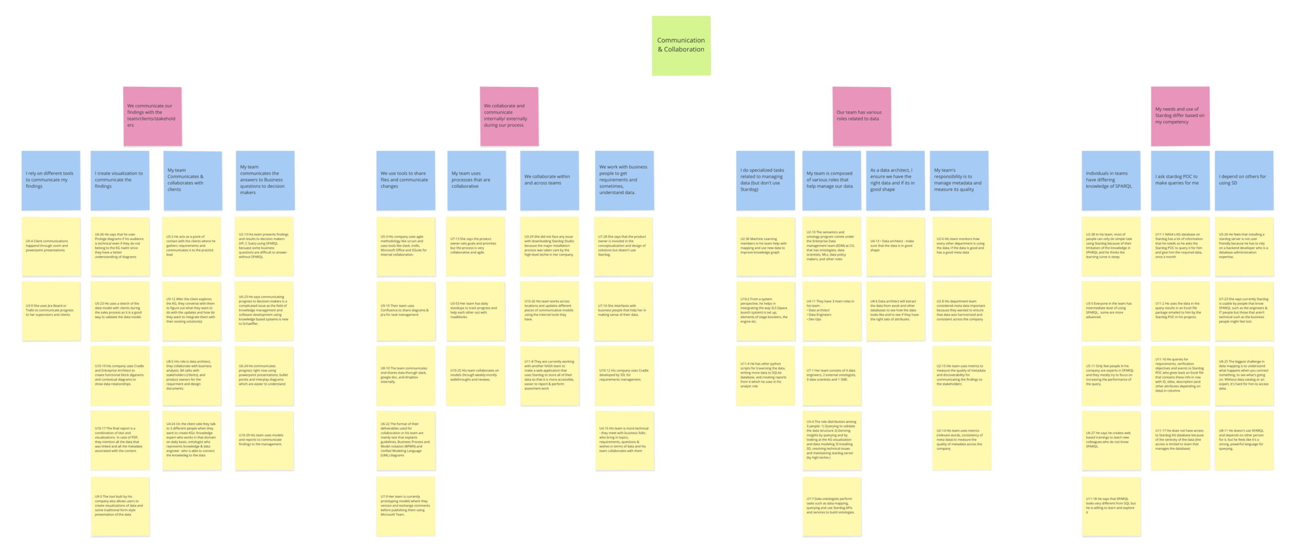
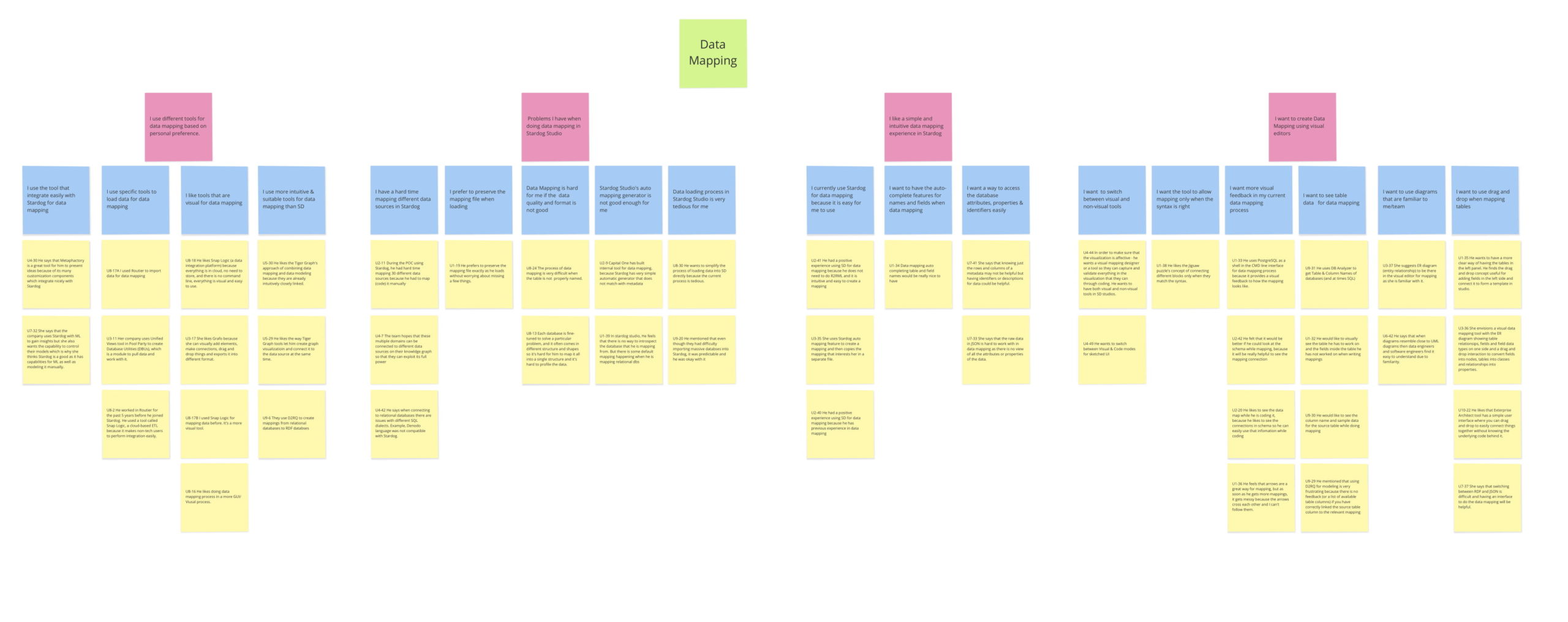
Affinity diagram
Our team gathered more than 500 data points from the contextual interviews. Assimilating the massive data points gathered by the research process is a very complex process. We externalized our raw research data onto sticky notes to create affinity diagrams. Affinity diagrams helped us to see the bigger themes and patterns in user needs and behaviour.
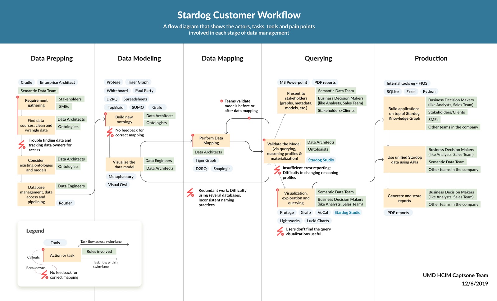
Journey Maps
Based on the interviews, we captured our user's workflow models, various tools used along every stage of the Knowledge Graph process. To illustrate the process, the various players involved and their paint points, we created a Jouney map and shared with the stakeholders for validation and feedback.
Research findings
- Modeling is highly collaborative (and requires communication over different platforms) whereas mapping is mostly done by one expert.
- Modeling and mapping are very closely tied. When users work on mapping, usually they need to edit/ add new nodes or properties as needs arise.
- Users want to select smaller datasets before mapping. They select a few fields that they need to work on before mapping.
- High-techies prefer coding. They are more comfortable with writing codes rather than using a graphical interface.
- Auto-mapping is the default starting point for techies. The system auto-generates the data model and mapping for them which is editable.
Design Phase - Spring 2020
Co-design Sessions
Storyboarding
Whiteboarding
User Environment Design
Low-fidelity Designs
Usability testing
Design Language
High-fidelity Designs
Co-design session
Designing a new interface to capture newer audiences and to cater to their needs requires us to understand the mental models. Co-design sessions helped us to understand how various frameworks would help the users to be more productive and efficient.
We invited 5 participants to sketch out an interface that would help their workflow easier and much more productive. We prompted them with various use cases and tasks to elicit more design ideas and validate some research hypotheses.
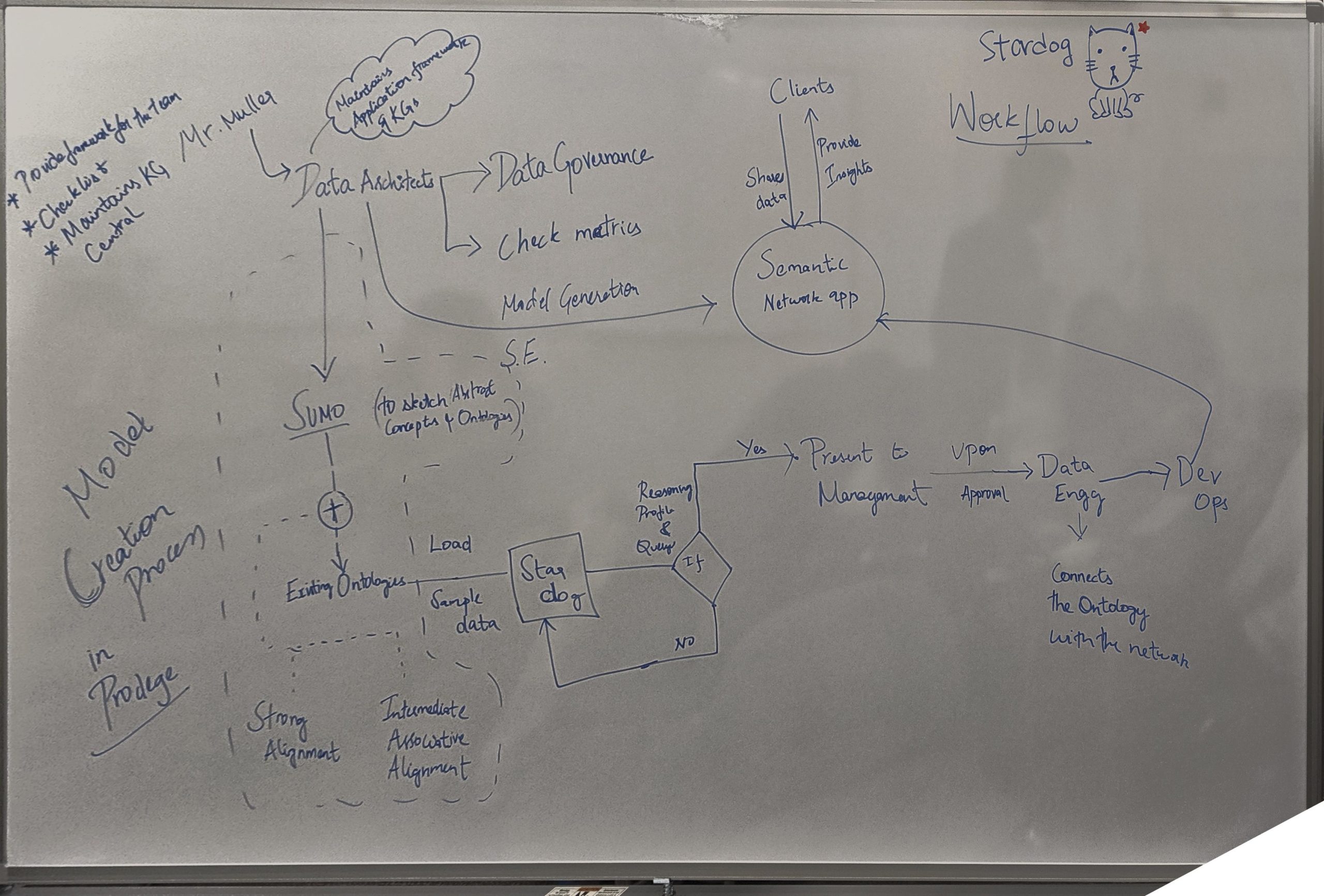
Sketching and whiteboarding
Storyboarding helped us envision our user's various workflows as each company used Stardog for different purposes. However, we were able to capture the common workflow and simplified it using a storyboard.
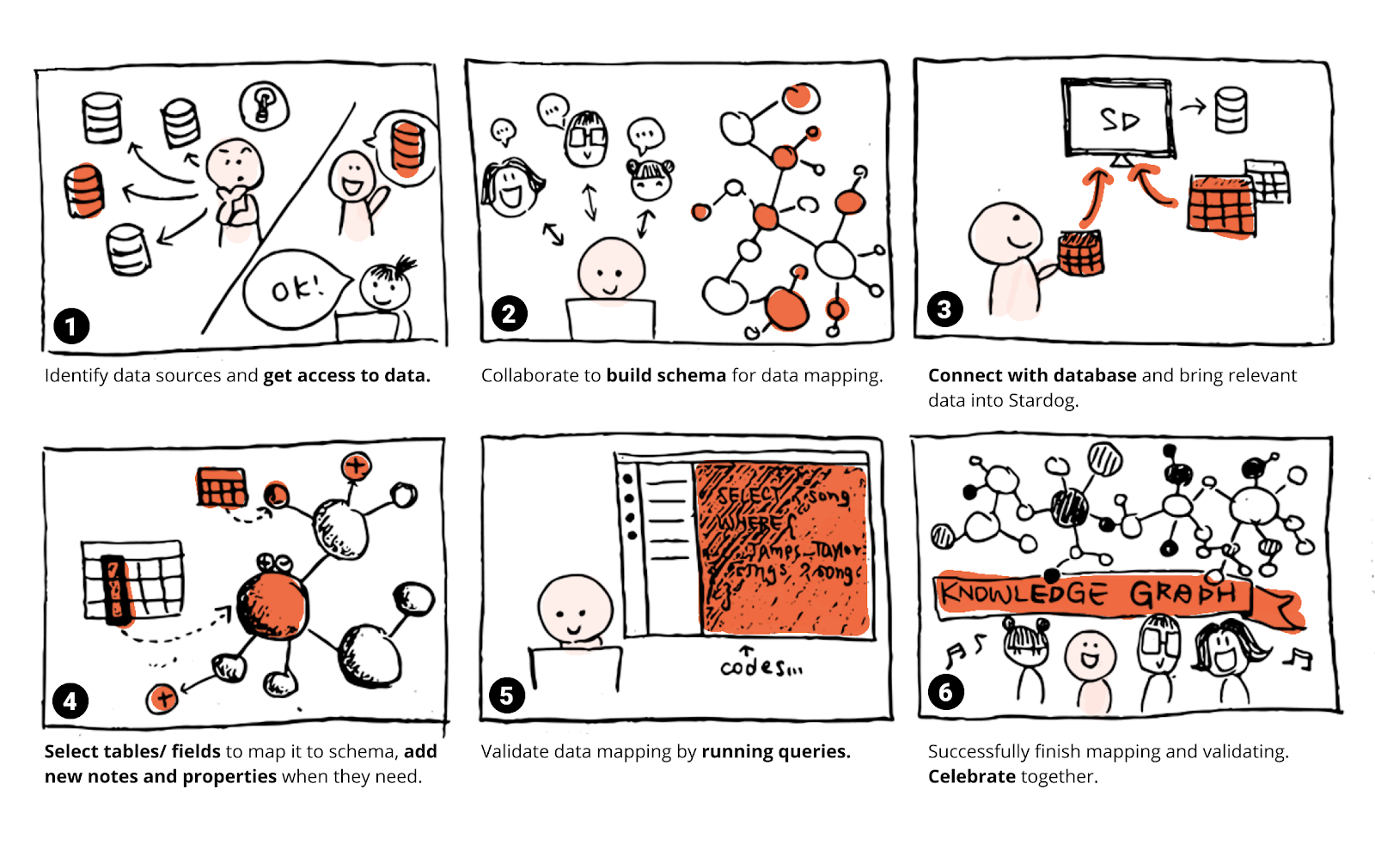
We also sketched out various workflows based on our co-design and contextual inquiries to better inform our design rationale. This helped us design the nuances in the user's mental models of mapping and modeling process.
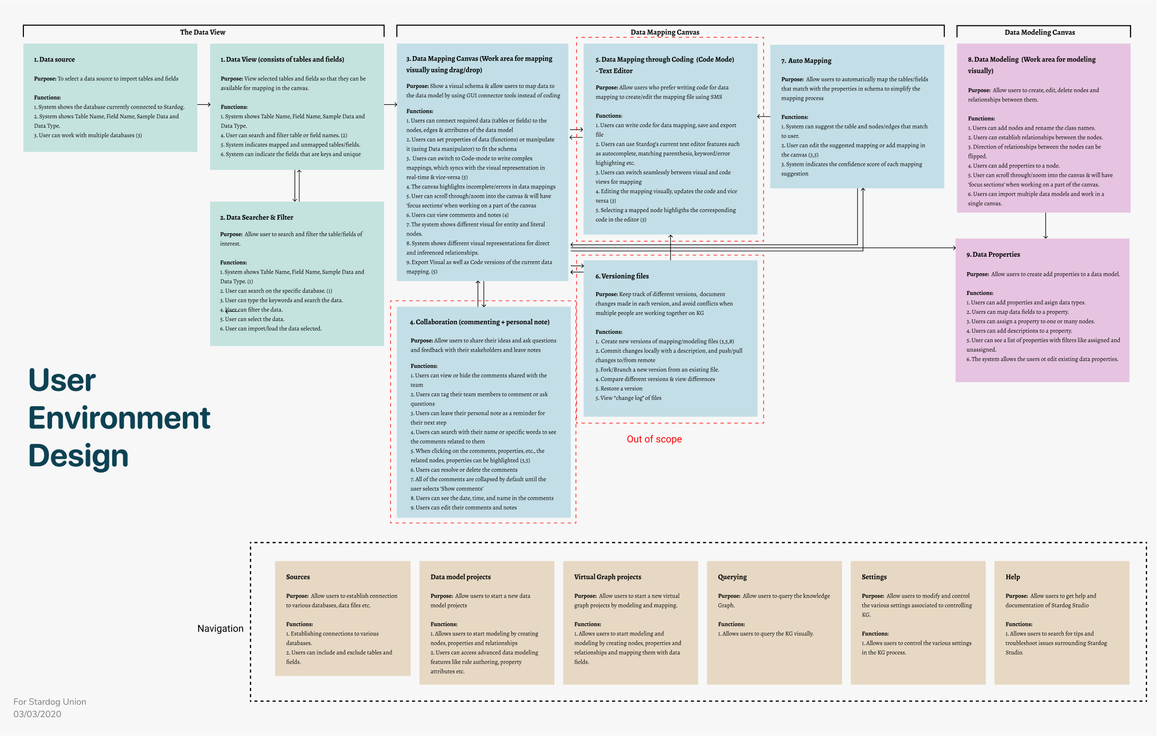
USER ENVIRONMENT DESIGN (UED)
Before starting with the designs, we documented various "Focus Areas" a user can interact with. A focus area has a definite purpose or an objective, a user can accomplish by performing a set of functions. UEDs also helped us understand the relationships and dependencies between the various focus areas based on the user's workflows.
We screened 12 potential participants and selected 6 participants based on their digital literacy and competency with using any voice assistant. We had equal representation of gender and their proficiency to speak in English. The only shortcoming of this demographic is that all our participants were students between the age group 23 to 35.
We screened 12 potential participants and selected 6 participants based on their digital literacy and competency with using any voice assistant. We had equal representation of gender and their proficiency to speak in English. The only shortcoming of this demographic is that all our participants were students between the age group 23 to 35.
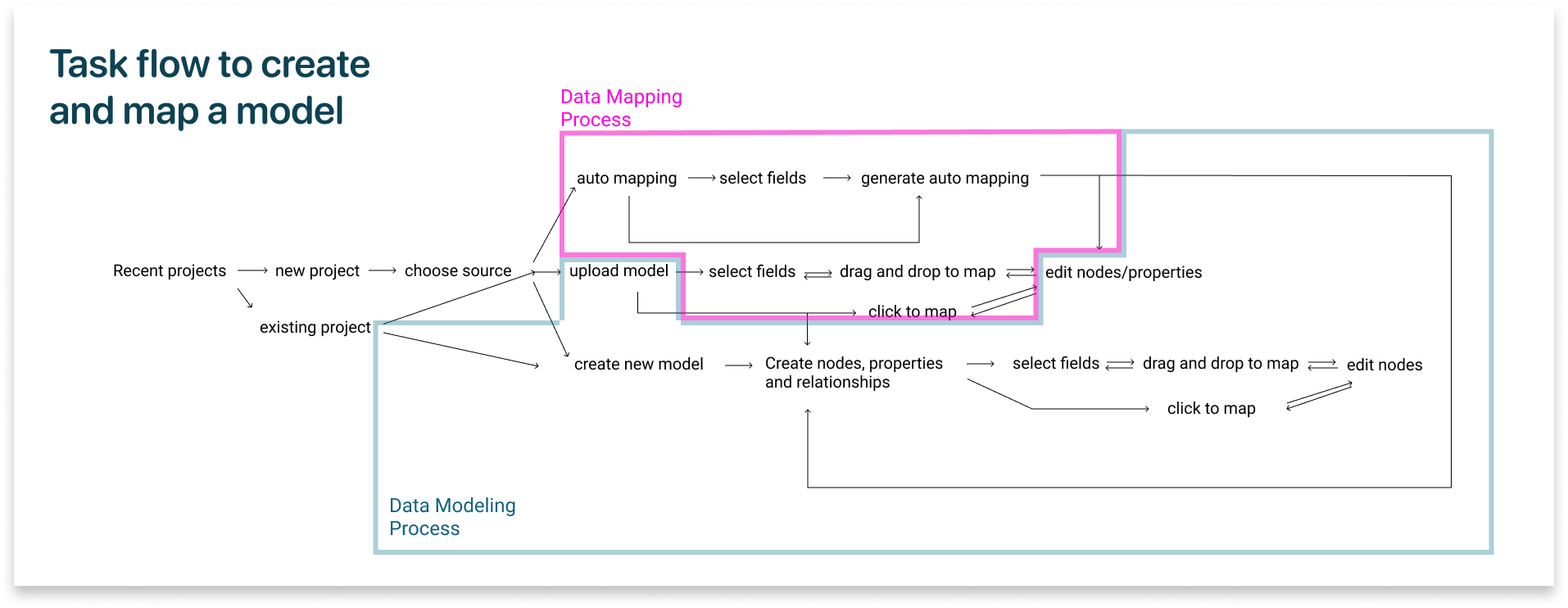
Based on the UED, we were able to build a task flow to create and map a data model.
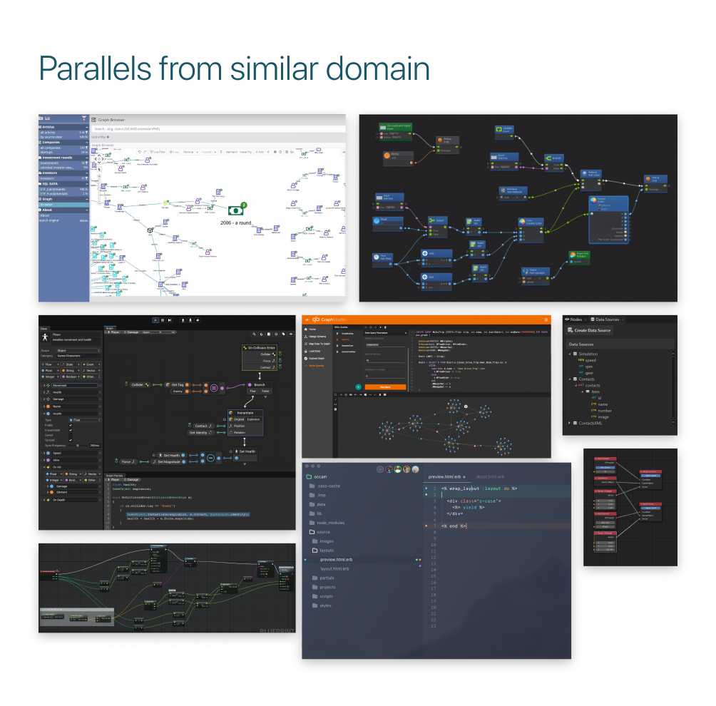
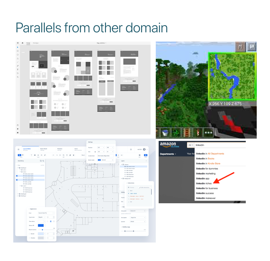
DESIGN INSPIRATIONS
Drawing parallels from tools in similar and dissimilar domains helped us to expand our inspiration for a user friendly, yet functional framework for our tool to be designed.
We drew parallels from various data mapping and modeling tools to understand the market competitors in this domain, and at the same time, we drew parallels from tools from dissimilar domains like 3D modeling tools, image editing tools, and search engines and even video games like Minecraft to include in our interaction pattern.
We screened 12 potential participants and selected 6 participants based on their digital literacy and competency with using any voice assistant. We had equal representation of gender and their proficiency to speak in English. The only shortcoming of this demographic is that all our participants were students between the age group 23 to 35.
We screened 12 potential participants and selected 6 participants based on their digital literacy and competency with using any voice assistant. We had equal representation of gender and their proficiency to speak in English. The only shortcoming of this demographic is that all our participants were students between the age group 23 to 35.
LOW FIDELITY DESIGNS
Based on the market and domain research, along with the mood board inspiration and Co-design feedback, we created an initial framework to build and iterate. Our low fidelity designs underwent 4 rounds of iterations, with each rounds incorporating the feedback from our usability testing. In total, we tested our prototype with 11 users.
We screened 12 potential participants and selected 6 participants based on their digital literacy and competency with using any voice assistant. We had equal representation of gender and their proficiency to speak in English. The only shortcoming of this demographic is that all our participants were students between the age group 23 to 35.
We screened 12 potential participants and selected 6 participants based on their digital literacy and competency with using any voice assistant. We had equal representation of gender and their proficiency to speak in English. The only shortcoming of this demographic is that all our participants were students between the age group 23 to 35.
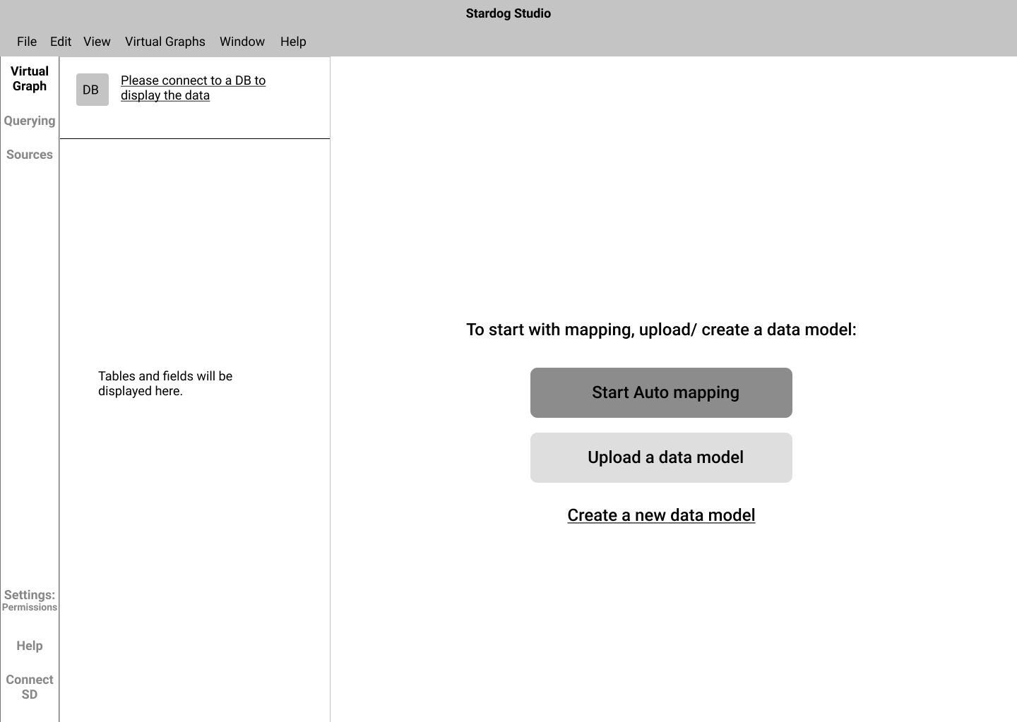
Onboarding
Before starting a new project, there are a lot of data configurations that have to be done like connecting it with Database, selecting various sources, selecting a model to work with, and sometimes, to select a smaller set of data fields.
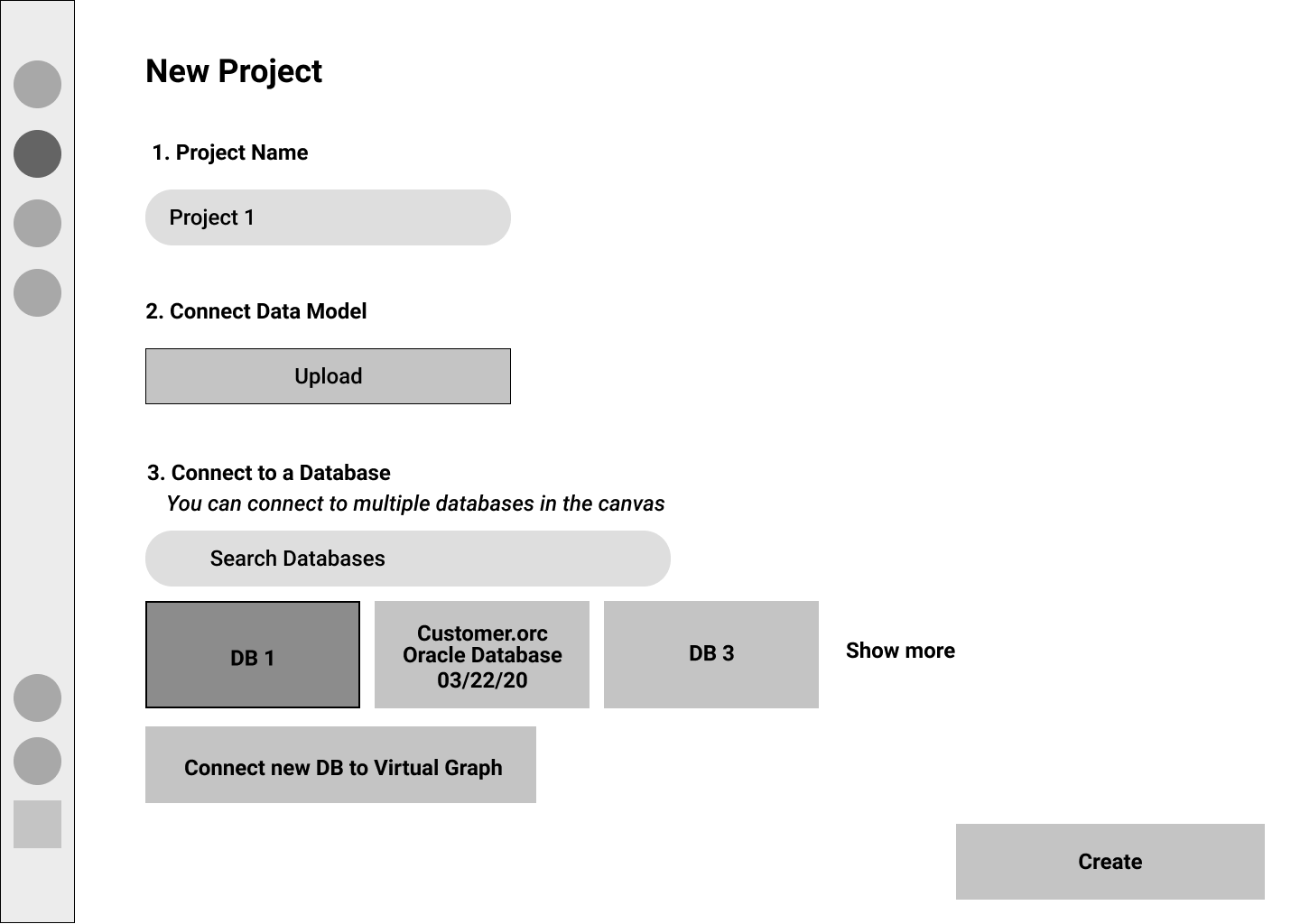
Version 1
We realized that it was prudent to have these questions upfront so that our users can quickly configure these settings.
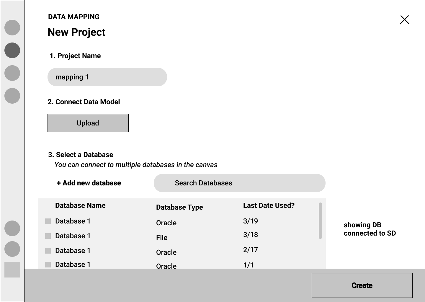
Version 2
Some of our users mentioned that they wanted more information about the databases they import into Stardog. The database type and the last accessed were important to our users. Hence we included those information in a form of a list.
Version 3 - Selected
On probing deep into the mental models of the users, we uncovered that, in order to start modeling, the users did not have to connect to any data source. Thus, the process of configuration of data sources was unnecessary. Hence we directly let the user to the canvas to start modeling their KG.
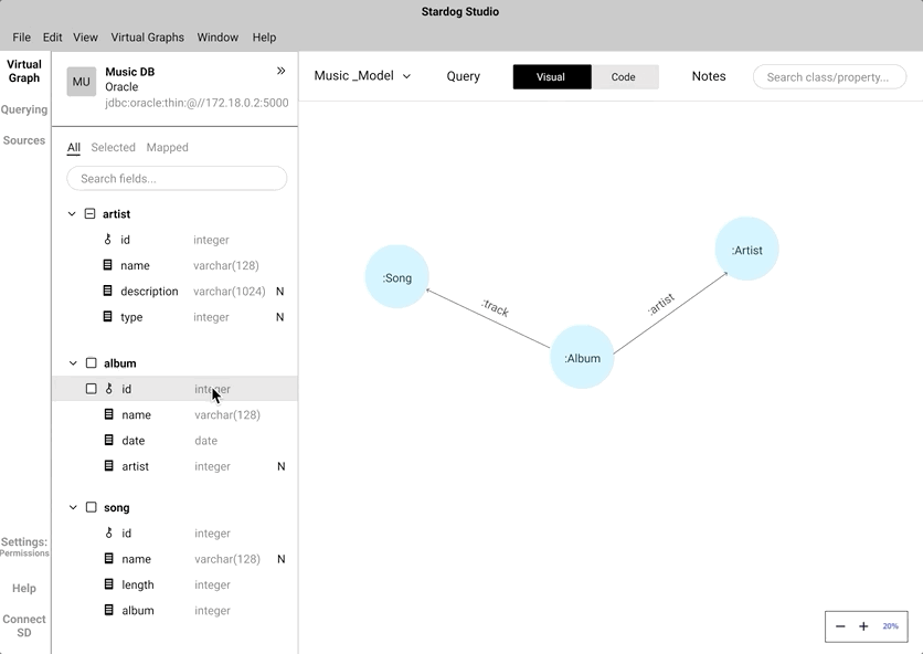
Data modeling
Building a data model is an important step that lays the foundation of a knowledge graph. A data model consists of "Nodes" which may have many "Properties". Each node is linked with one or many nodes by "Relationships" After several iterations of data modeling approaches based on user and stakeholders feedback, settled with an intuitive WYSIWYG approach. We settled with our final approach based on the design inspirations where we drew parallels from similar and dissimilar domains.
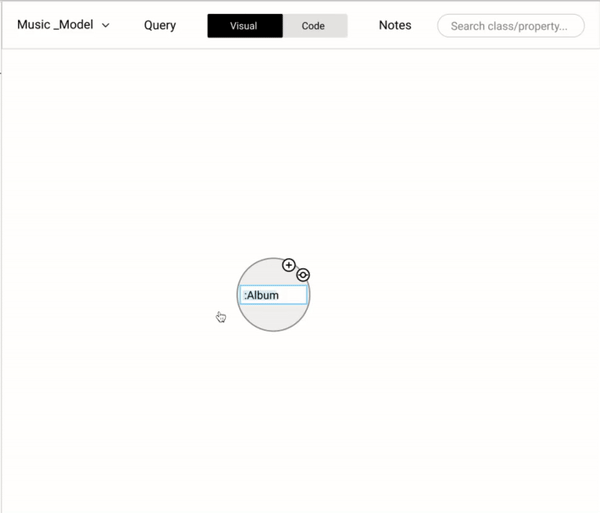
We wanted to cover all the basic operations (add a new node, properties, and relationships) in modeling while coding and also provide the flexibility (copy, paste, and delete) that could help users be more effective.
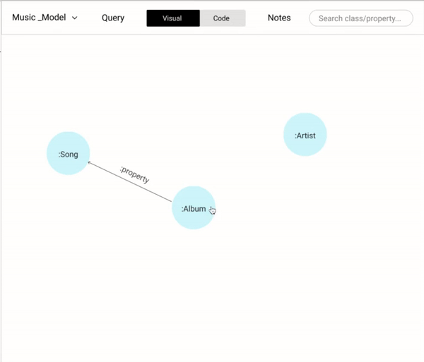
Allowing users a way-in to edit and change the data modeling saves a lot of time. For example, flipping the direction of a relationship using a simple toggle button would have a lot of time since it mimics the user's intuition. Alternatively, having dragging and dropping the anchor points of a relationship to different nodes would help the user to link different nodes.
There are two ways to rename a node or a relationship.
- Double click the node name.
- Right-click on a node to trigger the context-aware menu and click on rename.
On hovering over a node, two icons appear - creating a new node and creating a relationship. These are the most frequently performed operation. Having them on hover helps the users to quickly create and build a data model.
Data mappping - Click to Map vs Drag and Drop
Before starting a new project, there are a lot of data configurations that have to be done like connecting it with Database, selecting various sources, selecting a model to work with, and sometimes, to select a smaller set of data fields.
Instead of coding the relationship between a "node" and a "data field", we wanted to mimic the natural human gesture of dragging and dropping. We did consider the implication of drag and drop action in a crowded knowledge graph.
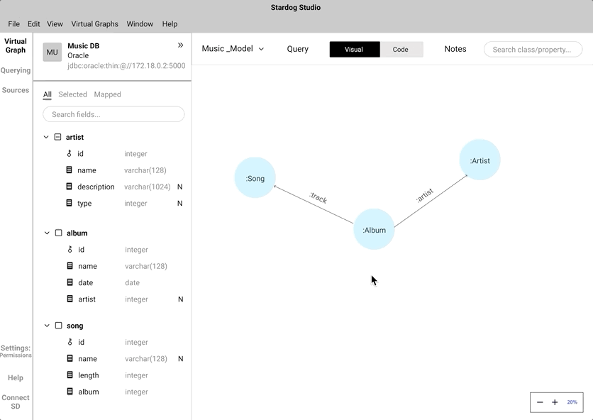
An alternate to drag and drop is the click-to-map approach. This will definitely come handy while mapping nodes in a highly-populated knowledge graph.
We did A/B testing to understand which approach was easier and intuitive for the users during the mapping process. During the testing we found out all our participant's first touch interaction was to drag and drop. Some of the participants did anticipate that the drag and drop approach would be cumbersome while interacting with a highly populated knowledge graph. Participants preferred to have both and saw use cases where both approaches can work in tandem.
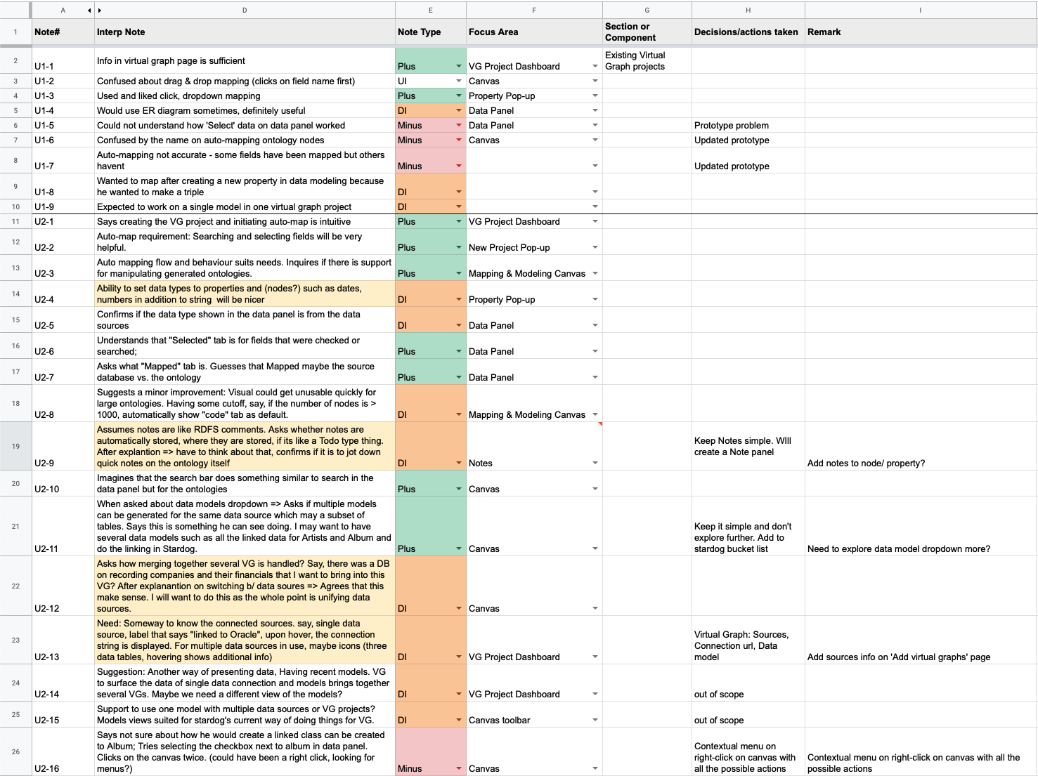
USABILITY TESTING
As mentioned earlier, we constantly tested and validated our design assumptions with real users. We performed 4 rounds of UT with 11 participants. We documented each and every feedback we got from our participants categorizing the "Focus Area" where there can be an improvement. We documented the data in an excel sheet along with the design decision we took.
DESIGN LANGUAGE
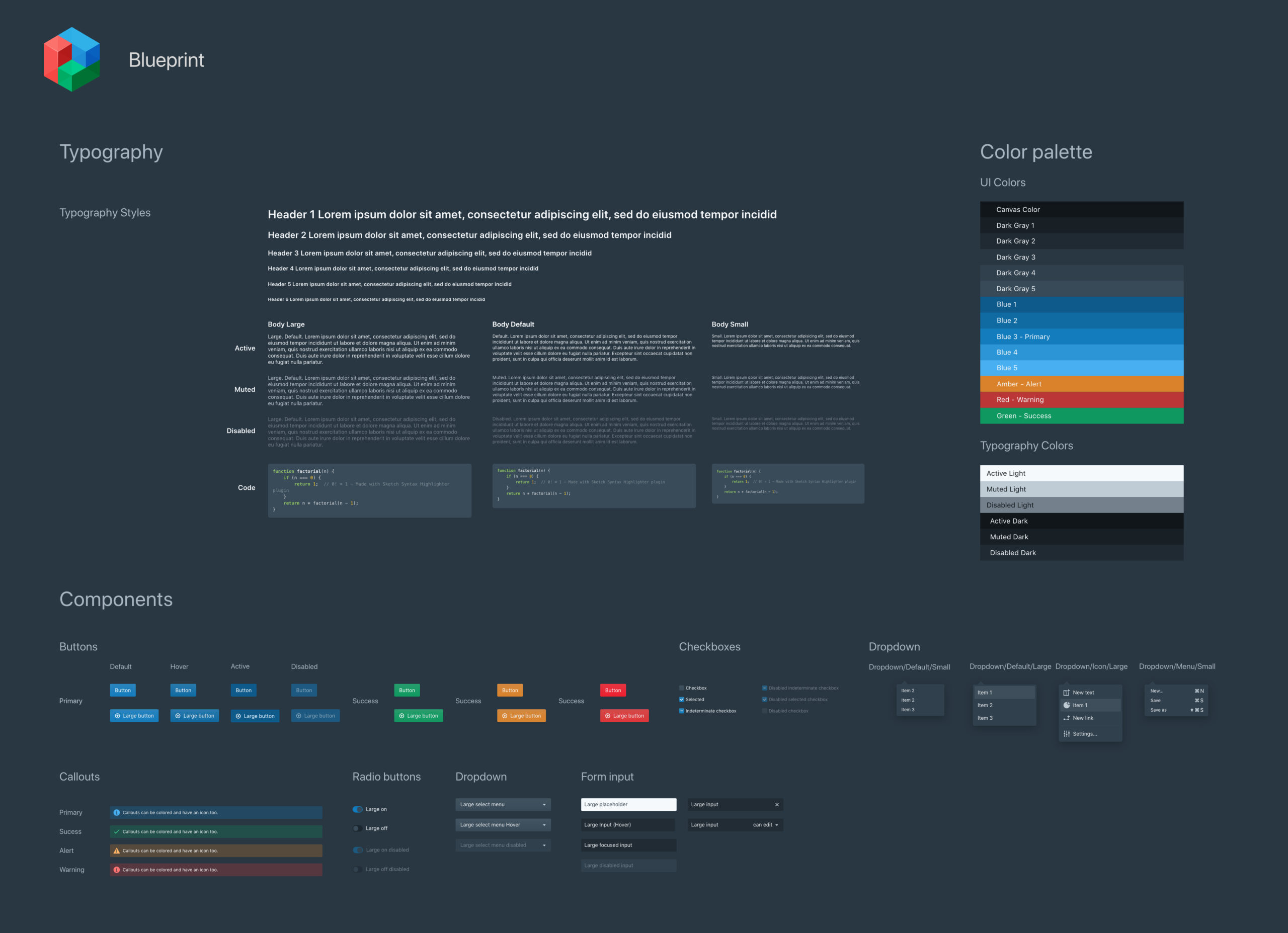
Stardog followed Blueprint.js for their design language. We used components from blueprint.js to design our mockups. The stakeholders admitted that there were some design inconsistencies and wanted us to follow the existing design language. We used Adobe XD to create various states for the below components. This saved the team a lot of time while designing hi-fi mockups. This also ensured that the team was able to create and ship consistent, pixel-perfect mockups.
We screened 12 potential participants and selected 6 participants based on their digital literacy and competency with using any voice assistant. We had equal representation of gender and their proficiency to speak in English. The only shortcoming of this demographic is that all our participants were students between the age group 23 to 35.
We screened 12 potential participants and selected 6 participants based on their digital literacy and competency with using any voice assistant. We had equal representation of gender and their proficiency to speak in English. The only shortcoming of this demographic is that all our participants were students between the age group 23 to 35.
Design Framework
Based on our User Environment Design (UED), we created a framework for our design which consists of 5 sections.
- The Navigation Panel
- The Data Drawer
- The Property Panel
- The Toolbar
- The Workspace Canvas
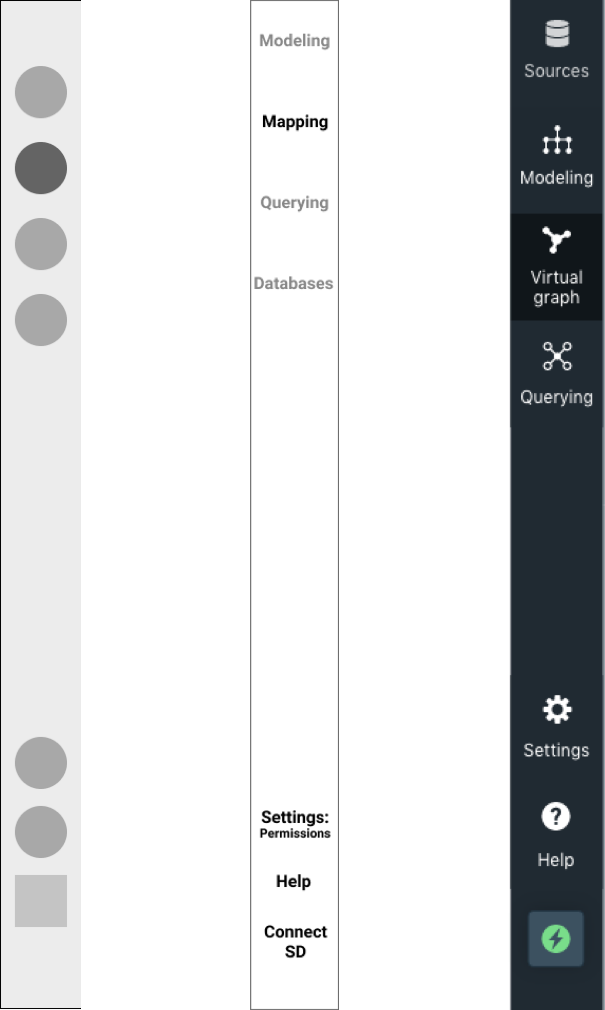
1. Navigation Panel
Over time, our navigation panel evolved from mimicking the existing design to rethinking how projects live in Stardog Studio. Below is the evolution from low-fi to hi-fidelity design
We wanted the users to easily switch between various stages in creating a knowledge graph. This way, the flow is in line with the users' mental models.
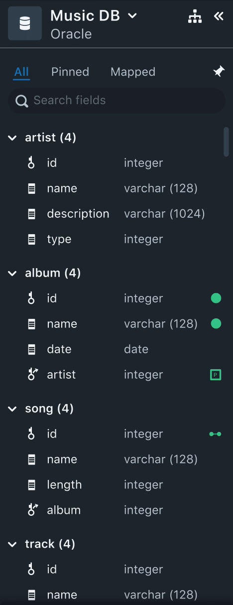
2. Data Drawer
All the data required to perform data mapping from various data sources is populated here. Here, the users can sort, filter, and search data fields.
Needs
- Users often spent time trying to identify mapped and unmapped data fields.
- Users, usually, select a subset of data to start mapping. Once they complete the mapping the small dataset, they validate it by running quick queries.
- Often times, the name of the data field would not necessarily convey the context of the data. Users felt that sample data of the field could be useful.
Solution
- Having a "Mapped" tab to filter all the mapped fields helps users keep track of all the mapped fields.
- Using colors and icons also aid users visually to identify if the data field is mapped to a Node, or a relationship or a property. This was very useful to help users skim through the list of unmapped data fields.
- Each data field will have the datatype listed next to it. Instead of having the sample data, we decided to stick with the datatype since it gives a better context of the data field.
- Having a "Pinned" tab helps users to select a small subset of the data and work on mapping instead of getting distracted by huge unrelated data fields.
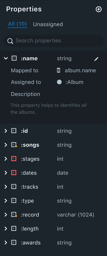
3. Property Panel
Properties are nothing but attributes of a node. The property panel lists all the properties that were created by the user.
Needs
- From our research, we found out that users, oftentimes create various properties, before mapping them to a node.
- An easy way to distinguish between assigned and unassigned properties.
- A property can be mapped to multiple nodes. Naturally, our users wanted to know which properties are mapped to multiple nodes and the names of the nodes mapped.
Solution
- Having an "Unassigned" tab to filter all the unassigned properties helps users keep track of all the unassigned properties. This also helps users to quickly get started to assign properties.
- Property icons that are red in color indicate that the property is either not mapped to a data filed or not assigned to any nodes. This helps the user to easily distinguish between assigned and unassigned properties.
- Each data field will have the datatype listed next to it. This helps the data mapping process easier as the user can match the data type of the fields in the data drawer.
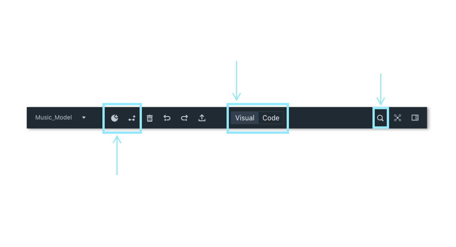
4. Toolbar
A toolbar harbors all the most frequently used functions that we identified in the user environment design. The objective of a toolbar is to have quick and easy access to functionalities related to data modeling and mapping to help users be more efficient and productive.
The toolbar lets users switch between the visual and code mode. This is to accommodate advanced users who prefer coding but use visual mode as a form of validation.
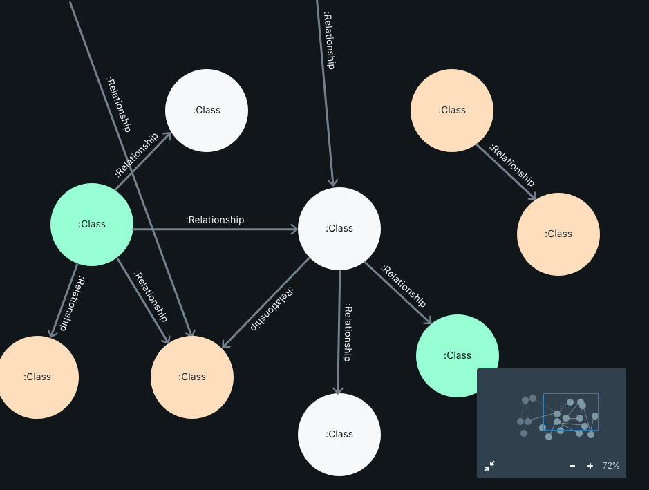
5. Workspace Canvas
The workspace canvas is the main focus area where the users could build data models and map data fields to those models. All the other sections above work in unison with the canvas.
The nodes are color-coded to indicate to the users if the nodes are not mapped at all (Gray), partially mapped (Orange), and completely mapped (Green).
On clicking on a node, the user can trigger a pop-up box that lets the users edit the node, map data fields to the node and properties, add properties etc.
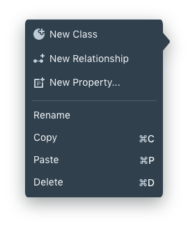
On right-clicking a node, a user can trigger a context menu where the user can perform vital data modeling functions like adding a Class, Relationships, and Properties. Likewise, the user can also use keyboard shortcuts like
[⌘ + C] -> Add a new Class
[⌘ + R] -> Establish new Relationship
[⌘ + P] -> Add a new Property
LEARNINGS
Working on this project was an amazing opportunity. At the end of this project, I was very comfortable managing both the researcher and a designer hat. It also helps me realize that working as a team is a very collaborative process and there is always a difference of opinion, which I learned to handle. I helped create a design system using Adobe XD which was very effective in working with 5 other product designers.
We screened 12 potential participants and selected 6 participants based on their digital literacy and competency with using any voice assistant. We had equal representation of gender and their proficiency to speak in English. The only shortcoming of this demographic is that all our participants were students between the age group 23 to 35.
We screened 12 potential participants and selected 6 participants based on their digital literacy and competency with using any voice assistant. We had equal representation of gender and their proficiency to speak in English. The only shortcoming of this demographic is that all our participants were students between the age group 23 to 35.
We screened 12 potential participants and selected 6 participants based on their digital literacy and competency with using any voice assistant. We had equal representation of gender and their proficiency to speak in English. The only shortcoming of this demographic is that all our participants were students between the age group 23 to 35.
Do you think I can thrive in your complex problem space? Let's talk!
Apart from work, I am fiddling around with Google Assistant actions to create a Bot that helps me be more productive. Ask me about that when we talk.
Email: hello@aravindjr.com
LinkedIn: Aravind Jembu Rajkumar
© Aravind 2021
Designer | Researcher | Product?